Redesign of Lufthansa Corporate Identity
In February 2018, Lufthansa announced that it is revising its logo and corporate identity. I asked five designers for an opinion. They are specialists for logo development and corporate design from Denmark, Luxembourg, Brazil, Greece and the Netherlands:
Christian Baun, logodesign.dk, Denmark
Claudia Eustergerling, eustergerling.lu, Luxembourg
Rodrigo Faustino, Commgroup, Brazil
Sophia Georgopoulou, Brand Identity Designer, Greece
Pim Nap, Studio Piraat, The Netherlands
Links with background informations from Lufthansa:
https://newsroom.lufthansagroup.com/english
http://magazin.lufthansa.com/de/en/aviation-en/a-new-dress/
Update Februray 27, 2018: Lufthansa has problems with the blue. In some situations this colour looks too dark.
http://www.airliners.de/lufthansa-lackierung/43799
Introduction
Claudia Eustergerling: Wenn ein Unternehmen nach 100 Jahren sein Corporate Design verändert, kann man davon ausgehen: es ist wohl überlegt. Die eigene Schätzung des Unternehmens, in etwa sieben Jahre für die Umstellung zu benötigen, unterstreicht meine Vermutung. Corporate Design, Designmanagement und Markenführung sind keine kurzfristigen Angelegenheiten. Markenentwicklung ist ein Prozess.
Die Lufthansa hat toll dokumentiert was dahintersteckt, welche strategischen Überlegungen, welch Aufwand, wie viele Details und wie viel Hingabe. Spannend zu sehen wie es glückt. In meinen Augen alles in allem sehr gelungen, insbesondere im Zusammenspiel mit der Kampagne. Den Beteiligten gebührt mein Respekt. Da wär ich als Designer gerne dabei gewesen!
Pim Nap: Lufthansa‘s restyled identity is an evolution rather than a revolution. This can be a deliberate direction for Lufthansa‘s future. A restyle often forms the core question of many clients, in turn also motivating designers to focus on this particular question. From experience, this enquiry more than often has its origin in clients being afraid or tentative of impactful/innovative change. A lot of times clients show a high readiness for change during strategy and positioning sessions/workshops but refrain from their initial enthusiasm for a revolution. This leads to the wish at the centre of many restyle questions: retain recognisability but with a fresh direction/course.
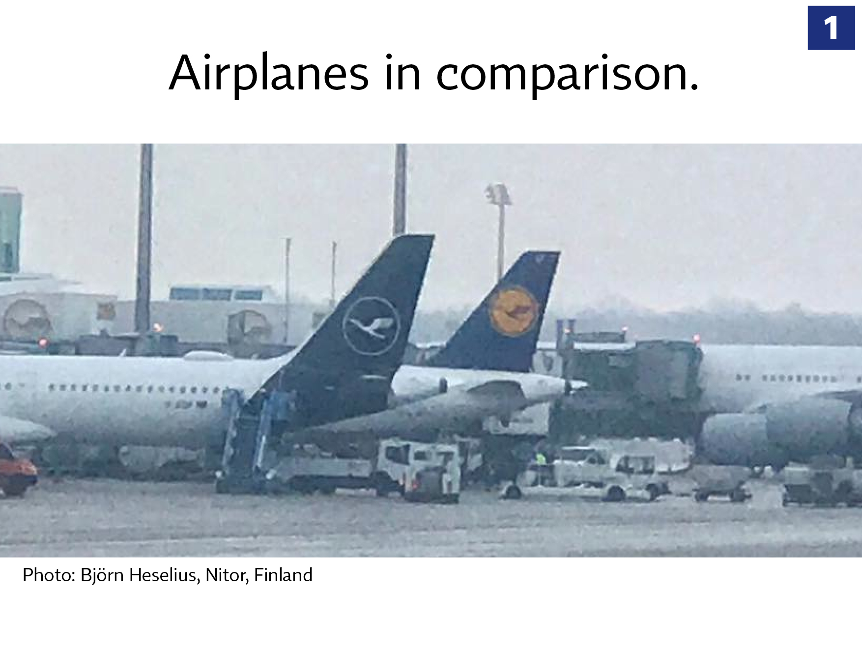
Christian Baun: I think that the new brand design evolution is very well done. A brand design has to be changed in small steps, and its right on time — the former brand design was 30 years old! The brand is more modern, more relevant and the appearance is stronger.
Rodrigo Faustino: No doubt the tail signage now seems more elegant, premium and efficiently, if you are looking just for an aesthetic and the new look a feel of the plane, we know that tail is more of the same blue in the airline business, but for me, they lost not just a pinch of color with the yellow circle in the middle of tail but they lost also the vibration of the unique power of joy and happiness of the yellow brand in the planes fleet.
Sophia Georgopoulou: I believe that the new logo on the planes looks more confident, modern and shows trust.
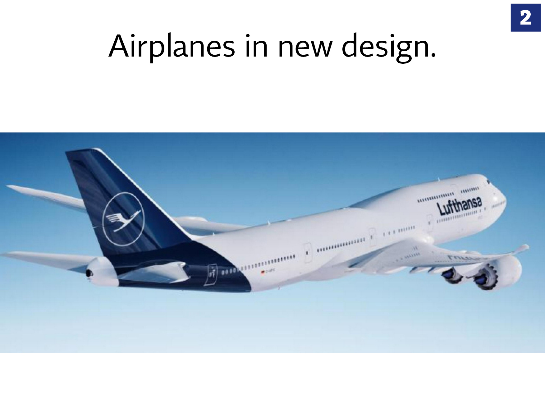
Christian Baun: First of all — the color yellow is removed. I like that. Blue and white is relevant colors for aviation — not yellow. They tryed to find the most premium blue in the world, and they succeeded. The tone of voice is clearer, more fresh and has more class.
Rodrigo Faustino: The livery is the most recognizable stage of an airline‘s brand statement and for Lufthansa they take the blue color continuous until the lower body of the aircraft, we know that nowadays is one more thing to do in the checklist, just like other identities as the new ones Latam, American, Qantas and others. But still talking about the new look of the livery, we have to agree it‘s to much blue, isn‘t? For me the storytelling where the yellow now is a link for the emotional and functional it‘s not convincing enough when they forgot to share equally the new balance of colors even in the livery.
Sophia Georgopoulou: The new design looks fresh and modern and I believe color wise it is more successful and elegant.
Source: Lufthansa
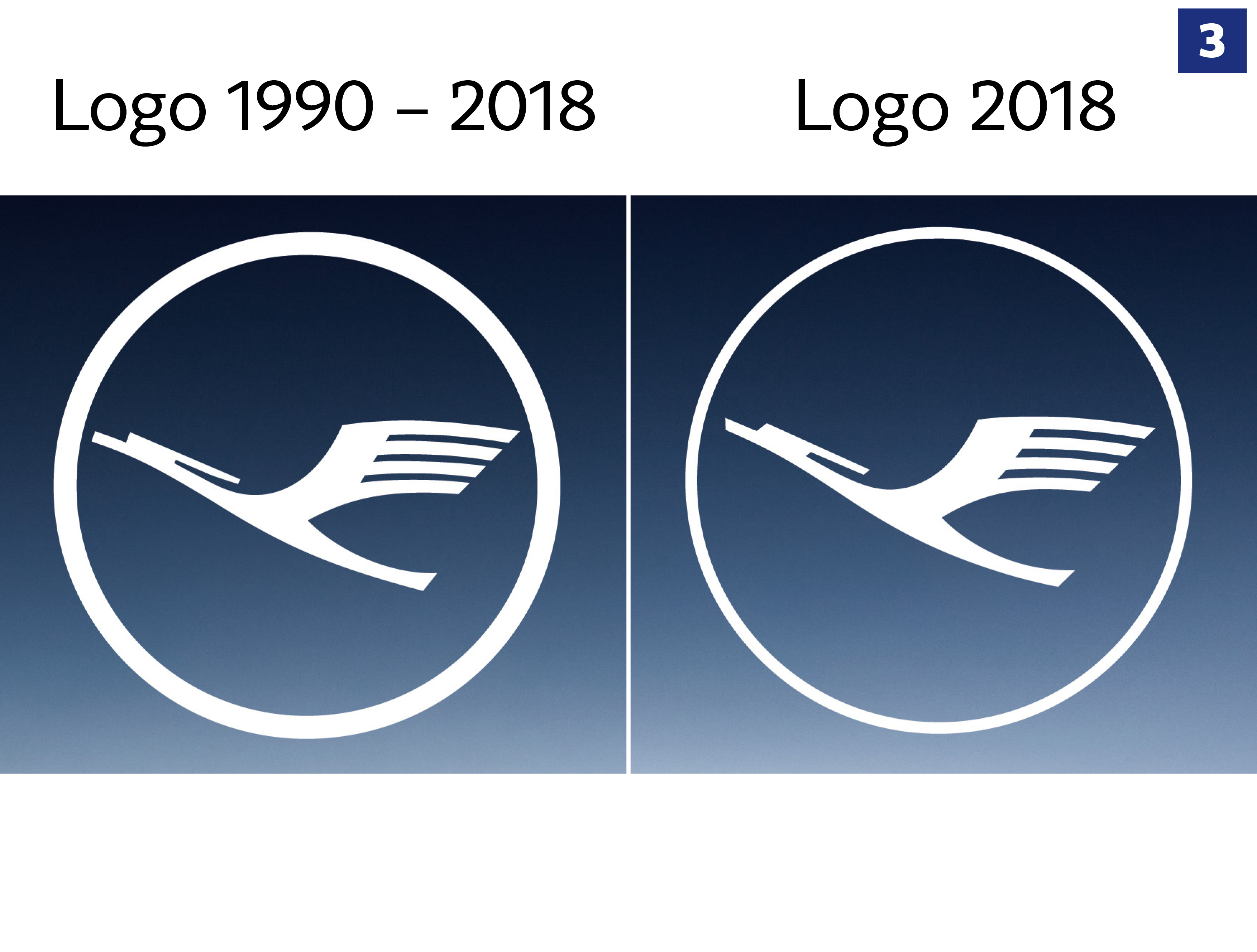
Christian Baun: Of course Lufthansa maintains the crane. I think its very strong to have a mark, especially in these years where the trend is only to have a wordmark. The crane (designed in 1918) has soul and is very characteristic.
Claudia Eustergerling: Der Kranich tritt mit dünnem Ring mehr in den Vordergrund, so kommentiert von der Lufthansa. 3-dimensional gesehen, kommt er in der rechten Darstellung im Vergleich zu linken nach vorne. Man muss sich das perspektivisch vorstellen, räumliches Denken mit 2-dimensionaler Darstellung kombinieren. Solche Dinge sieht ein Designer. Manchmal hat man eine Überlegung, man sucht nach etwas ohne es genau zu kennen, probiert aus und entscheidet an einem Punkt, das ist die Lösung, das ist besser!
Rodrigo Faustino: The new redesign of the crane, the iconic 100-years-old symbol, it‘s more sharpen now, best for the new technologies and platforms that require this, we also agree with that.
Sophia Georgopoulou: I like the new clear lines of the new logo and I believe that the changes are good. I never liked the fact that in Lufthansa’s logo, the crane is placed inside a circle (even though now the circle is thinner) because it seems like it is a “bird in a cage”. That stresses me.
Source: Lufthansa.
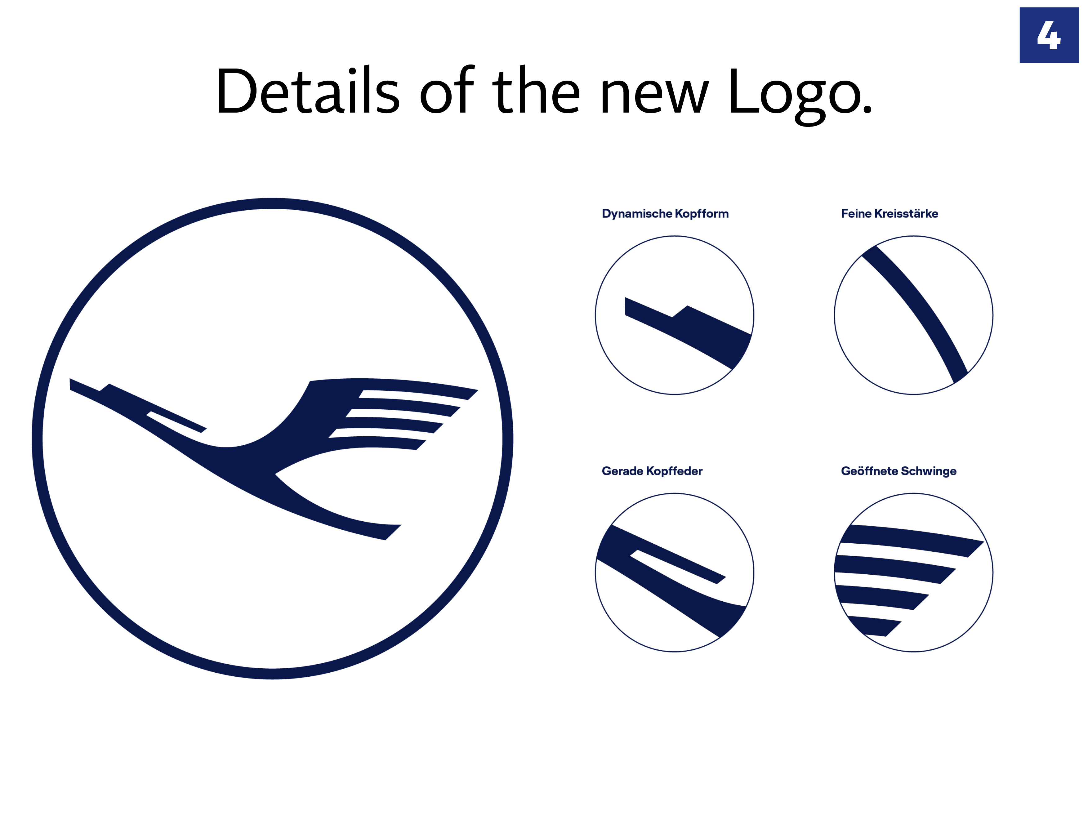
Christian Baun: The result of the redesign of the crane is clear: Its more elegant and more dynamic. But it is also changed to increase functionality — it will not loose details in small size, because the negativ space is increased.
Sophia Georgopoulou: Details look good.
Pim Nap: The logo has been sharpened and repositioned in comparison to the previous version. It is now more open and less heavy; in both ways a nice job. Simplicity is a common theme amongst many brands in almost every business sector. Obviously, this is only effective if the original your working with provides a strong foundation, of which Lufthansa has plenty.
Source: Lufthansa.
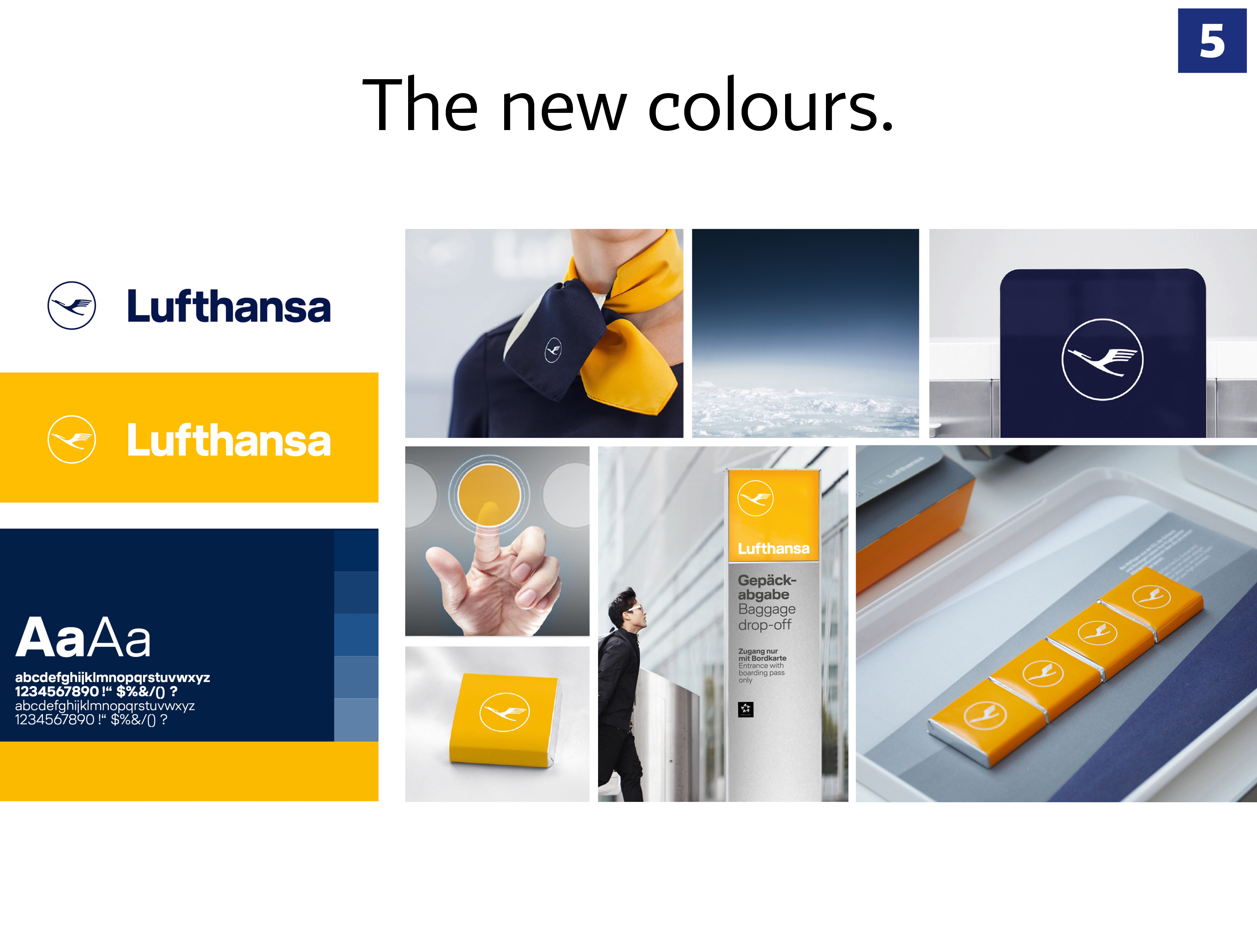
Christian Baun: The new blue is deeper and more premium, and is now the leading color of the brand. The color yellow plays a minor role, and I like that: In 1981 a discount-retailer (Netto) started up in Denmark and they chose yellow as their brand color. Since then the color yellow has become the code for discount in Denmark.
Claudia Eustergerling: Die gelbe Farbe ist nicht weg, sie ist Signalfarbe. Das ist konsequentes Design im Sinne von Form follows function. Hier ist die Farbe nicht nur dekorativ, sondern hat eine Funktion. Ihr Einsatz ist gut überlegt. Sie hebt Elemente hervor, weisst auf etwa hin, ist Blickfang. Die Farbe ist meines Erachtes viel stärker im Markenauftritt und gar nicht abwesend, wie schnell behauptet.
Sophia Georgopoulou: I like the colour palette. If it is used correctly (blue on white and white on yellow and not like before — blue on yellow) the result is more fresh, modern and premium.
Pim Nap: The new colour and typography both origin from and propel Lufthansa‘s heritage in aviation.
Source: Lufthansa.
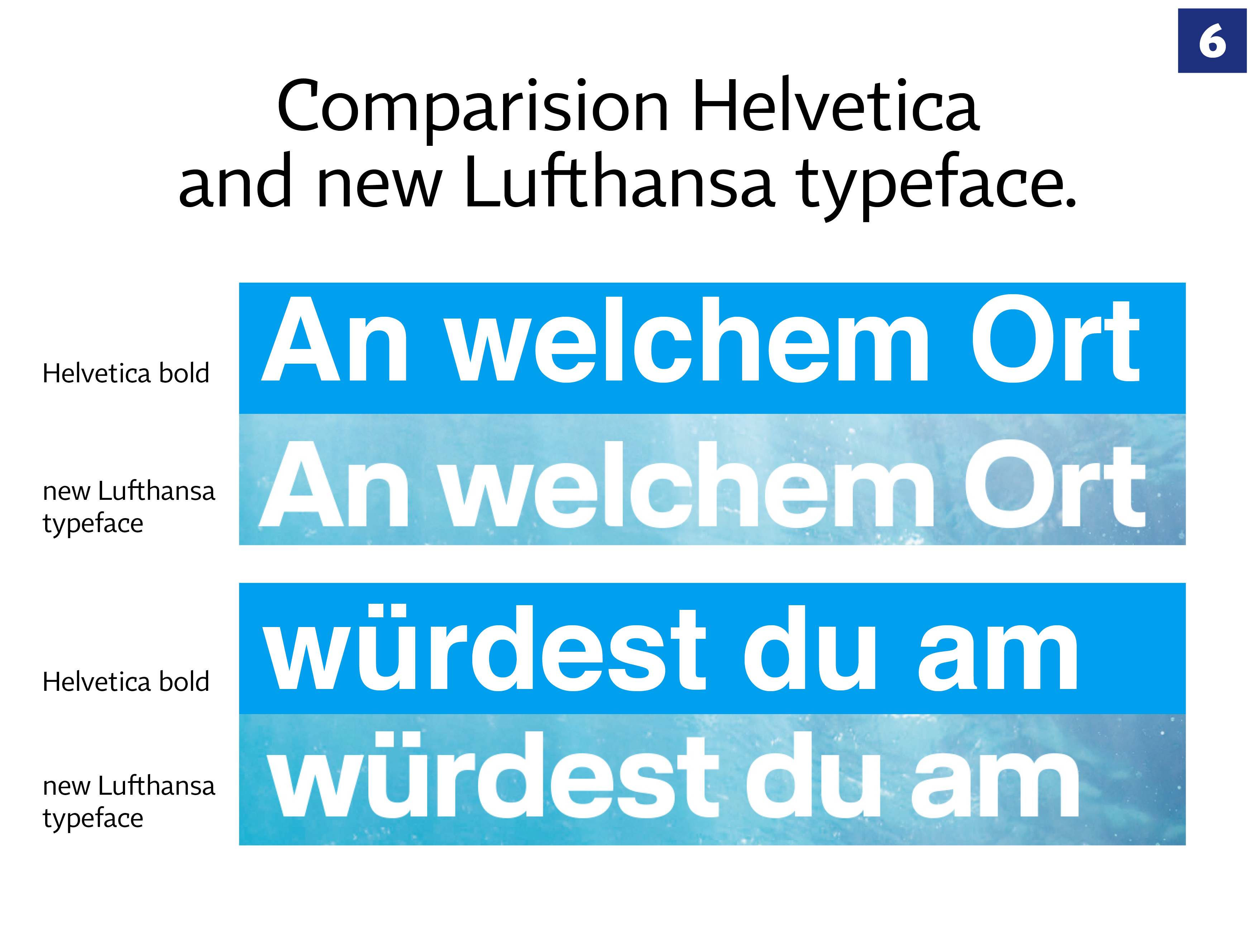
Christian Baun: For me the redesign of the typography is only to increase functionality online. I think its right to keep the same font. I like the font to be neutral — so that the symbol can shine with its personality.
Claudia Eustergerling: Die neue Schrift gleicht der bisherigen Helvetica, ist aber besser. Die neue Schrift wurde auf Basis der Helvetica bold entwickelt und optimiert. Alles in allem wirkt die Schrift eigen und damit besser wiedererkennbar. Sie ist stabiler und wirkt aufgrund der Gradlinigkeit moderner. Mich wundert, dass die Öffnung beim kleinen „e“ nicht vergrößert wurde, die meiner Erfahrung nach bei vielen Anwendung zuläuft. Leider unterschätzen Kunden die Wirkung einer eigenen Schrift — und auch die der Summe der Details.
Rodrigo Faustino: The new wordmark, it‘s a great right decision with the finest evolution of the old typeface (God bless Helvetica), nice fixed with the new proportions, spacing and T and F letters curves.
Sophia Georgopoulou: Font wise I don’t see much difference than before.
Conclusion:
Rodrigo Faustino: So, at the end of the day, it seems meticulous well-done project of corporate identity, I have to agree about the method, the execution and the hard work to make all this stuff consistent. But for me it‘s not just all about the project itself, I supposed that one of the legendary classics of German design, now makes the crane more lonely and the Lufthansa colder than ever, to be precise 75{13ce6d6cf9cb0a44521ccac5c1b2c9ac90fc2e6afc85aa198465174590f4233a} more blue breeze cold.
Pim Nap: Being given the chance to design for airlines, remains one of the toughest and most desirable challenges in the business, including both high risk and high pay-off. Nonetheless, the remaining questions are: is this a future-proof refresh? Do we choose evolution over revolution? And is this the Lufthansa for future travellers? “Why join the navy if you can be a pirate?” — Steve Jobs
Additional statements:
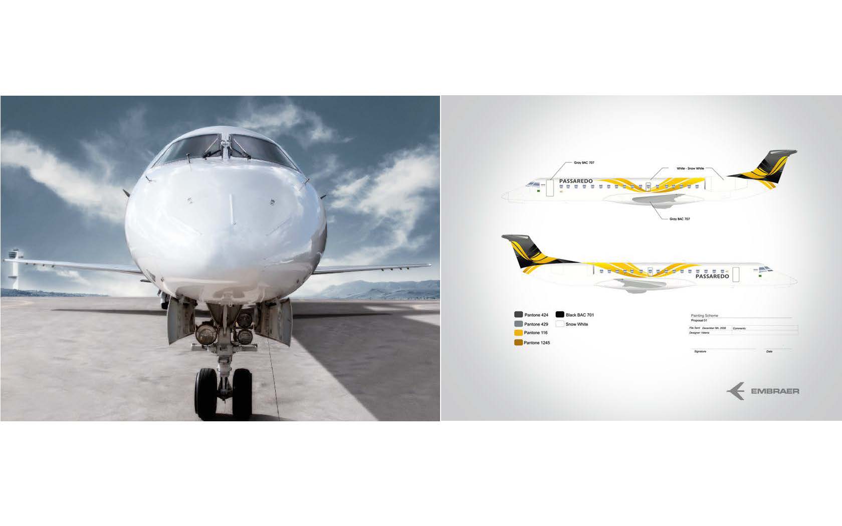
The Passaredo identity project from Commgroup Branding.
Rodrigo Faustino: The Lufthansa project remounts me when I worked for Passaredo new identity project with Commgroup Branding, Pass is a regional Brazilian airline, and the agreement of the redesign project was to make all the identity recognizable by the new color background, the yellow. In that time, and still now, the majority of the airline companies are red and blue. No one can distinguish inside the airport where is the right place to follow, that‘s a real concern when we talk about airports signage systems. In that case was very important to share a new balance of the color identity.

Left: transavia.com OLD corporate identity. Right: transavia.com NEW corporate identity. Studio Dumbar, The Netherlands.
Pim Nap: As a critical designer, I can‘t help and wonder whether there could have been more in it for Lufthansa? Is the new brand innovative enough? Is this a contemporary version of Lufthansa or the does it match the company‘s future? Could this have been Lufthansa‘s chance for a revolution? To illustrate my thinking, I would like to refer the refresh of Transavia, where in my opinion, more has been accomplished. Our (industry) colleagues from Studio Dumbar fully realised a forward-thinking refresh of Transavia. Moreover, they managed to understand what the future path of aviation might look like. The future of flying might look a lot more like taking the bus today.
About the designers:
Christian Baun, logodesign.dk, Denmark
Since I started my design business in 1993, I have designed logos for at least 250 companies. I have designed all the logos on my site alone and all is implemented in the respective companies. I was apprenticed as a commercial artist in 1987 and have enjoyed a diverse life as a graphic designer, art director and creative director for eg. Stampe & Stampe and Lysholm Advertising Agency where I have worked with branded products in the Nordic market. Website: www.logodesign.dk
Claudia Eustergerling, Eustergerling Sarl., Luxembourg
After getting her degree in design at the University of Applied Sciences in Aachen, Germany with specialisation in visual communication she gathers extensive on-the-ground experience. Before studying Claudia spends a year in an advertising agency. Later she turns various of her student projects into reality, such as an award winning cinemaspot which has been exported to Italy. Now she is concentrating on Claudia Eustergerling Design, focusing on the development of identities and brands with a strong interest in the process of co-creation, research and advance. Her team shares her customer-oriented holistic approach and accompanies interdisciplinary projects from start to implementation. Website: http://eustergerling.lu
Rodrigo Faustino, Commgroup, Brazil
Rodrigo Faustino is a Brazilian working with design as a creative entrepreneur, ethical and driven by the passion for innovation, fearless guardian of the purpose of brand statement into the corporate culture of companies. He ist Founder of Commgroup Branding, Director of Abedesign — Brazilian Design Association, Starting-Up the Festival Innovation by Design in Brazil, a content platform about design and innovation, Leading CSR initiatives — Sustainability Social Program #WeAreAmazonians for companies with commitment for a better world protecting The Amazon. Website: www.commgroup.com.br
Sophia Georgopoulou, Brand Identity Designer, Greece
Sophia Georgopoulou, who lives and works in Athens-Greece, is an expert in a series of design fields that include: corporate identity development, logo design, branding, visual communication, illustration & package design while her clients are both of Greek and international origin. Sophia’s benchmark is to create brands that have a reason of existence, that generate strong emotions to the targeted consumers while her definition of success is to see the brands she handles flourish and grow! Website: www.sophiag.com
Pim Nap, Studio Piraat, The Netherlands
Together with Fabian Meijer, Pim Nap founded Studio Pirate in The Hague in 2002. The agency now has 11 employees and Studio Piraat is no longer just a design studio. Pim Nap: “We have grown towards multidisciplinary agency in the field of design and communication.” Studio Piraat is a band of ambitious and talented creatives. Graphic designers, interactive designers and creative strategists. Mavericks who excel in simplicity, passion and fun; far from typical. Fast, agile and groundbreaking, but also down to earth and with an eye for detail, that binds us. Website: www.http://studiopiraat.nl
Contact:
Norbert Küpper
Office for Newspaper Design
Gutenbergstr. 4
40670 Meerbusch, Germany
Email: nkuepper@editorial-design.com
Phone: +49 2159 911615
If you have read the story up to this point, you are probably interested in a new facebook group about editorial design. Newspaper and magazine design and also Logos and stationery design are the themes. This group was just started.
https://www.facebook.com/groups/333596403813055/
