When I look at food packaging as a graphic designer, I am primarily concerned with legibility and functionality. I have compiled a series of packages here that can be used to see problems and solutions in packaging design. In general, one can say: there is a lot to be done, because many packages are not perfectly designed. In many cases, the rules for readability and functionality are not followed.
Logo typography
One could assume that the typography of packaging is neutral, factual and sober. But that would not be purposeful, because with the design of the lettering you can already make a lot of statements that users automatically take in without thinking about it. Three examples:
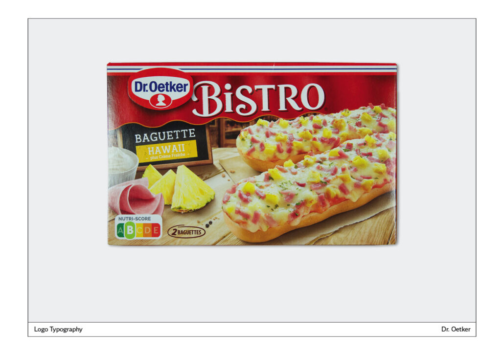
Dr. Oetker Bistro Baguettes
The lettering has been specially produced. No existing font is used here for the logo. The capital letters appear monumental, significant. They stand on a red background, which is recognisable as the awning of a shop because of the lower edge and the shading. You can also see something of the interior in the background, blurred. This also explains the sign on the left naming the type of baguette. The sign is practically in front of the shop. The name Bistro radiates the French flair that one associates with the name baguette. To take away some of the monumentality of the capital letters, they are loosened up a little. The B has larger arcs, the i is a lowercase letter and the S has a curved arc towards the bottom. All in all, a successful logo. The Dr. Oetker trademark is a little lost at the top. It could have been placed more cleverly.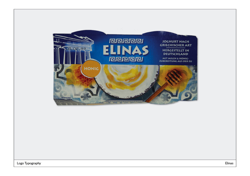
Elina’s yoghurt
This yoghurt is relatively new to the supermarket. One secret of its success could be its mild taste, which is probably achieved with a high fat and sugar content. The yoghurt with honey pictured here has 7.5 percent fat and 16.2 grams of sugar per 100 grams. This is not made a big issue on the package.
For the logo, a font is used that can also be seen in a similar form in Greek restaurants: a sans serif that dances a bit because the letters are not exactly at the same height next to each other. In addition, the A, for example, is cut off at an angle at the bottom left and right.
This also creates a Greek impression:
– an ornament above and below the lettering,
– white and blue like the buildings and sky in Greece,
– illustration of a temple,
– floor tiles with ornament,
– Yoghurt with honey, because this combination is hardly ever found in German yoghurts.
All in all, a very successful work, which is further supported by a well-designed website: www.elinas.eu.
The elements that can be seen on the packaging are also consistently used in the web design.
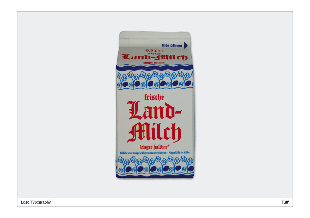
Tuffi Fresh Country Milk – Tuffi Frische Landmilch
The broken script used here stands for home and tradition. This typeface family is also used for many types of beer and, for example, for the herbal liqueur Jägermeister. At the top and bottom of the packaging is a border of blue flowers. This underlines the rural origin. The white background matches the milk and also stands for purity, cleanliness and hygiene.
It would have been enough to put the word “Landmilch” in the broken script. The words “Freshness” above it and “Longer shelf life” below it could also have been set in a sans serif font.
On the website of the manufacturer Tuffi you can find packaging where the reference to the homeland is made by names like Bauern Milch or Heimat Milch. Here, a handwritten font is used. https://www.tuffi.de/produkte/milch
Functionality
When it comes to functionality, these questions are in the foreground:
– Can the consumer recognise what is being offered?
– Is the name of the product and the illustration easily recognisable?
– Are there legible and functional instructions for preparation?
– Are charts and other information about the product designed in such a way that they can be read?
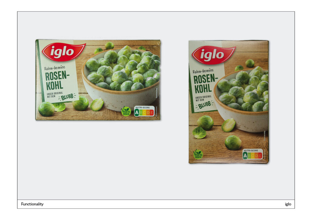
Iglo Brussels sprouts – Iglo Rosenkohl
A good solution all round, because you can see the product well, you can read the text, there is not too much text used. The “blubb” has been borrowed from spinach, but is also used correctly here. A very nice idea: you can put the pack in portrait or landscape format in the supermarket’s chiller cabinet, depending on the space available. A little tip: portrait format always looks more dynamic.
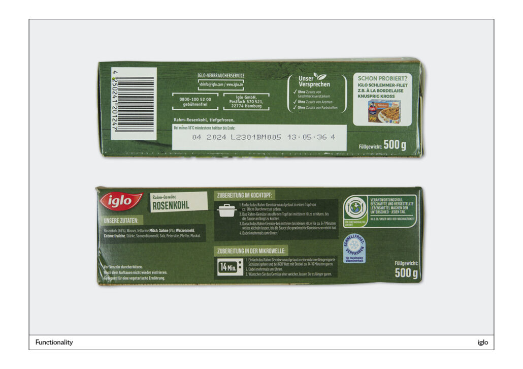
Iglo is a little weaker when it comes to service information. The following can be done better:
– Service phones: the brackets for visual structuring can be removed.
– Preparation instructions: A light font is placed negatively on a dark green background. Better: It should be legible, therefore black writing on a white background.
It is very good that the instructions are divided into cooking pot and microwave. The two icons also make sense. If there is a timing indication for the microwave, then there should be one for the saucepan as well.
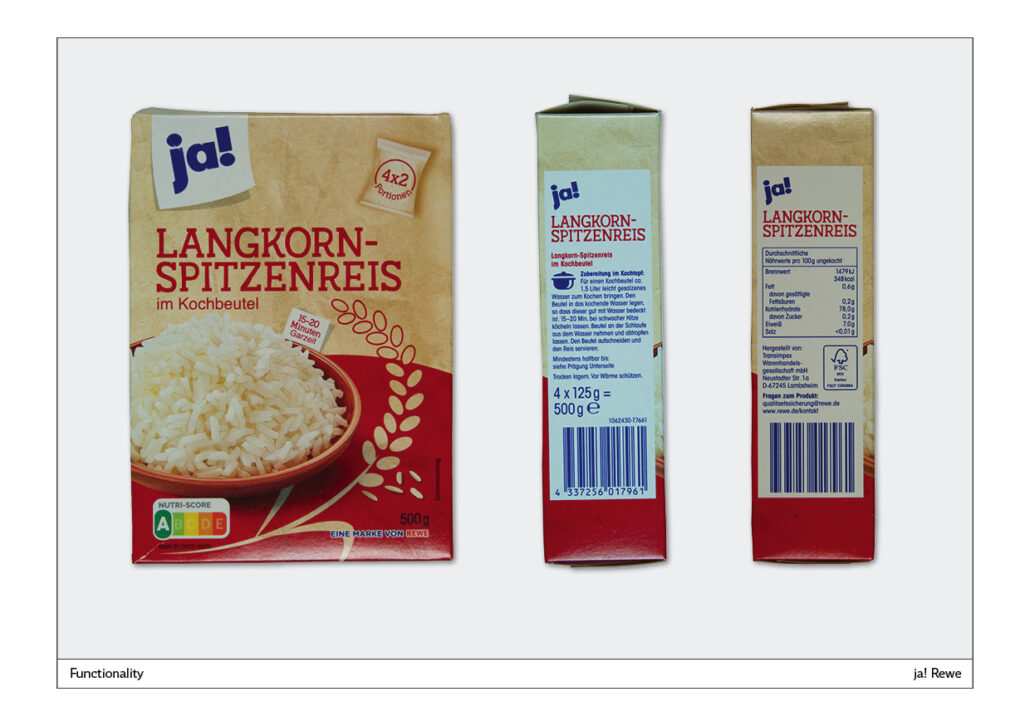
yes! Long grain top quality rice – ja! Langkorn Spitzenreis
The packaging is well done, because you can easily see that it is rice. The rice ear on a red background is a nice touch. The quantity indication on the top right is also good, because the consumer wants to know how many cooking bags are in the package. The text 4 x 2 is good, the much smaller text “portions” is of course disappointing, because there are a total of four cooking bags in the pack and not 4 x 2.
A serif font was used for the name Langkorn-Spitzenreis. Presumably, many of the label’s products are labelled like this. The font appears neutral, factual, without any further promotional references.
The ja! label is clearly visible at the top left. It stands for good value products.
Tip: Even short texts should not be written in capital letters, because they do not produce a recognisable external form. You can see that in this example: Langkorn or LANGKORN. Langkorn has a capital letter and two letters with ascenders or descenders. You already have a recognisable outer form that is easily recognisable.
Service information:
It’s good to have the logo and name repeated on the side.
The preparation information is also good. The length of 15 to 20 minutes could have been depicted like the cooking pot. The nutritional information is written in a condensed font. However, this is not easy to read and not necessary here, as there is enough space.
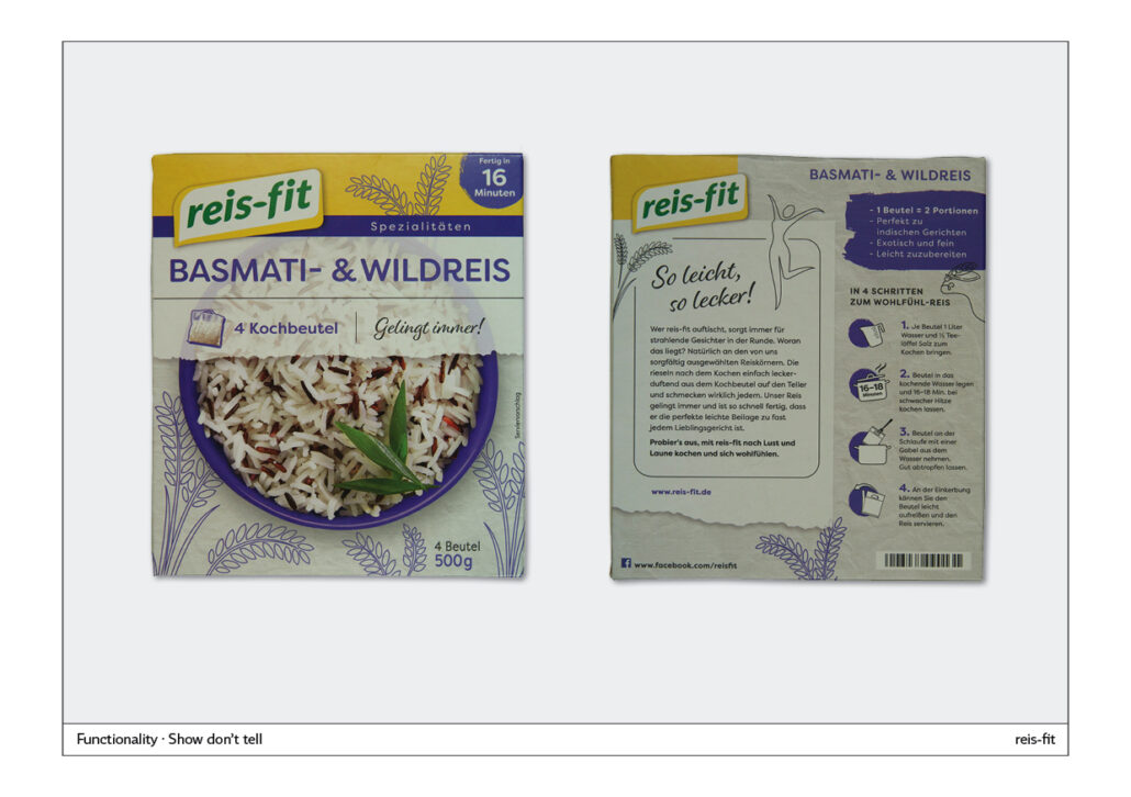
rice-fit – reis-fit
The front page has all the information you need to buy: Name of rice variety, number of cooking bags, preparation time. The picture shows the result. It is a bit strange that the photo is partly covered by the labelling.
The colour combination yellow-blue makes a good contrast and is not often found. It is both a cold-warm and light-dark contrast. The product is easily recognisable on the supermarket shelf. The reis-fit logo is well placed, the size is right and it is easy to read.
The illustrated rice ears have a loosening effect and create a healthy, natural impression.
On the back, the yellow ribbon is picked up at the top. It should have been kept across the entire width.
A lot of space is taken up by a text addressing the buyer. You will only read it if you have a lot of time.
Preparation: On the right, the four steps are listed that lead to feel-good rice. Illustrations and texts complement each other. Functional and easy-to-read instructions.
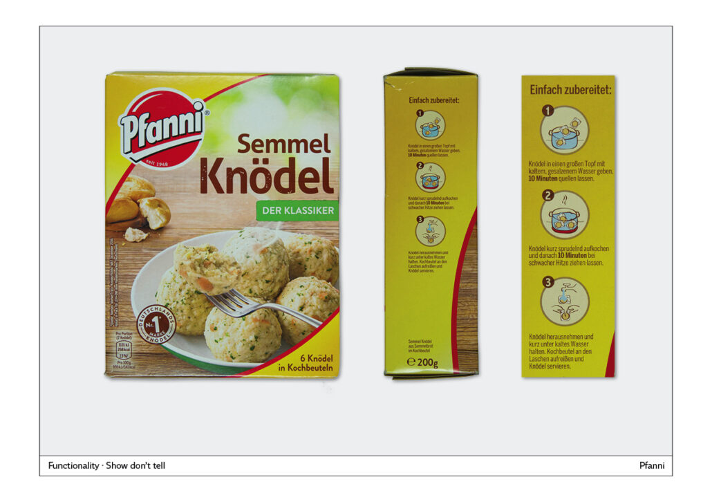
Pfanni bread dumplings – Pfanni Semmel-Knödel
Pfanni bread dumplings are classics through and through. The logo is as round as a dumpling and the red colour makes it easy to see on the pack. The front is good, the only question is whether you need the bread rolls in the background on the left. The font for the subheading “The Classic” doesn’t really match the font for bread dumplings.
The service information is very well presented, because the motto here is: show, don’t tell. This means that illustrations or photographs are used and explanatory text is dispensed with or, as in this case, the text is supported with appropriate illustrations. The preparation is clearly divided into three sections. Each section has a number and an illustration. In addition, the procedure is explained in text blocks. The only problem with the details is that the font is condensed and therefore not as legible as a normal running font.
Functionality for plastic bag packaging
One important piece of basic information is usually ignored in the design process: Plastic bags are usually shiny. That’s why you often can’t read the text well. If other factors are added, important service and preparation information is unreadable. Factors that affect readability are: negative font on a dark background, text in capital letters, condensed font.
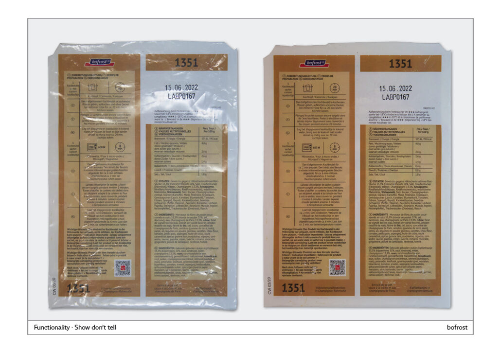
bofrost
On the left, one sees an original photo. This is how the user views the text on the shiny plastic bag. On the right, the light reflections are faded out.
Good: The preparation instructions are arranged in a table. Preparation in the cooking pot and in the microwave are explained with illustrations. The text is in three languages. The problem is handled well, because on the left before each text block is a small country label.
For the nutritional information, this clear structure is abandoned and the three languages are written directly behind each other. Better: Give each language its own line.
Readability: Black type on light beige is acceptable. Instead of a central axis in the table, it is better to left-justify the text.
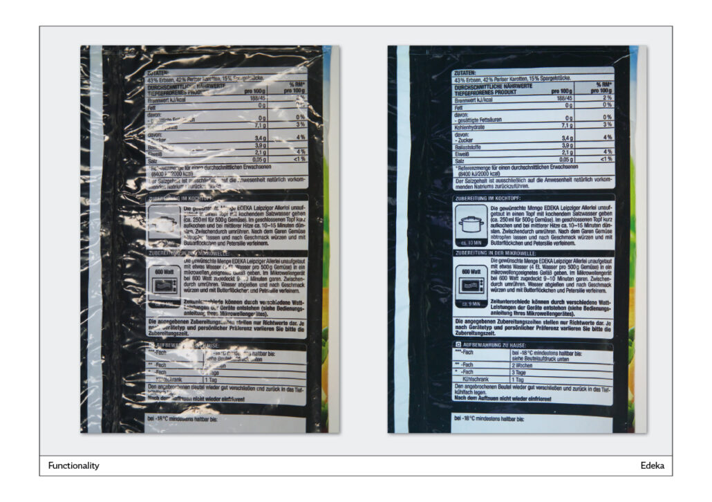
Edeka
It is always a good and obvious solution to set the text in a black font on a white background. In this example, the headings should also have been set in this way. You can see here very well how difficult it is to read the negative form of the headings in capital letters.
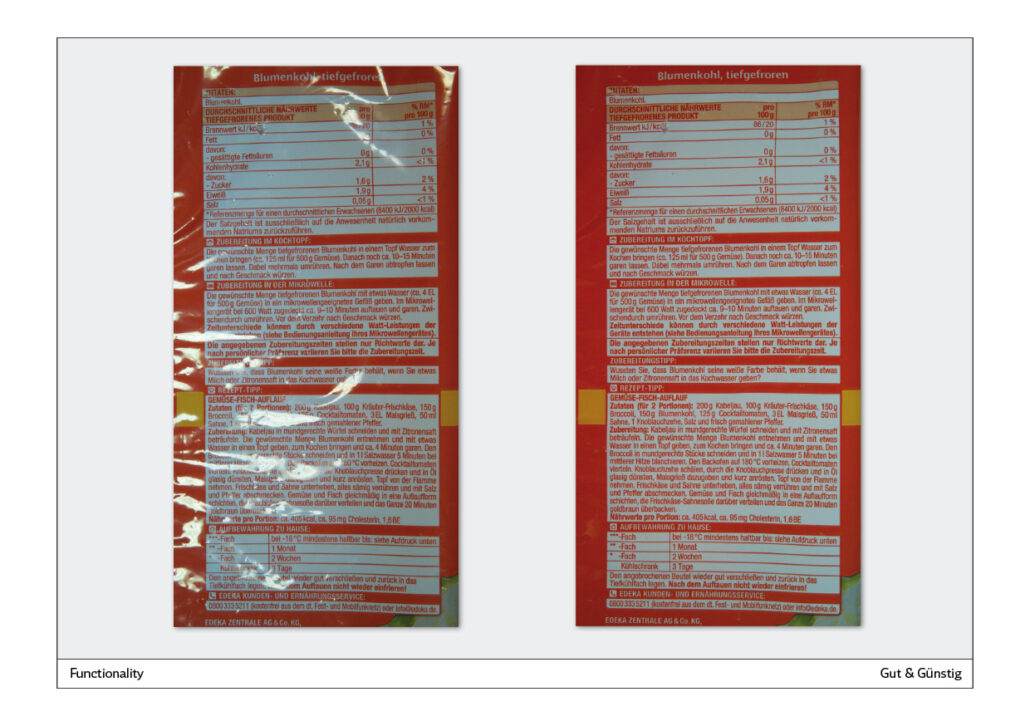
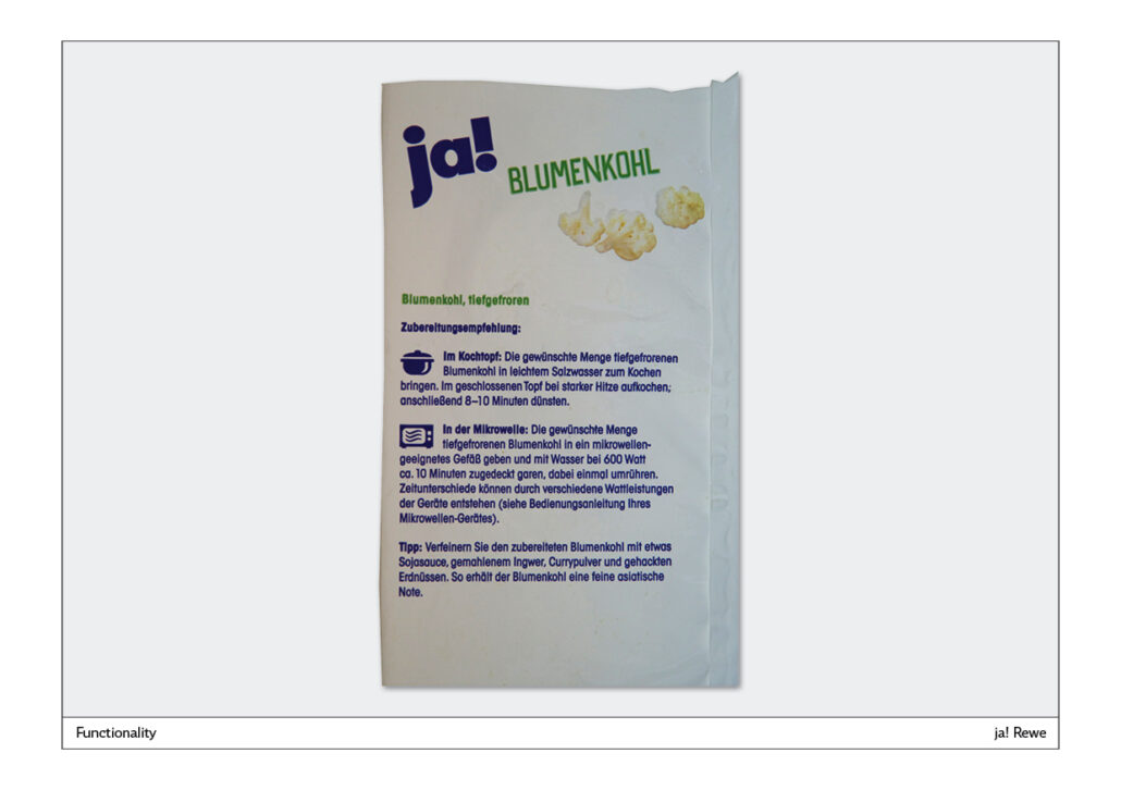
Edeka cauliflower, frozen – Edeka Blumenkohl, tiefgefroren
These are white blocks on an orange background. The text is clearly structured by the box-shaped underlays. In front of the headings in capital letters are small pictograms that are too small to be recognisable. Better: Print type in black.
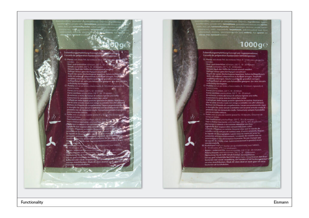
Eismann
Not good:
– White type on a dark background is almost illegible.
– Illustrations: A frying pan and a fan can be seen on the left. However, the assignment to a text is missing.
– The text is presented in four languages. The labelling of the respective language is too small.
– There are three preparation methods and some notes on hygiene for poultry. The necessary structure in the texts is missing.
Overall, very confusing and difficult to read.
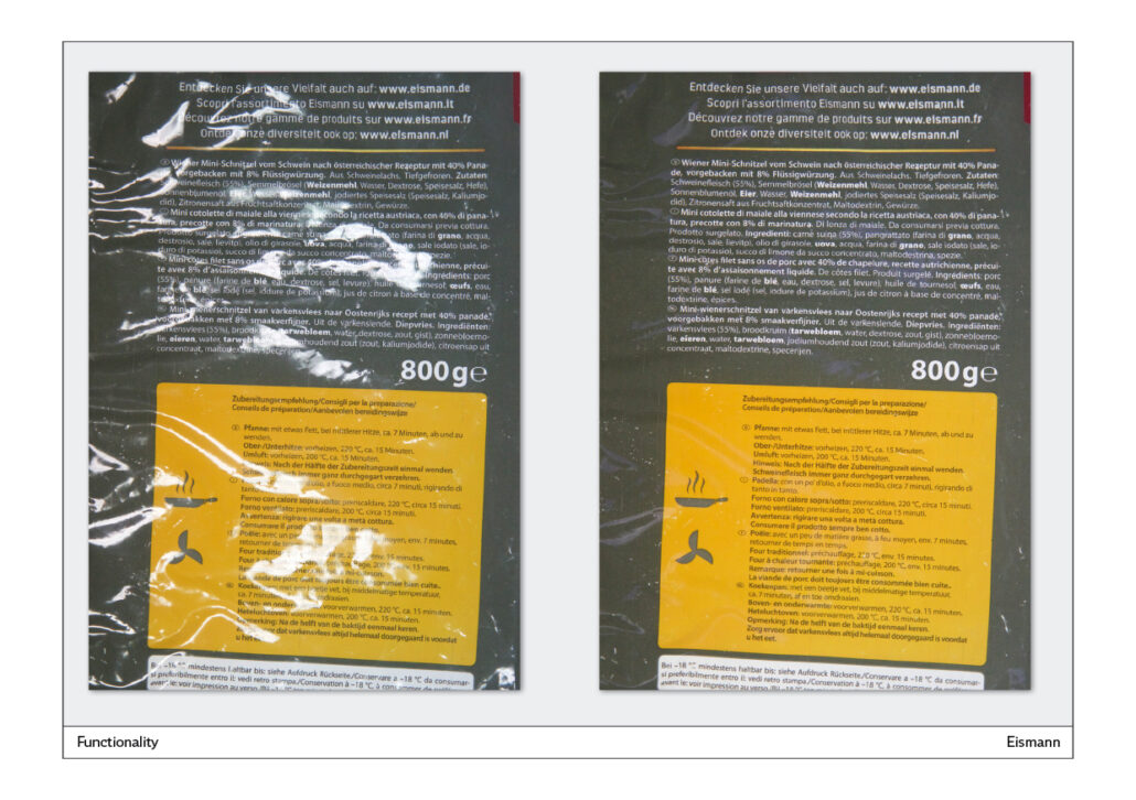
Eismann
The back of the pack is dark grey. It describes the contents in white writing at the top. There are four languages. The grey makes it look depressing and is very difficult to read.
Preparation instructions:
Black writing on a yellow background is easy to read.
The pan and the fan are also next to the text without being assigned. There are three preparation types and a hint in a total of four languages.
yes! Cauliflower – ja! Blumenkohl
It’s so simple: dark text on a white background is easy to read. The basic text is also easy to read here. Cooking pot and microwave are in the right places in the text.
Congratulations to ja! from Rewe!
Packaging relaunch
The redesign of a packaging is always a delicate matter. Even if everyone involved in a company agrees that the packaging needs to be renewed: End consumers are usually attached to the previous design and often react very negatively to major changes. The trick is to proceed step by step and work on the design until you have reached your goal. This can take several stages.
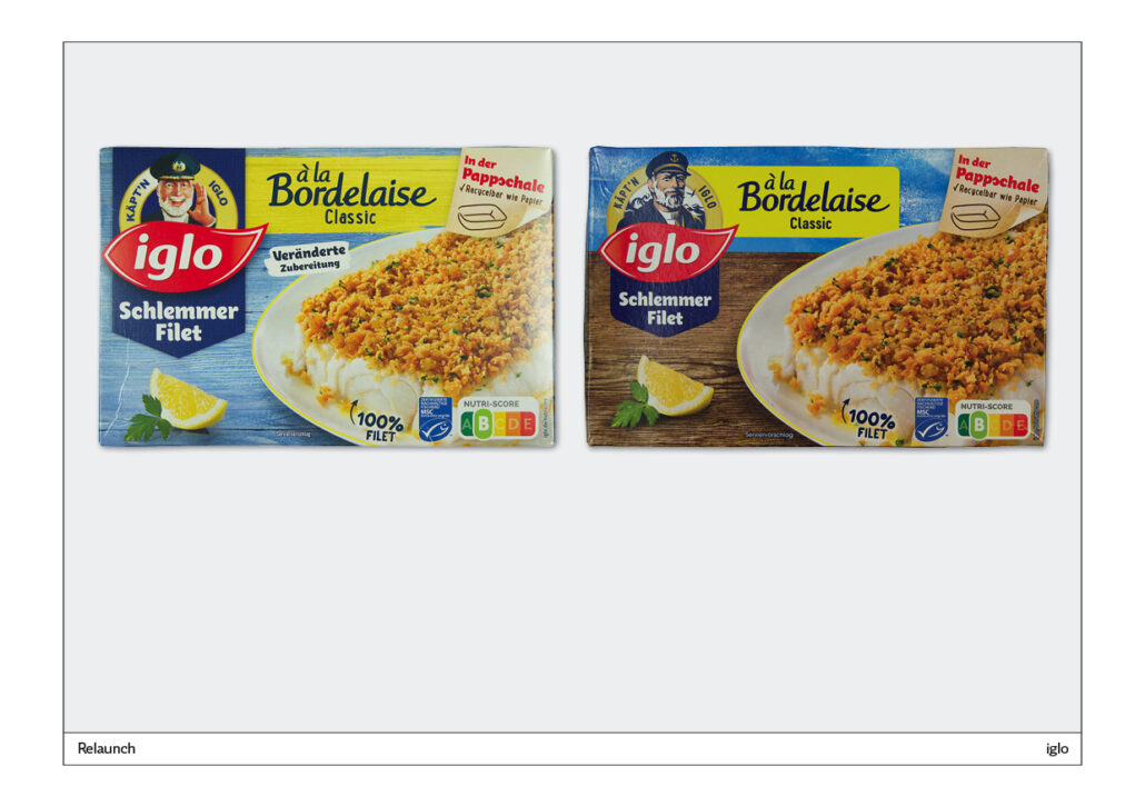
iglo Schlemmerfilet
In this relaunch, Käpt’n Iglo was freshened up. The Iglo logo and the text have been made slightly smaller. Otherwise, the packaging has not been touched. Good solution.
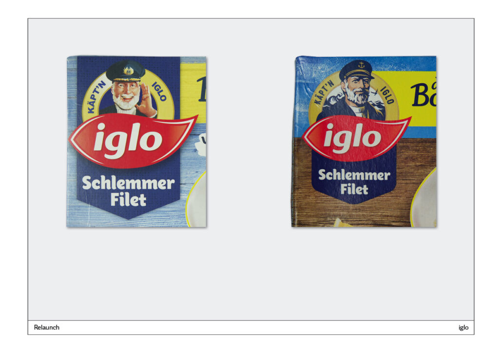
Käpt’n Iglo: From Icon to Storytelling
What happened to Captain Iglo? On the left you see the original. A nice older gentleman with a white turtleneck jumper. In the reworking, the captain has become much younger. He has a wilder beard and in the background you can see the moving sea and a sea bird. This captain is obviously catching fish in the open sea. As you can see, this is how an icon becomes a story.
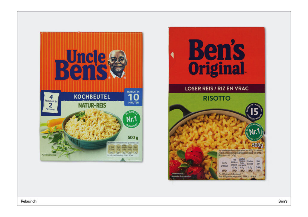
From Uncle Ben’s to Ben’s Original
At some point, Uncle Ben was no longer viable. He was apparently a remnant of slavery. That’s why it was removed completely. At the same time, the packaging as a whole was redesigned. On the old packaging it is an orange area with vertical yellow stripes. In the new design, it is only an orange surface. The packaging has been simplified, but the stripes were already a good way to distinguish it from other products: a unique selling point.
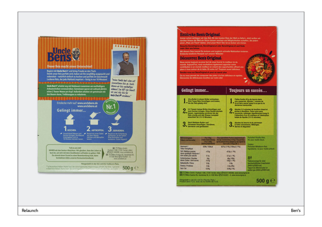
Ben’s back page
On the previous back cover, the three steps of preparation were visually supported: Cook, Drain, Serve – these steps are illustrated and additionally described in the text. In the new design, only the numbers are highlighted. With illustrations, the text would have been easier to understand.
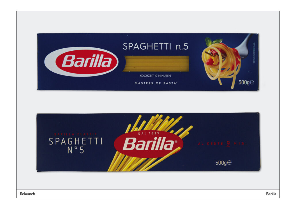
Barilla
The famous pasta brand is making changes in small steps. Before the redesign, each pack had a window. The customer could see exactly which type of pasta was in the pack. In the redesign, this service is eliminated. Customers who don’t know the brand are at a loss when it comes to choosing.
The new pack shows the logo underlaid with noodles that stick out of nowhere. One even stands in front of the logo, creating an interesting three-D effect.
What you can’t see: The new pack has red writing on a dark blue background. Badly legible. The scientific term is: lack of figure-ground differentiation.
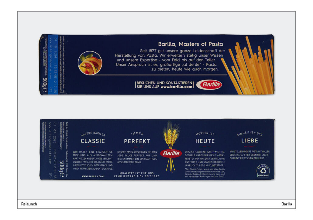
Backside Barilla
In the older form, a long-winded advertising slogan is presented. In the new design, four blocks of text are presented, each with its own headline. In the middle are bundled ears of corn. A reference to an important component of Barilla pasta: Durum wheat. One of the text blocks explains why the plastic window was removed: 126,000 KG of plastic are saved each year.
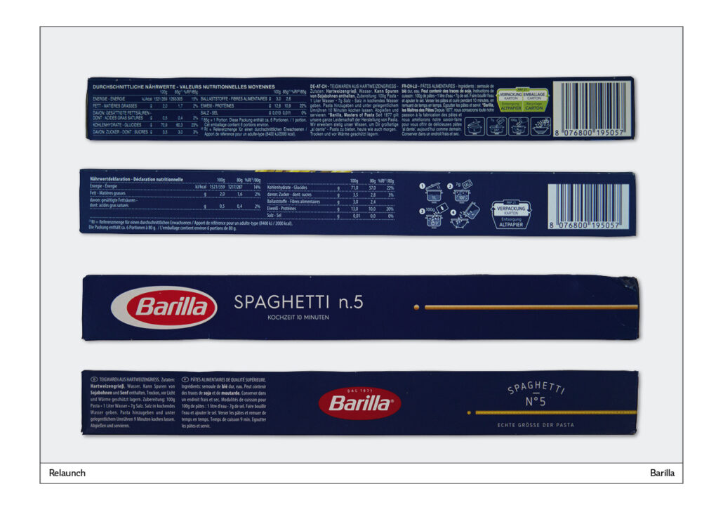
Small sides of the Barilla pack
On the two sides shown above, an attempt is made to describe the preparation with illustrations. In the older example, the illustrations are too small. In the redesigned version, the illustrations are also too small and you don’t understand what you are supposed to do.
There is obviously a cooking pot next to the four small illustrations. But it is only a graphic that is supposed to show that you should recycle the packaging. Here, a simple note that the empty cardboard box belongs in the waste paper would have made more sense.
The other side of the packaging shows a line on the right with a dot in front of it. With the older version, it is clear to the consumer that this noodle is not hollow. On the new version, it says underneath: Real size pasta. This is an attempt to make up for the loss of the plastic window.
The oval logo was easier to see in the old version because the white background made it stand out better from the background.
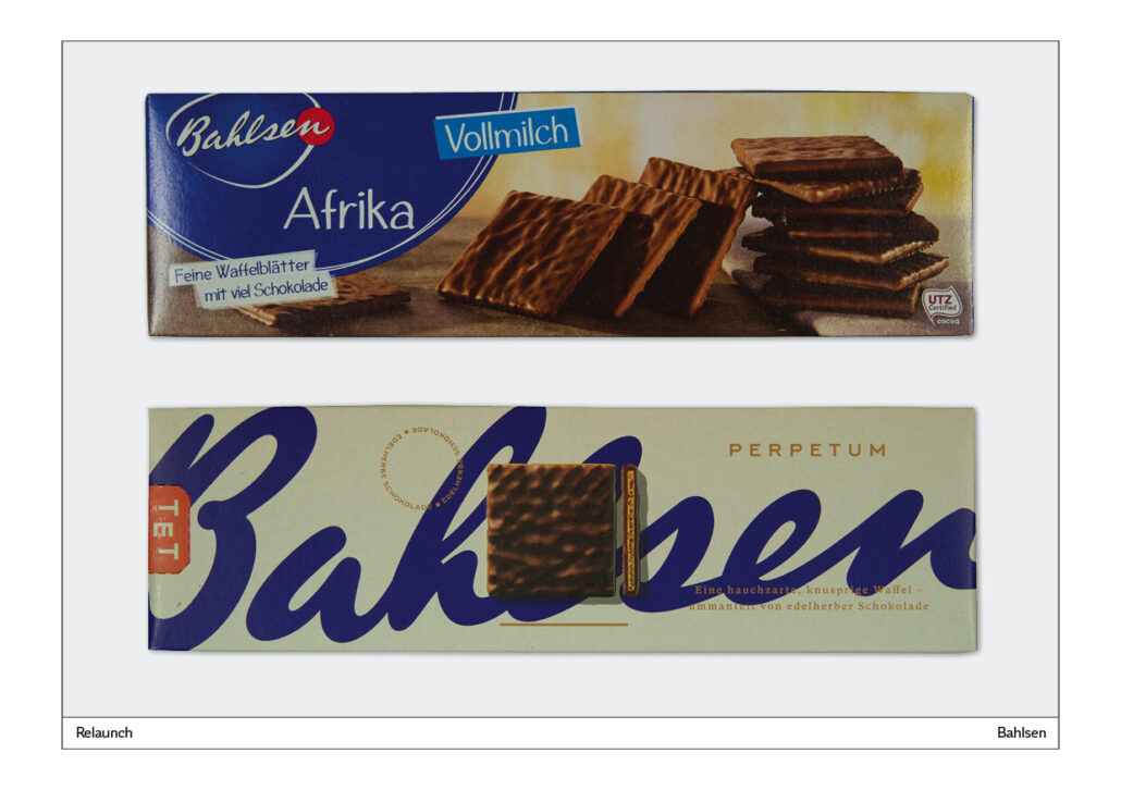
Bahlsen
This biscuit manufacturer underwent a major redesign. The biscuits remained the same, but some things were changed on the packs.
The large lettering in the background is particularly striking. It is used as a decorative element that is very eye-catching on the supermarket shelf due to the repetition of the packs standing next to each other. No other biscuit packaging looks like this. The white background is also very good because the packs stand out very well against the background and are clearly visible.
The TET freshness seal on the left is also an interesting element, but it has only been printed on and does not really function as a seal.
It is obvious to show the biscuits in the respective pack on the outside as well, but it is not a distinctive idea. The competition makes similar biscuits and similar photos. The image of a single biscuit in the middle is already innovative and distinctive.
Typography: On the left above the biscuit is a text in a circle. A game that the consumer will not play. In the circle is written twice: Edelherbe Schokolade. Better: Place this notice horizontally and legibly.
The description “Fine wafer sheets with lots of chocolate” in the original made perfect sense to customers who do not know the product.
The redesign of the Bahlsen packaging is successful overall, but there are detail problems, such as text in the round set or superfluous elements that are not easy to read.
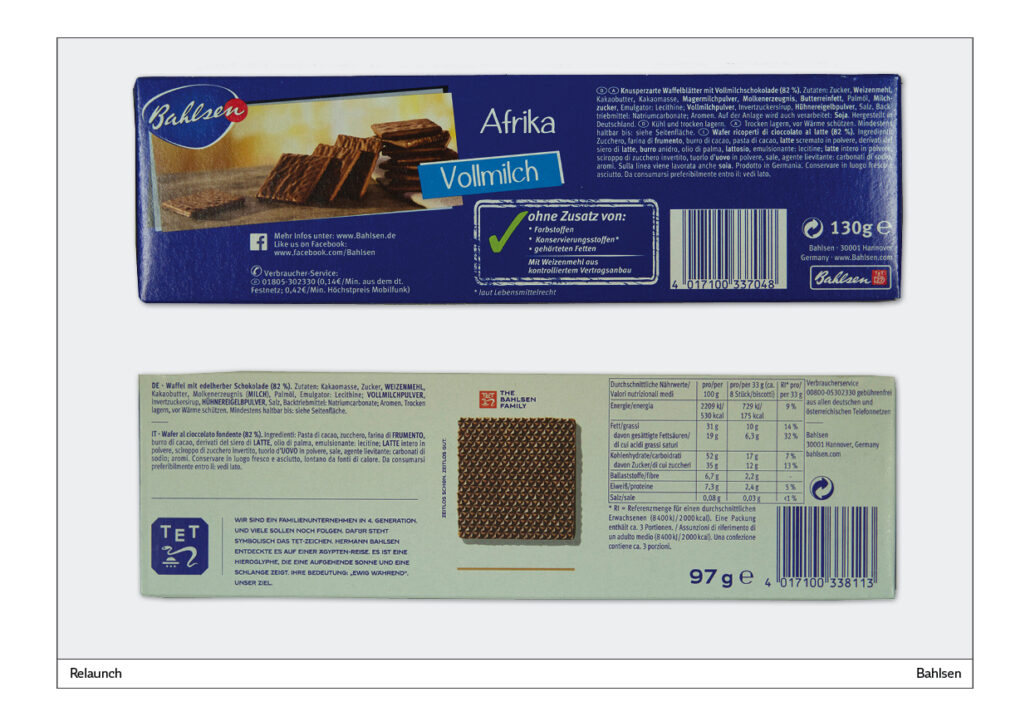
Back side Bahlsen
The white background makes the text easy to read. Here you can see the back of the biscuit in the middle, which is shown on the front. Good idea.
Gag on the side: In the course of the redesign, the content of this biscuit variety was reduced from 130 to 97 grams. Surely a contribution to the weight reduction of the buyers. Hopefully they are grateful for this service!
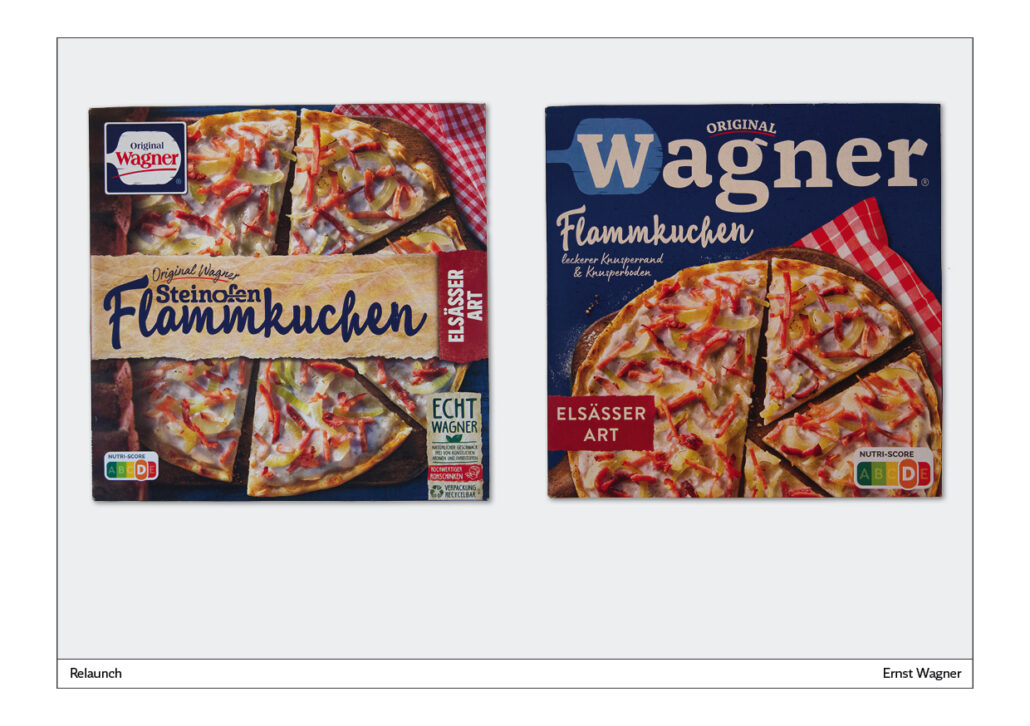
Wagner tarte flambée – Wagner Flammkuchen
In the old version, the logo was placed relatively small at the top left. In the new design, the Wagner lettering runs across the full width of the pack. The serif font emphasises that these products are hearty, nutritious, down-to-earth. The pizza slider seems to be an important feature of the company, as it is also used in the redesign.
In the old version, the variety is placed on an upright position on the right; in the new one it is placed more legibly horizontally on the left. Texts should not be placed vertically because this impairs legibility.
The photo of the tarte flambée is better recognisable in the new design because it is not divided into two parts by a text.
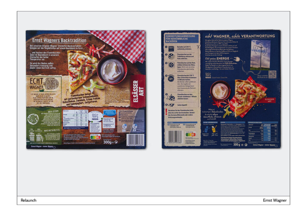
Back side Wagner tarte flambée
With the older version, the back page looks as if updates and additions have been made over and over again. A revision was urgently needed.
The redesigned back page is better structured. The preparation instructions are numbered. The text is supported by illustrations. The writing is easy to read on the light background. “Preparation instructions” sounds very bureaucratic. “Instructions for preparation” sounds a bit friendlier.
The redesigned back cover also has some problems. It still looks cluttered and there is a lot of text presented in white on a dark blue background. The dancing dustbins at the bottom show approaches for the next redesign. Rule: Never put text negatively on a dark background.
Packaging trends
More and more and bigger supermarkets are being built. This also means that there is more space for new products. Well-known companies are fanning out their product range and creating more and more new variants. But there are also start-ups that are trying their luck with innovative products on the supermarket shelf.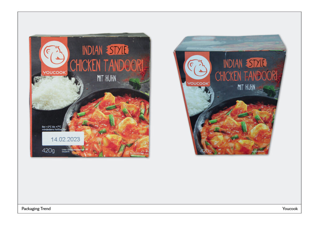
Youcook
Youcook’s ready meals are on the refrigerated shelf and stand out because of their unusually shaped packaging. It is square and tapers towards the bottom.
The packaging is innovative, but the design is conventional, as the photographs and typography can be found in a similar way on many other products.
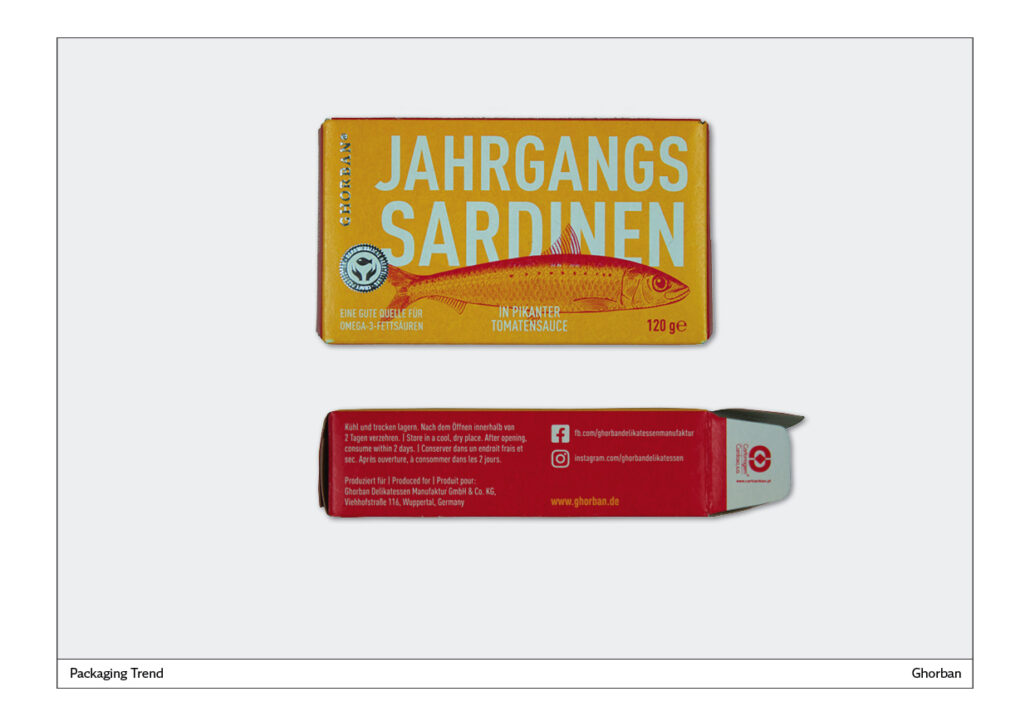
Year sardines
It is a small tin box of sardines for the Ghorban company, perfectly packaged here. A sardine is shown as an illustration. The illustration partially covers the text. The legibility is nevertheless preserved. Very valuable, expensive overall impression, which is achieved by reducing it to the essentials. The metallic embossing of the company name is not convincing because the effect is hardly noticeable because the logo is shown too small. Better: use metallic embossing over a larger area.
Eismann
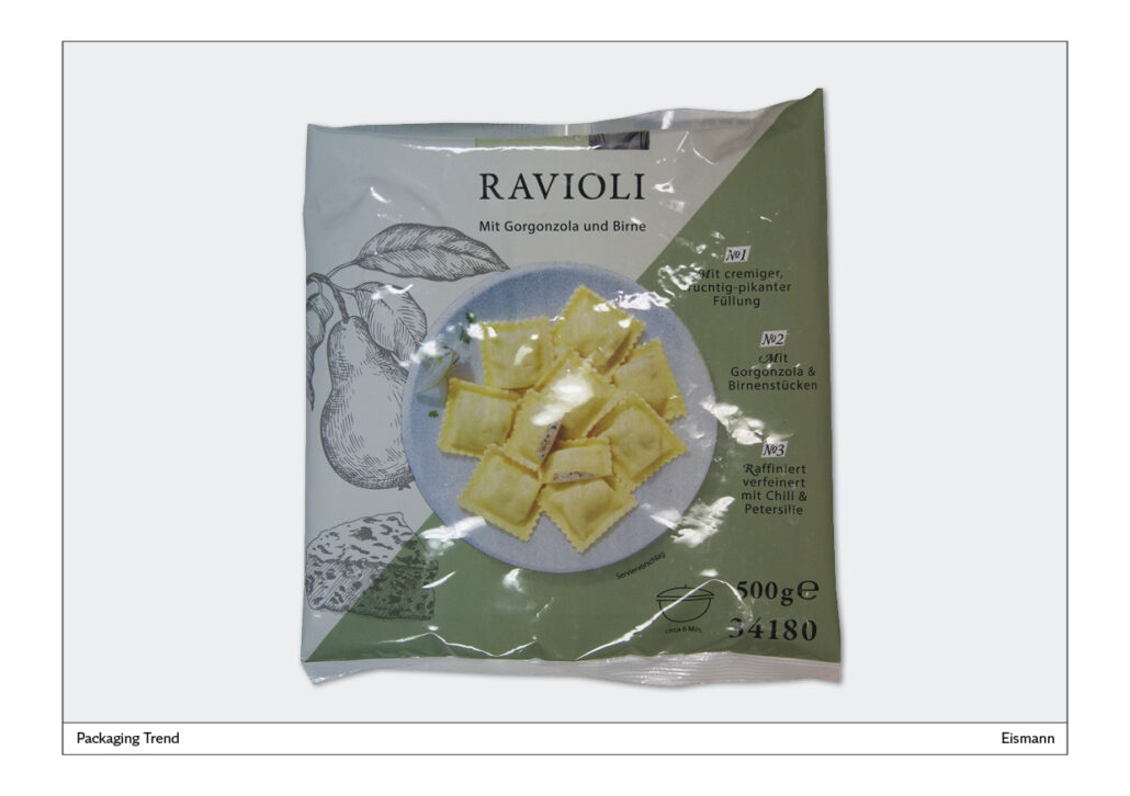
The packaging for ravioli is very innovative, because normally one expects a rather cheap mass product in a bag. Here, a much more expensive segment is targeted, which is made clear by the design.
The ravioli are photographed from above. The photo is surrounded by illustrations that depict the ingredients used, gorgonzola and pear, in an idealised way. All in all, a very innovative packaging design. The Eismann company obviously wants to move away from the mass market towards exclusive frozen products that are not in every supermarket refrigerator compartment.
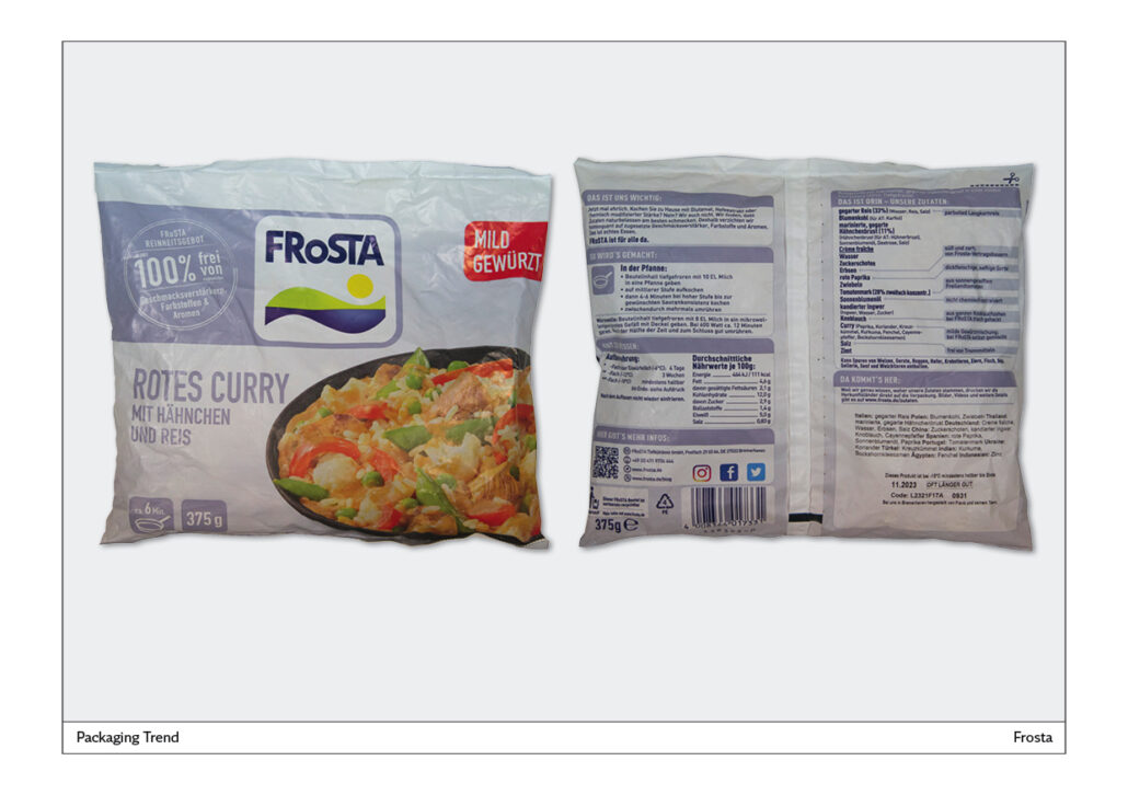
Frosta
This company does some things very well:
The packaging is white. This makes it stand out positively in the refrigerated section.
The packaging is matt. This makes the text much easier to read than with glossy foil packaging.
The front is very clearly laid out. The photo shows what is in the pack. The text does not contain any unnecessary information. “Less is more” – this old wisdom is perfectly implemented here.
Frosta back page
There is a lot of information, but it is presented very clearly for the consumer through clearly structured text blocks.
All in all: the food industry is on the move and packaging innovations go hand in hand with this. A wide field for packaging design is opening up and there are many opportunities to improve existing products and create new packaging for ever new products. Good luck with that!
Readability checklist
– Black text on a white background is easy to read. Therefore, avoid white text on a dark background.
– Texts in capital letters are difficult to read because all words look the same and are therefore difficult to distinguish. Therefore, always set text in upper and lower case.
– Text is horizontal and is read from left to right. Therefore, text should not be set at an angle or even vertically.
– Fonts that are normal width are easy to read. Therefore, you should not use condensed or wide fonts. Condensed fonts in particular reduce legibility.
– Use handwritten fonts only for individual words, because longer texts in these fonts cannot be read well.
– Avoid long, unstructured blocks of text, because packaging usually contains only brief explanations or instructions for preparation.
– Whenever possible, structure texts with paragraphs and/or bulleted lists.
– In many cases, illustrations can supplement a text or even replace it completely. The motto is “show don’t tell”.
About the author
Norbert Küpper is an editorial designer and reading researcher. He studied visual communication at the Düsseldorf University of Applied Sciences. After graduating, he held a lectureship in typography there. He has redesigned more than 180 newspapers and conducted several eye-tracking studies to research how newspapers are used in print and online.
He has a blog called “Layouttipp”, which is about newspaper design. The column of the same name appeared in Medium magazine from 1989 to 2020. Now it is here:
https://editorial-design.com/de/layouttipp/
To report on his activities and experiences, he will also be invited to give lectures, for example in 2022 as a keynote speaker at the annual meeting of the SGKM – Swiss Society for Communication and Media Studies – with the topic “The visual and audiovisual turn in the age of screen media”.