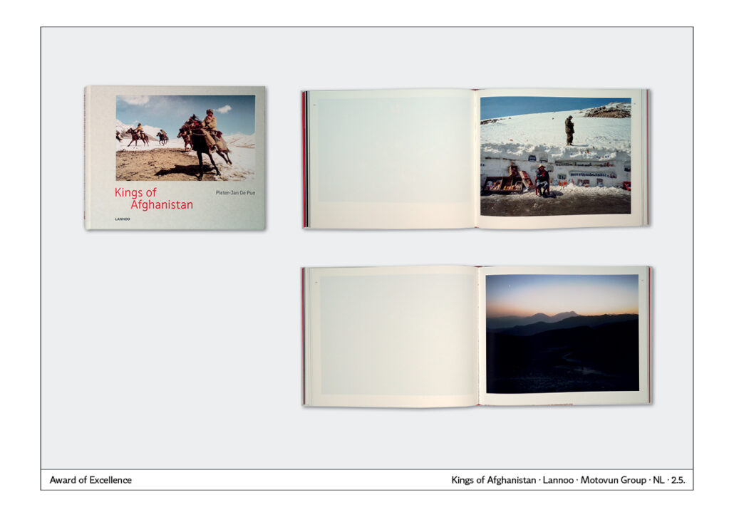
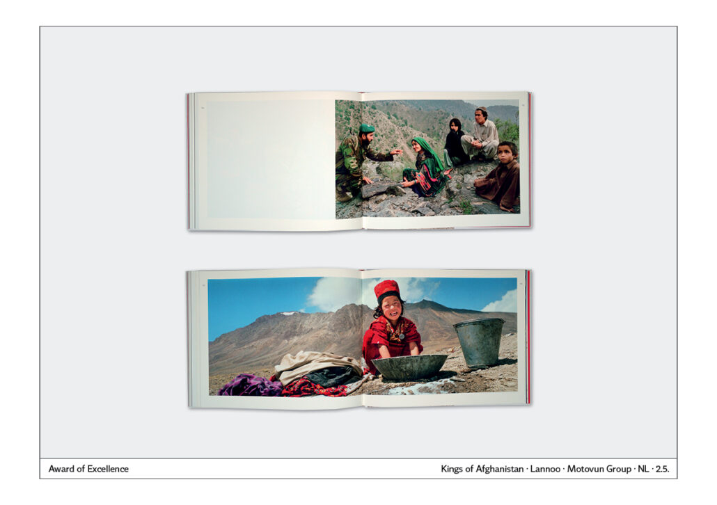
A book will not be successful solely because of the cover. It is always the combination of content, cover and the entire design of the book – paper, cover, typography, photography or illustration.
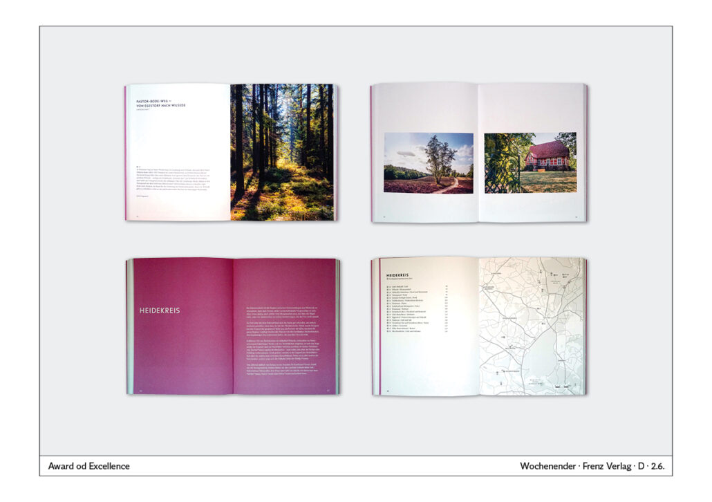
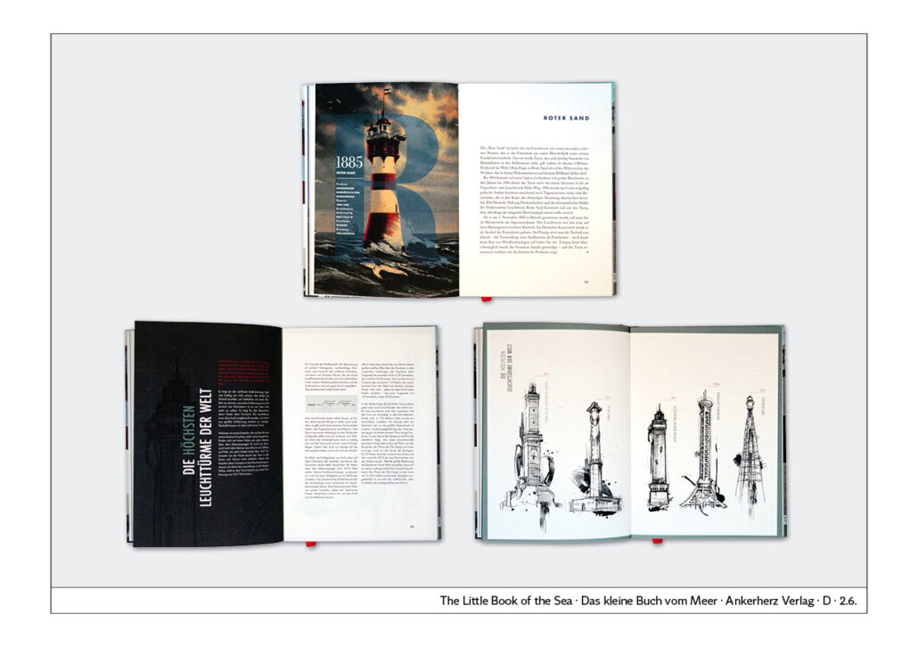
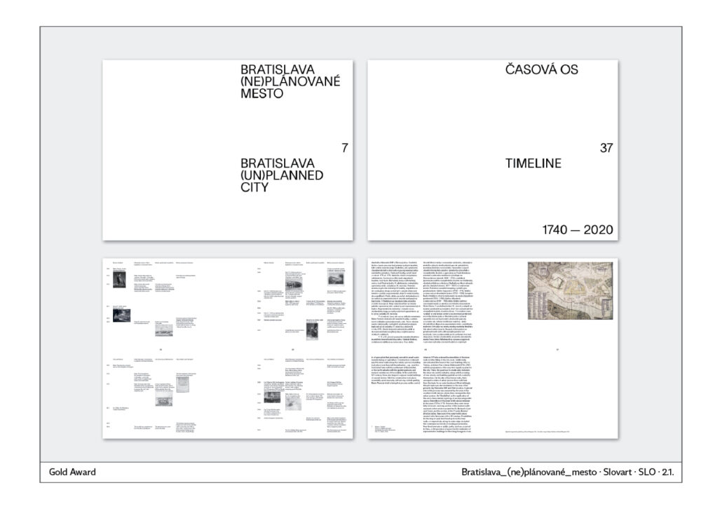
That is why not only the cover is shown here, but in many cases also the inside pages of an exemplary cover. Only then can you see how the cover and the interior work together.
The article is divided into six points: Eyecatcher, Visualisation, Book Series, Typography, Children’s Books and a Checklist.
Introduction
Functionality of book covers
Introduction
In 2022, I gave a presentation on book cover design at the summer meeting of the Motovun Group of International Publishers. The meeting took place in Montenegro. My article is based on this talk. It is divided into six points:
– Eyecatcher,
– visualisation,
– book series,
– typography,
– children’s books and a
– checklist.
A book will not be successful solely because of the cover. It is always the combination of the content, cover and the entire design of the book – paper, cover, typography, photography or illustration.
That is why not only the cover is shown here but in many cases also the inside pages of an exemplary cover. Only then can you see how the cover and the interior work together.
Functionality
Functionality
When judging book covers, I am all about functionality and readability. If the cover is functional, it will contribute greatly to its success.
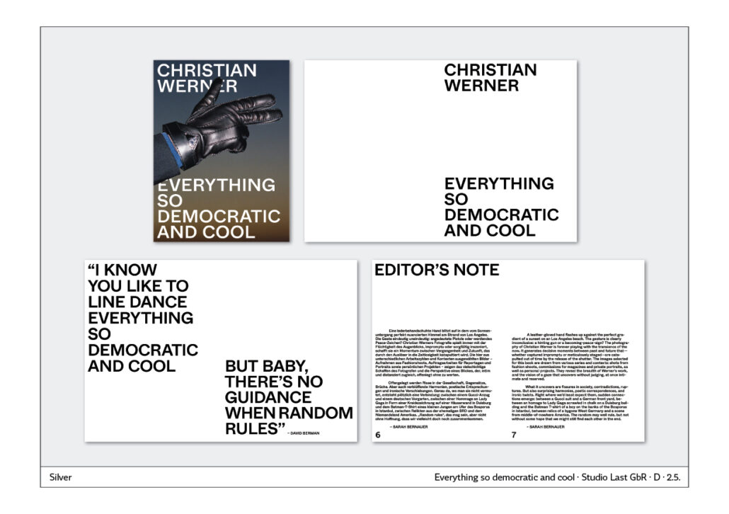
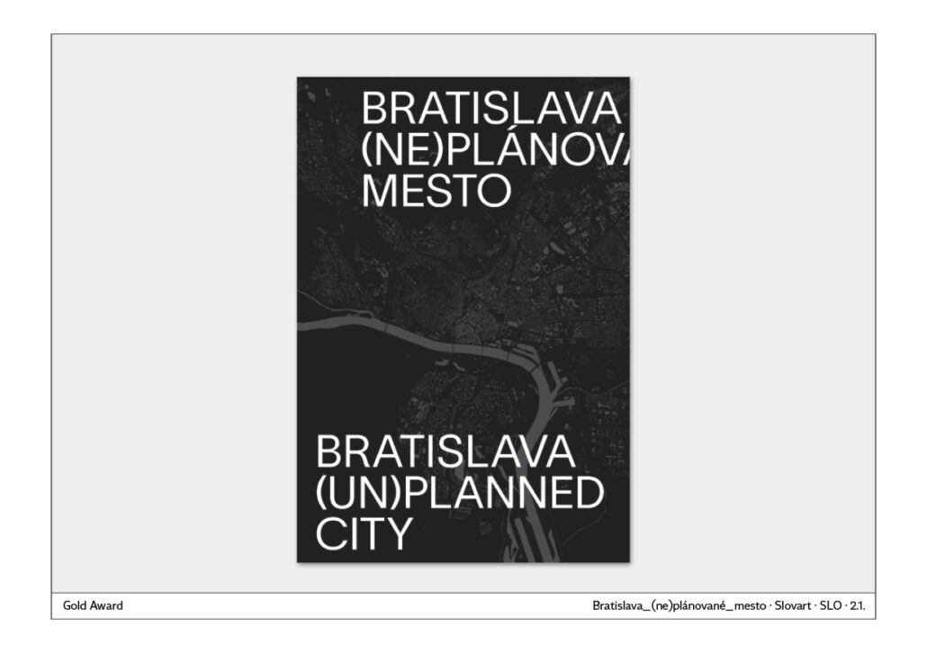
The cover gives the reader the first impression of the book. It must therefore function like a poster. The information in the illustration and text must complement each other and perfectly reflect the content. Reduction to the essential is therefore an important point.
The cover provides the first impression. That is why it must function like an eye-catcher. Eyecatchers are
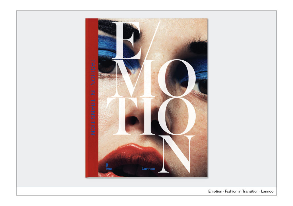
– faces
– action
– colour
– perspective
– Image editing
Cover has to work in all media
When designing the cover, you should place different design variants next to each other in a reduced form. The cover that remains legible and recognisable at only about 3 to 5 cm in size is a good choice, because it will also work for online orders, in social media and on smartphones. The cover must therefore not only be easily recognisable in the shop window or in the bookshop, it must be suitable for all conceivable media.
With these tools you create eye-catchers:
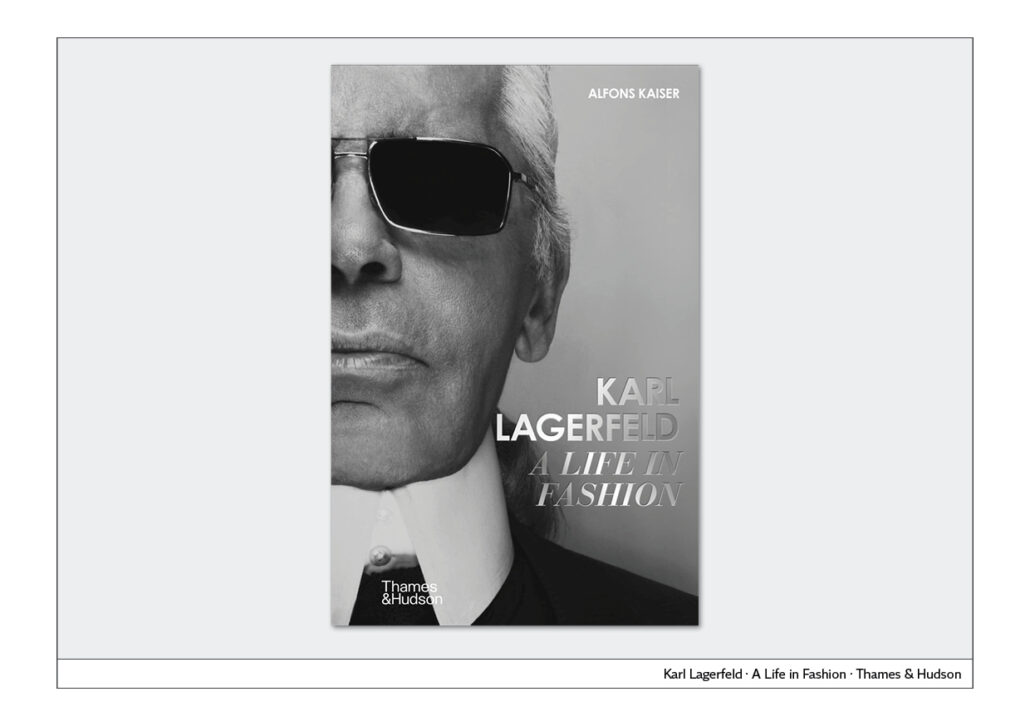
– Faces
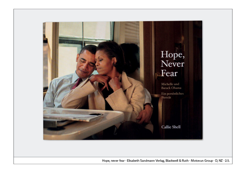
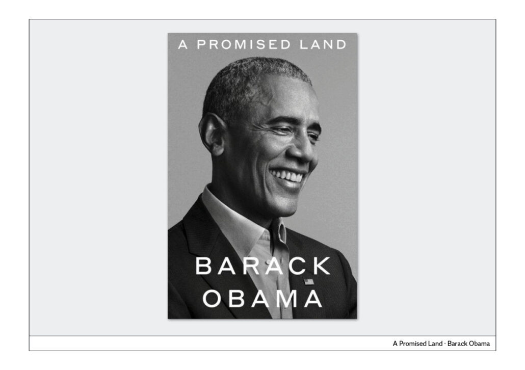
Faces of people or animals are always more noticed than landscapes or objects. That is why it is good to depict one or more people.
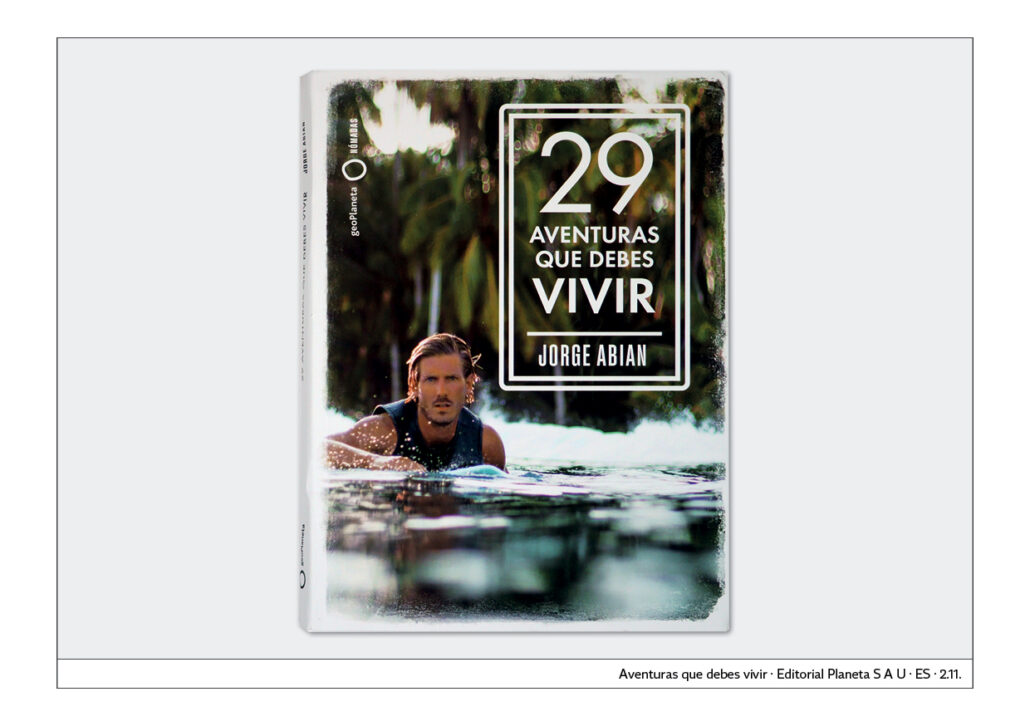
– Action
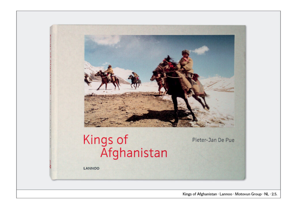
Motifs with movement, dynamics – action – always attract more attention than still, static pictures. Diagonals in the picture also create tension and attract attention.
– Colour
Red is undoubtedly the most striking colour. Yellow and orange are likely to have a similar effect. A cover in red stands out more than one in green, blue or purple.
– Perspective
A bird’s-eye or frog’s-eye view is always more interesting, more striking than a normal perspective. Therefore, if in doubt, choose the more unusual perspective for the cover.
– Cropping
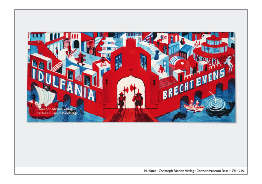
Heavy cropping of an image increases the possibilities of being seen. In particular, heavily cropped shots of portraits make very good eye-catchers. Image cropping can also make otherwise rather quiet subjects much more attractive. In Idelaflall, striking image editing runs through an entire book.
Here are some examples:
Faces

Action
Colour
Perspective
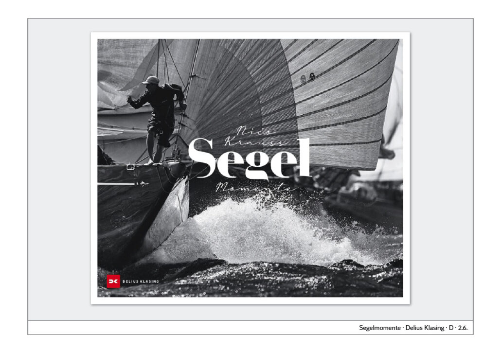
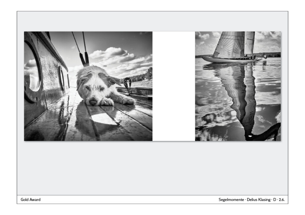
Image editing
Visualisation
Visualisation
When choosing an illustration for a book, the following questions, among others, arise:
– Does the image on the cover represent the content in a way that makes you want to open the book?
– Do the headline and the image complement each other in such a way that they form a unit?
The following media can be used to visualise a content:
– Photography
– illustration
– collage
– typography
– Photography
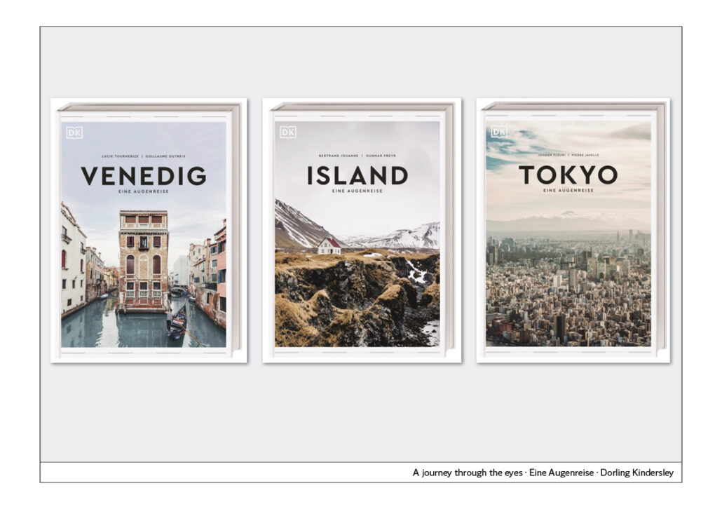
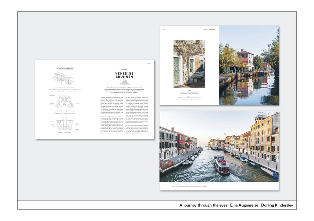
For a coffee-table book about different cities and countries of the world, it is quite obvious: one will choose a motif that the reader knows and can immediately associate with the illustration.
Since a cover should have only one photo to work as an eye-catcher, you have to choose an appropriate motif. The photo will form a perfect unit together with the headline.

– Illustration
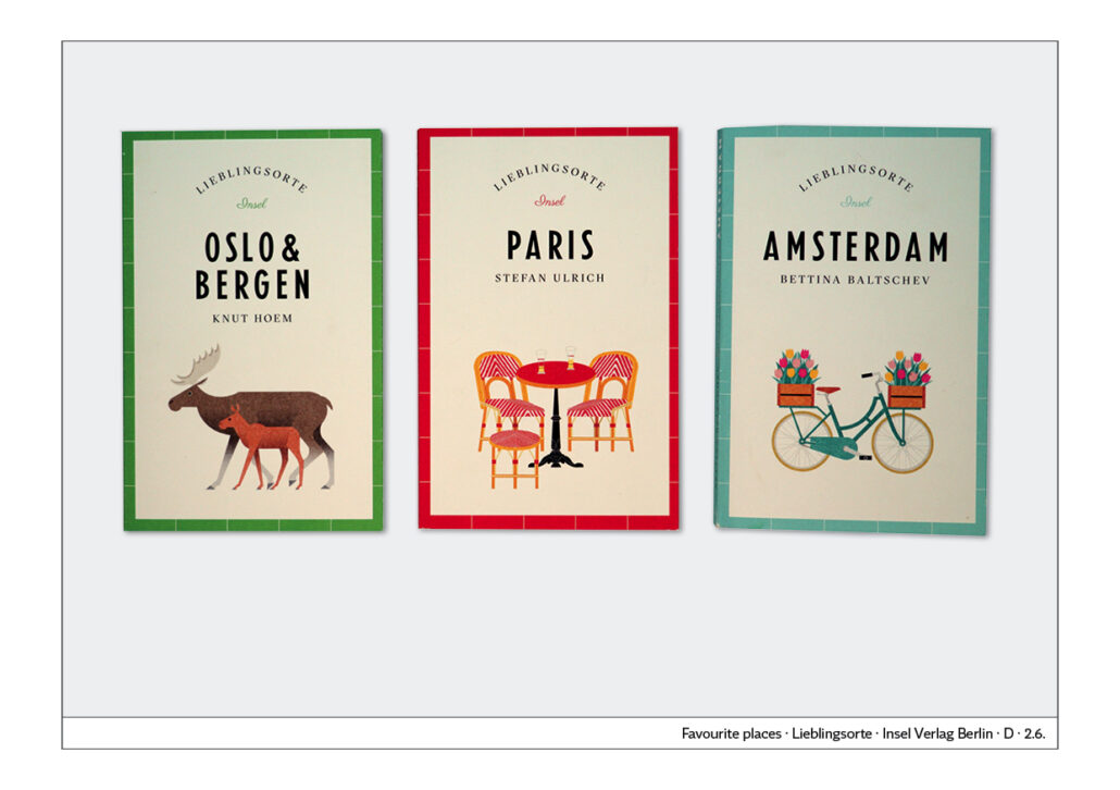
When working with illustrations, you can let your imagination run free, because illustrations can create a world that you cannot simply photograph. Illustrations are also based on the idea of depicting what is shown or described in the book. It is often about flair:
A book about Oslo and Bergen shows an elk with a young animal.
A book about Paris shows bistro chairs and a round table.
A book about Amsterdam shows a bicycle loaded with flowers.
– Collage
Collages can be composed of different photographs or a combination of photography and illustration. Collages can be used to give a book or book series a distinctive character.
– Typography
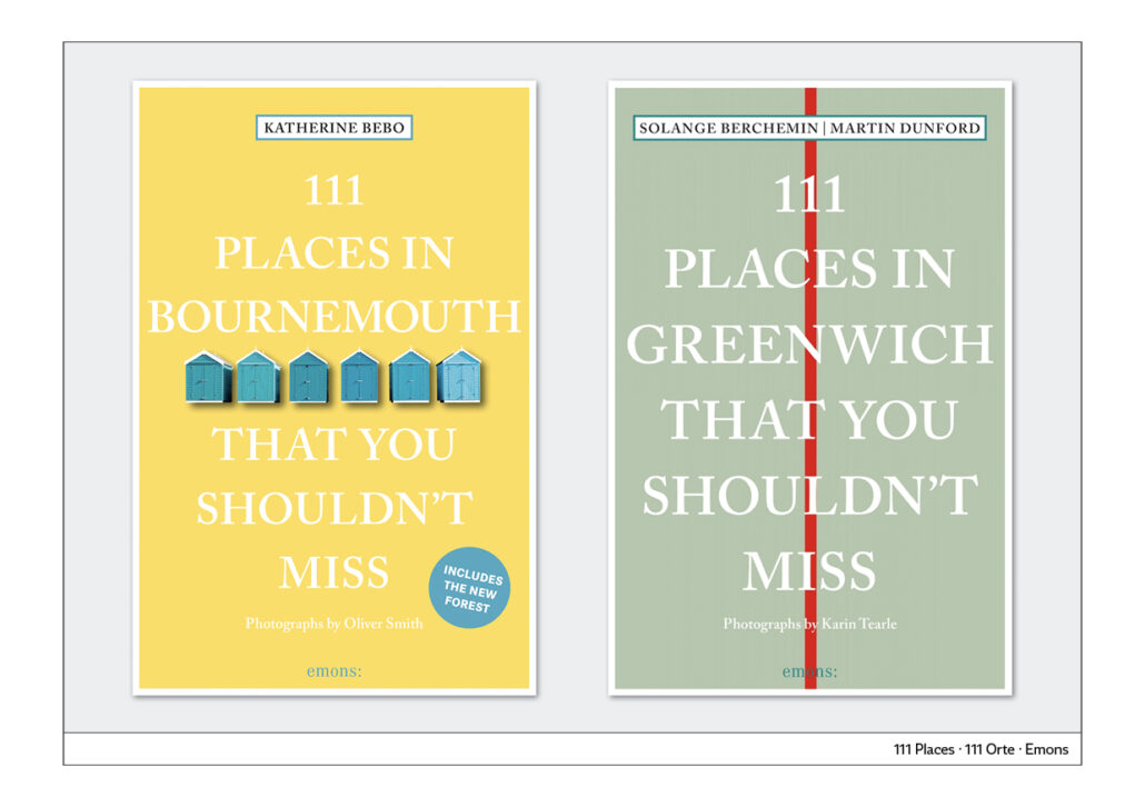
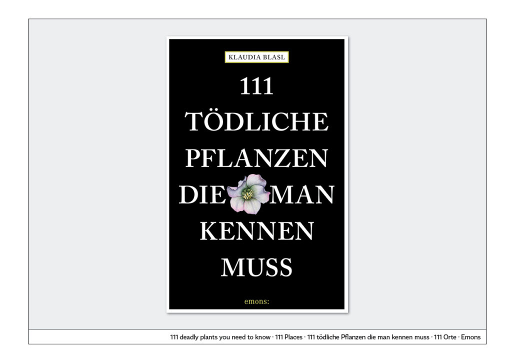
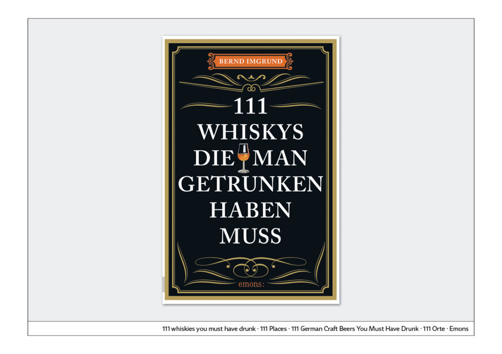
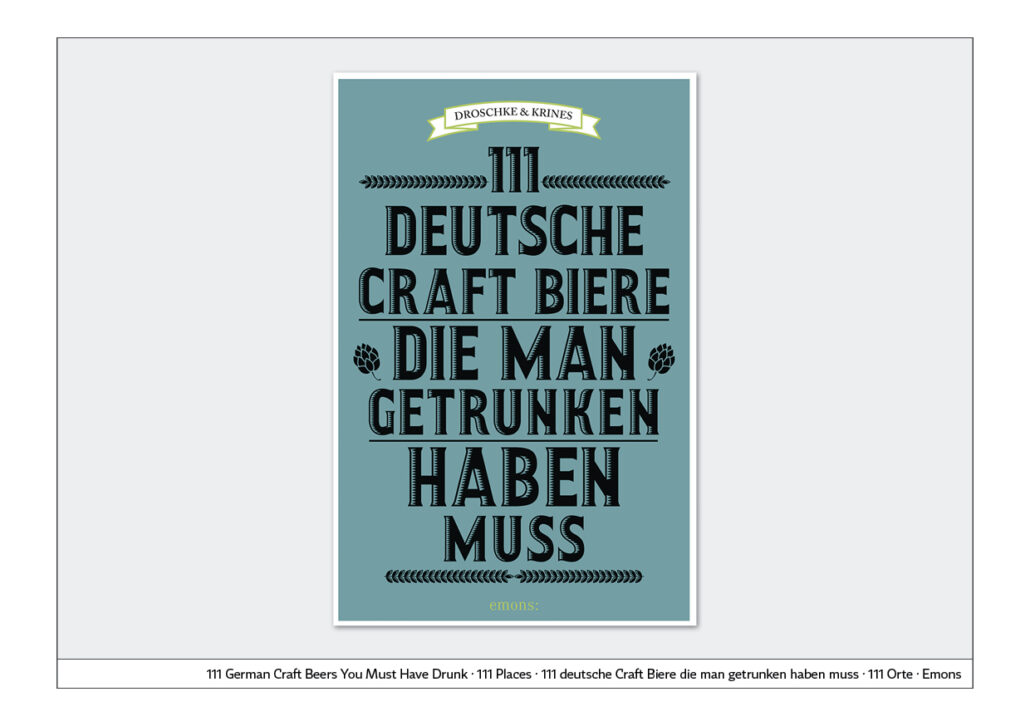
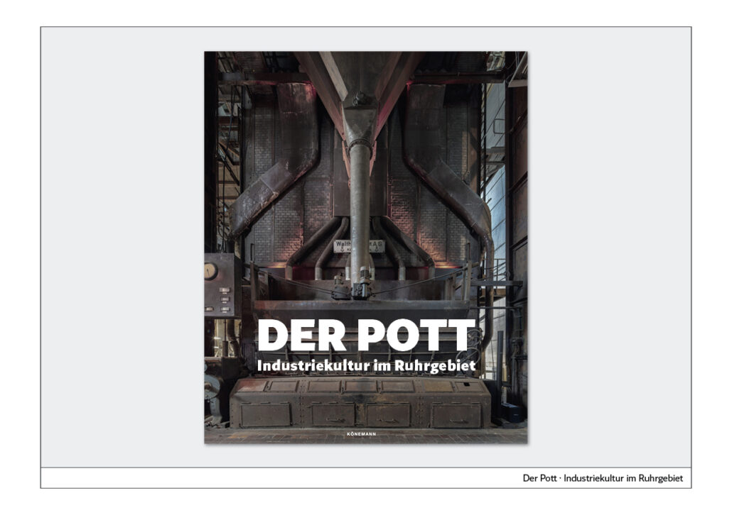
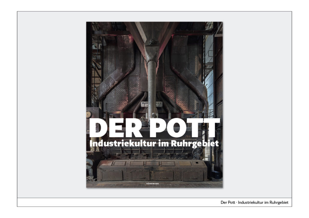
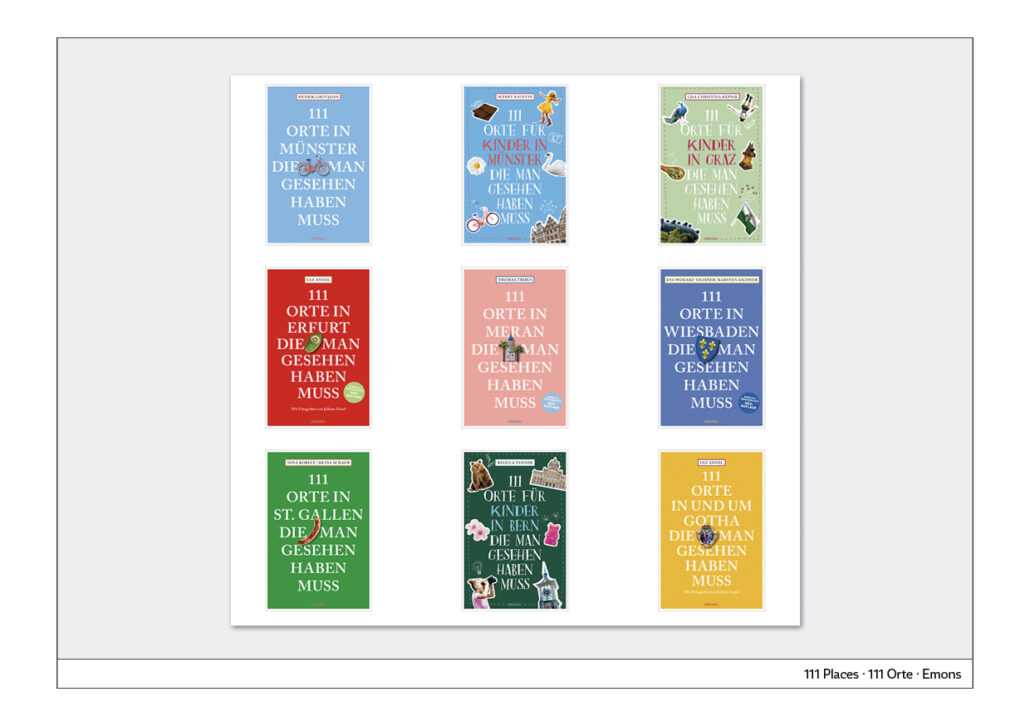
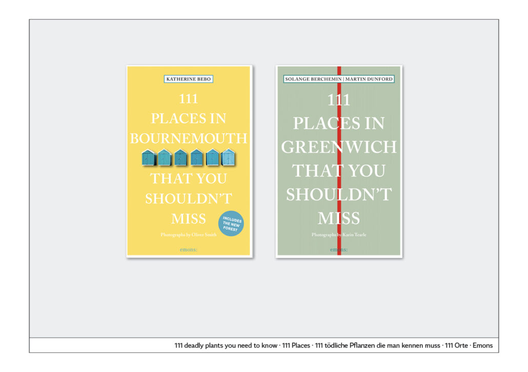
The choice of font allows the content to be presented visually. Even the capitalisation of the title gives the book seriousness. In a book series by Emons Publishing, the typographic title is accompanied by minimalist illustrations. For example, a vertical red line is on the cover for the town of Greenwich. This shows the most famous landmark of this city in a minimalist way. For the whisky theme, line elements are added to the typography and for the craft beer theme, a historically influenced font with a shadow edge is used alongside symbols for hops and malt, visually supporting the theme in the typeface.
For a cover about industrial culture in the Ruhr region, I made the name bigger and more powerful in two steps. This makes the book title as a whole seem even more appropriate to the theme.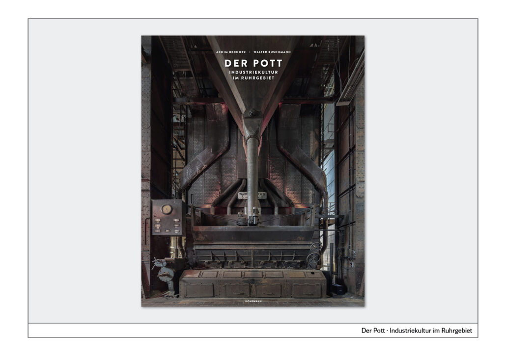
Book Series
Book series
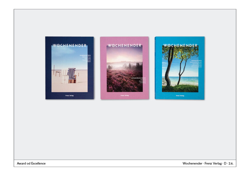
Book series have been in vogue for several years.
The design advantage of book series is obvious: once you have determined the design, you can continue in the same style without much experimentation.
Cover with label
A particularly elegant and easy-to-implement form is the cover with a uniform, for example floral, background. The name and author of the book are attached to the cover with a label. In the past it was glued on, today it is usually printed on. It is a timeless, elegant form of cover labelling.
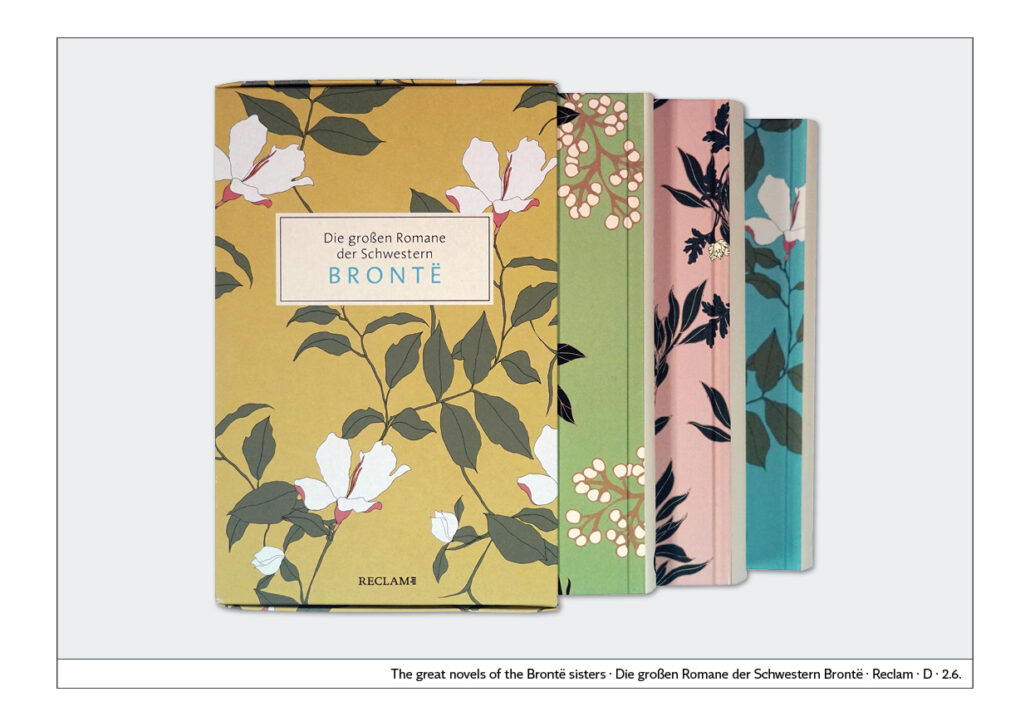
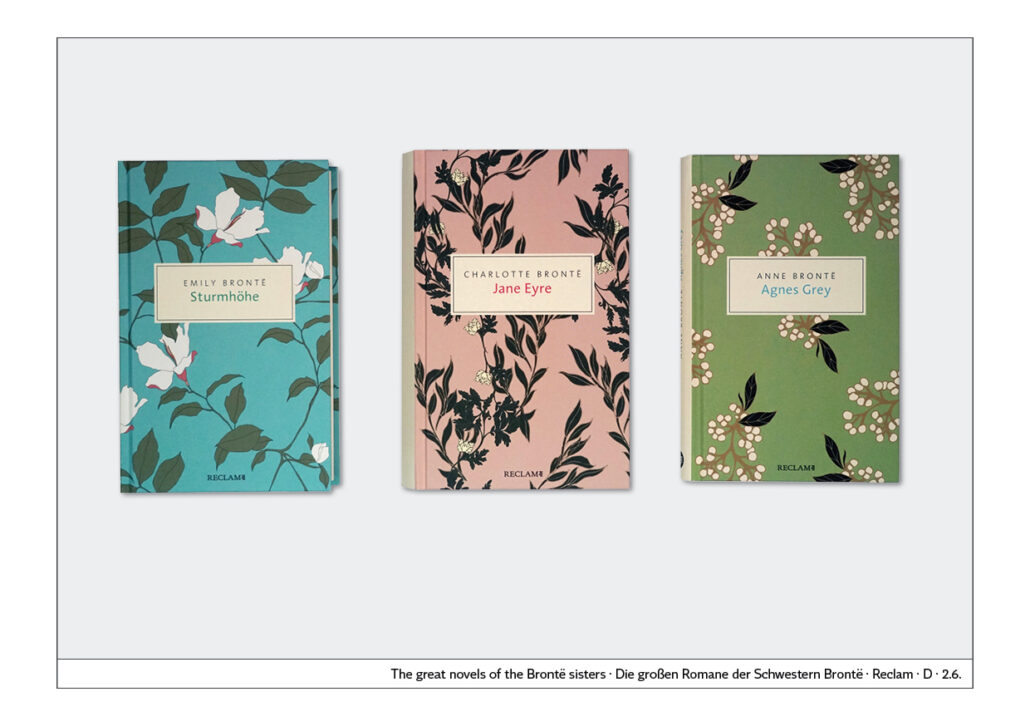

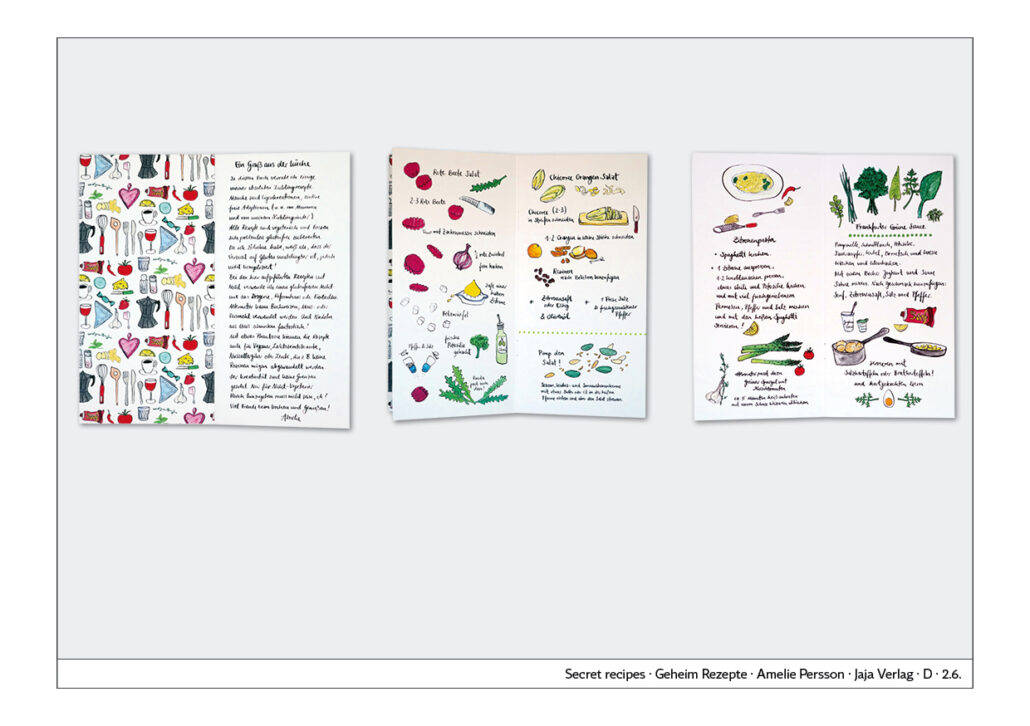
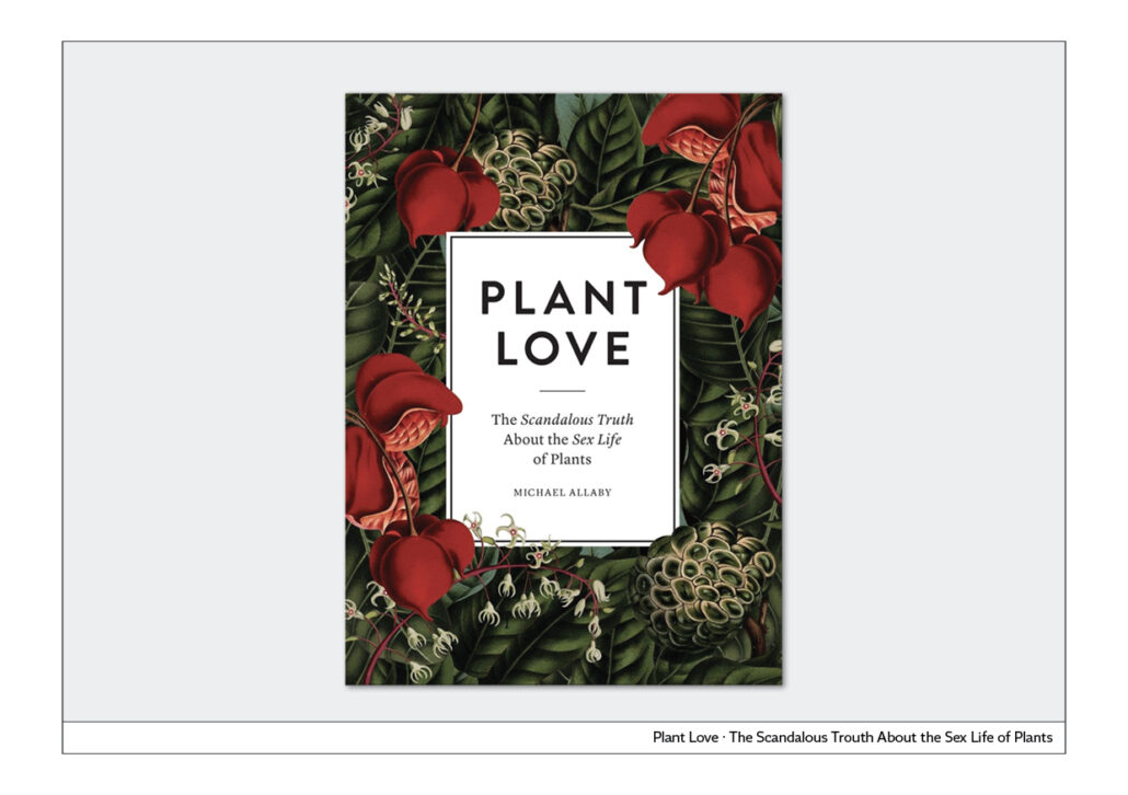
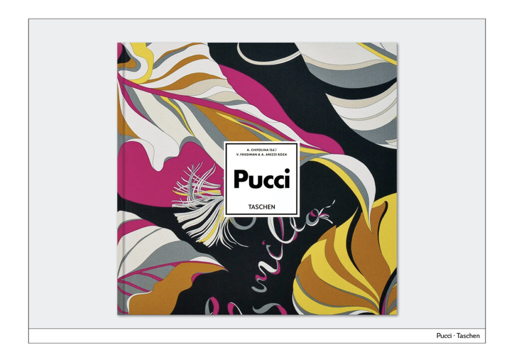
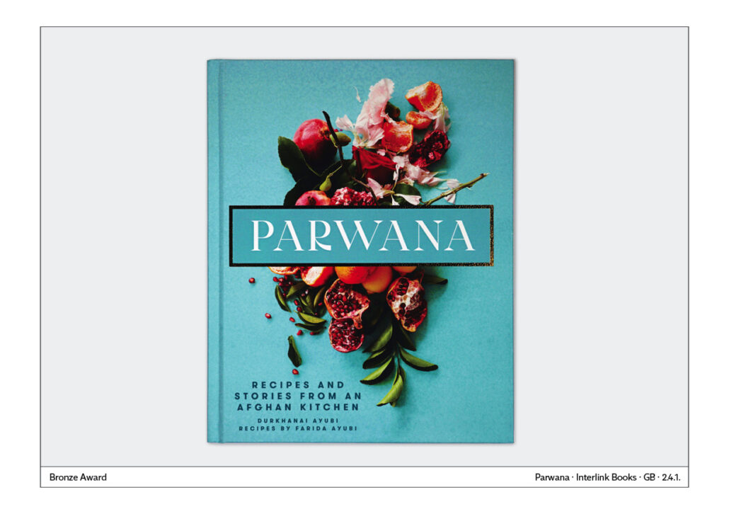
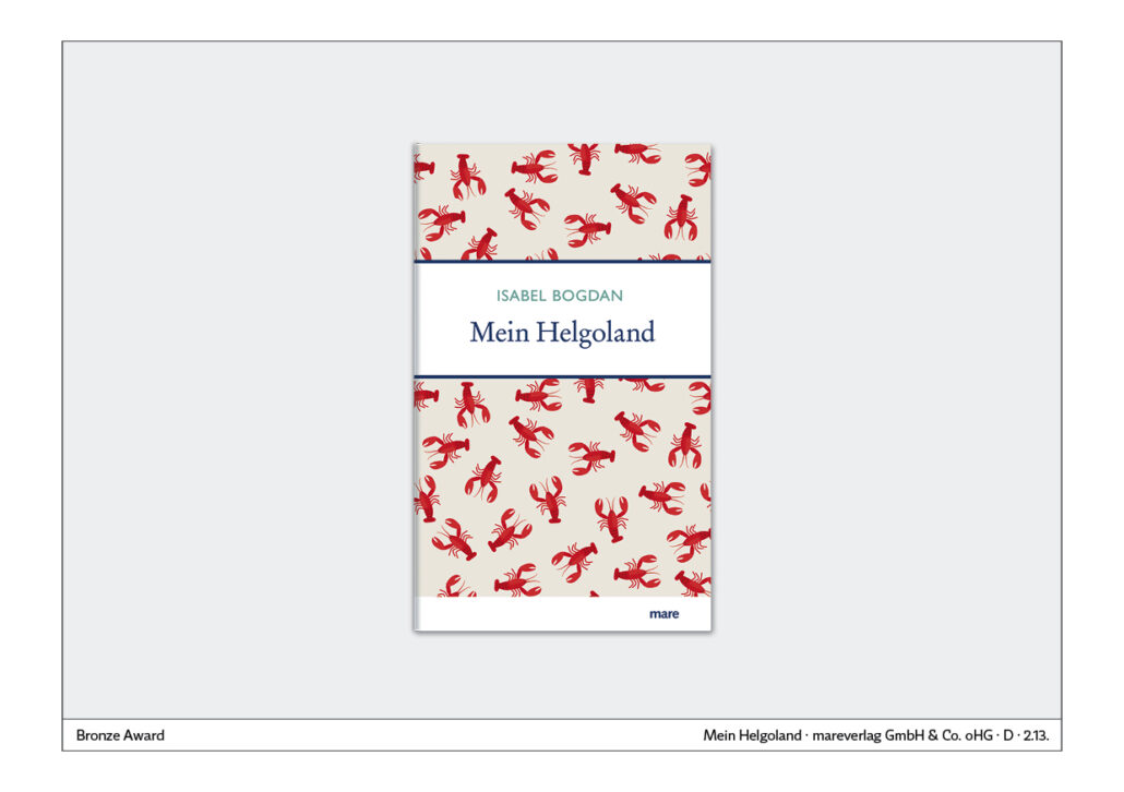
Illustration inside and outside identical
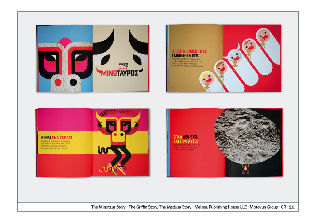
The design of a book series about figures from Greek myths is particularly unusual: Minotaur, Griffin and Medusa. Colours and illustrations of the covers are used identically inside. Consistent representation of the interior on the cover.

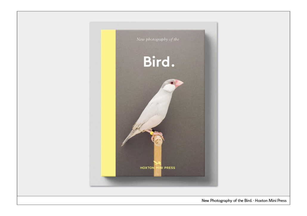
Serial character
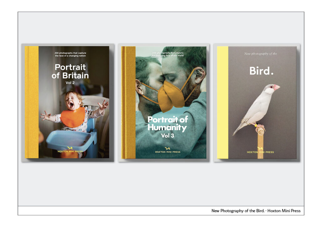
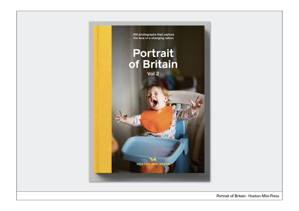
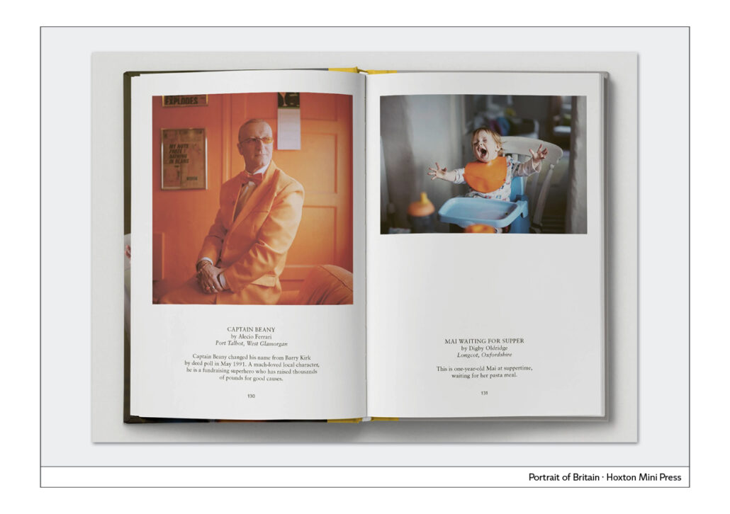
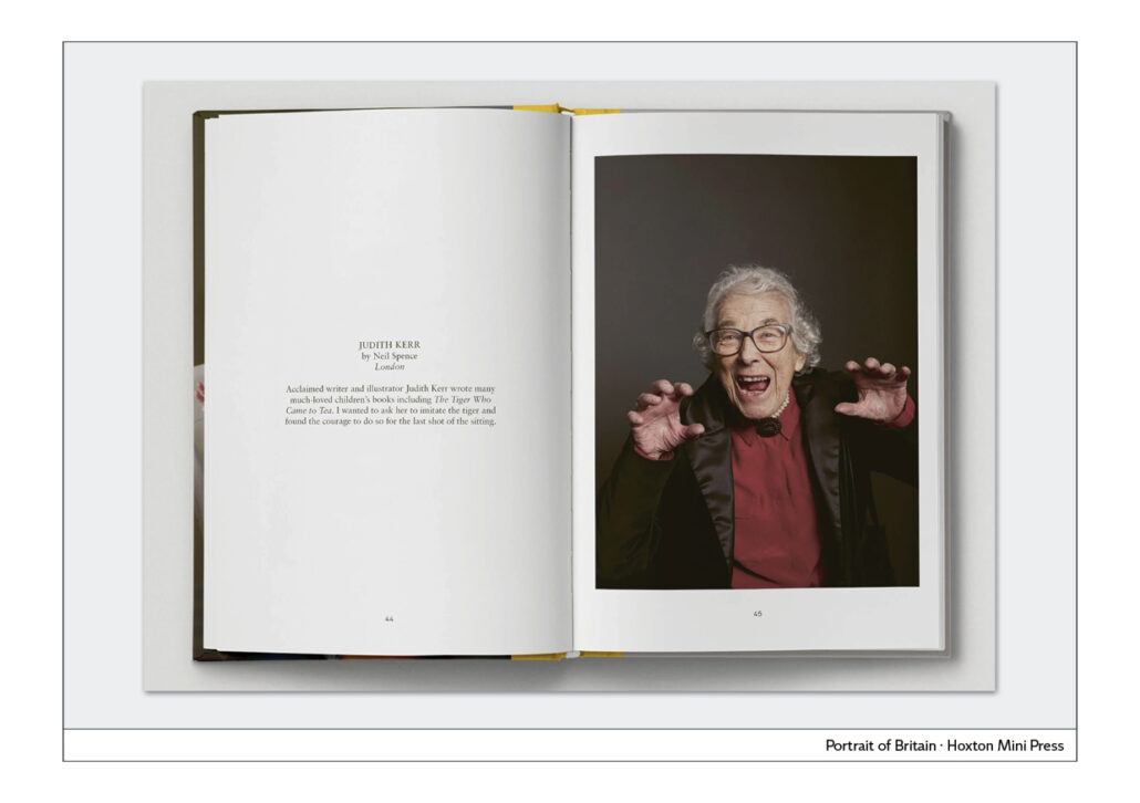
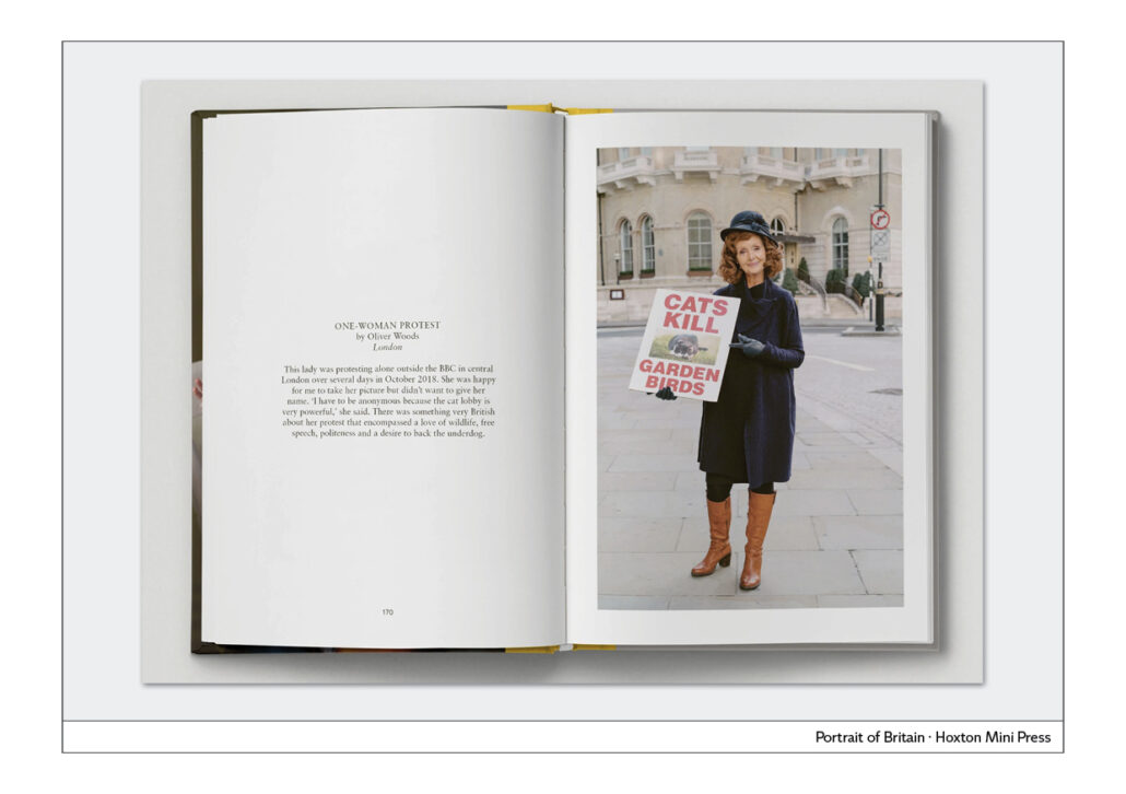
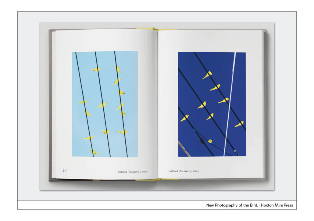
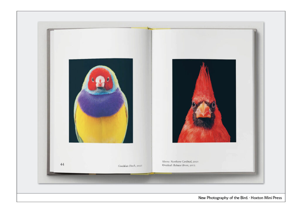
Photo books by Hoxton Mini Press, London, automatically form a series, because the books have the same format, the same binding, the same typography and the same layout on the inside pages. A typical example of the positive effect of the rule: less is more.
Very good how the book title and the picture of these covers work together. The pictures are emotional and the book title is matter-of-factly sober. This contrast increases the effect.
The other examples show different approaches to the design of book series. You can see: There are no limits to creativity.


Cover Typography
Cover typography
Every design and every book cover is subject to the spirit of the times. What we consider contemporary and modern today will be considered outdated in a short time. Nevertheless, it is sometimes possible to develop covers that have a timeless effect. They are usually very reduced.
The timeless cover
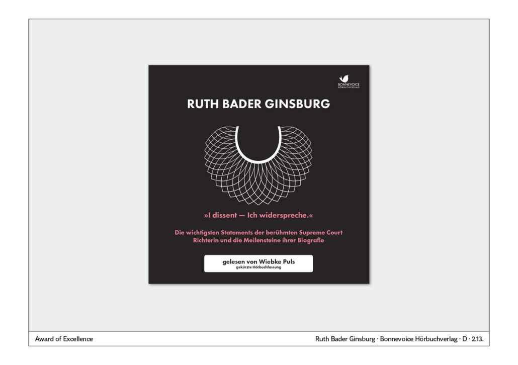
An audio book about the famous Supreme Court Justice Ruth Bader Ginsburg is an example of a reduced, timeless cover. In the centre is a white collar, which Ginsburg made her trademark on her black robe. Above it is only her name in capital letters. Below that, further notes on the audio book. Perfection through reduction. A photo of the judge would not have had this effect.
The modern cover
Headline typography, which is particularly trendy right now, consists of a sans serif font set in capital letters. The text is usually placed in one corner of the cover. The examples are from Germany and Slovakia. This trend is international. You can now decide: “That’s great, I want that too”. Or you say, “Good thing I know this trend. I’m definitely not doing that.”
Trademarks on the cover
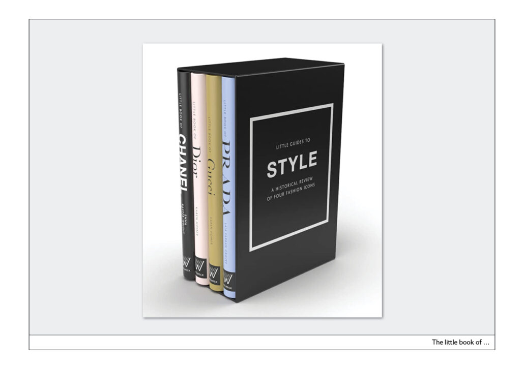
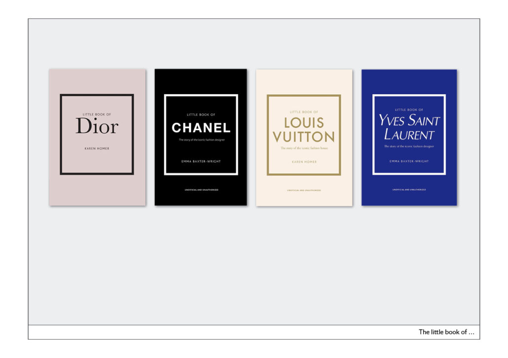
The small book series about fashion labels is particularly cleverly done. The four books in the slipcase have a square frame on the cover. Inside, the brand name is written in the original lettering. If a photo had been added to each cover, the uniqueness would have been lost. Typography and colour create the very own world of the respective fashion labels.
Typography and illustration
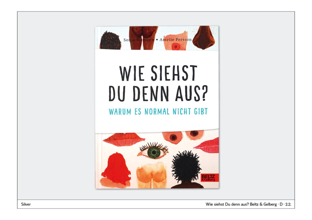
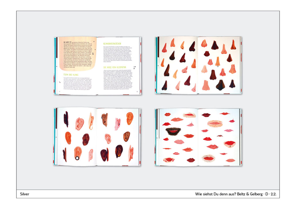
The book “Wie siehst Du denn aus?” – “What do you look like?” – is primarily about using many illustrated examples to show that normal does not exist, as the subtitle says. The typography of the cover is adapted to this design. It is a handwriting in capital letters that is simple and straightforward.
Typography on painting
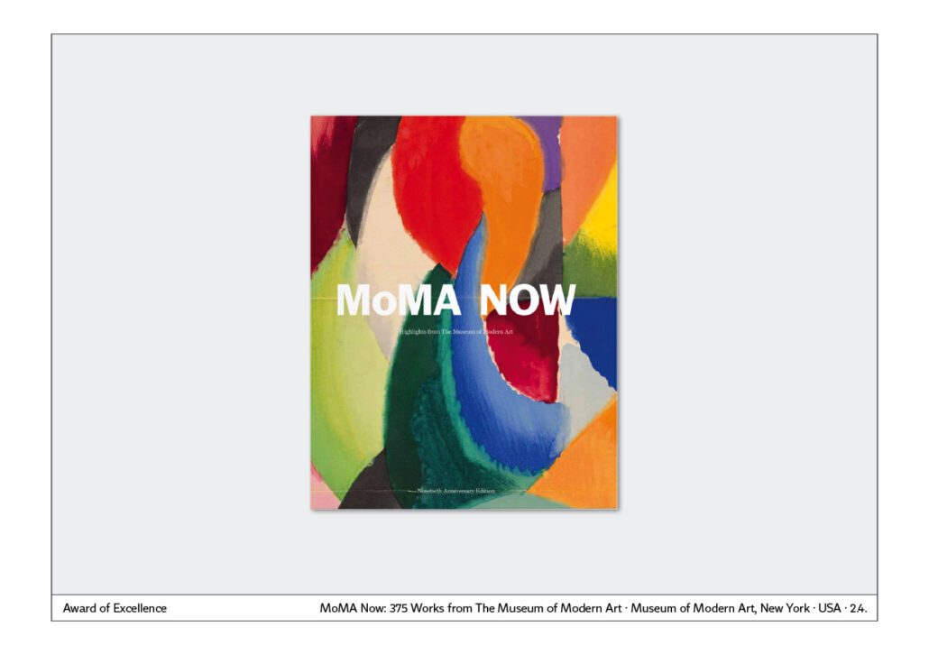
One will first see the artwork and then the title: “MoMa NOW”. Ideal fusion of image and name. A longer title, a different typography would not have achieved this perfection.
Magazine cover
This cover could also be a magazine cover: The illustration in the centre, above it the title and at the bottom still three tears that refer to topics inside. A good idea, perfectly realised, because it is a very clearly and concisely designed cover in which the elements complement each other.
Typography for visualisation
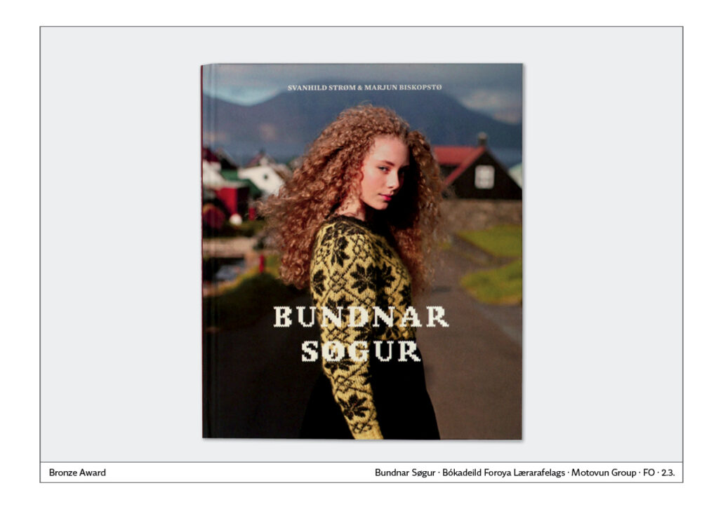
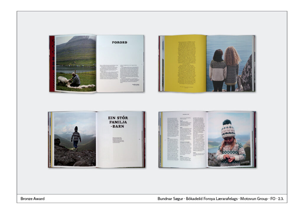
Knitting is the theme of this book. It is also visually represented in the typography of the headings. Lovingly designed book with distinctive detail from the Faroe Islands.
Children’s book cover
Children’s book cover
Children’s books are a wide field, because each age group has different requirements. They are made for children from 0 to about 14 years. Sometimes they are also intended for adults, who then read from them or look at the book together with the children.
Children’s books usually have illustrations. Therefore, it is obvious to place the illustrations of the inner part also on the title page. This creates a book of one piece: cover and content are connected by the illustrations. The endpaper is often used as additional illustration space.
The name of the book, the typography, the illustration on the cover and inside should form a unity.
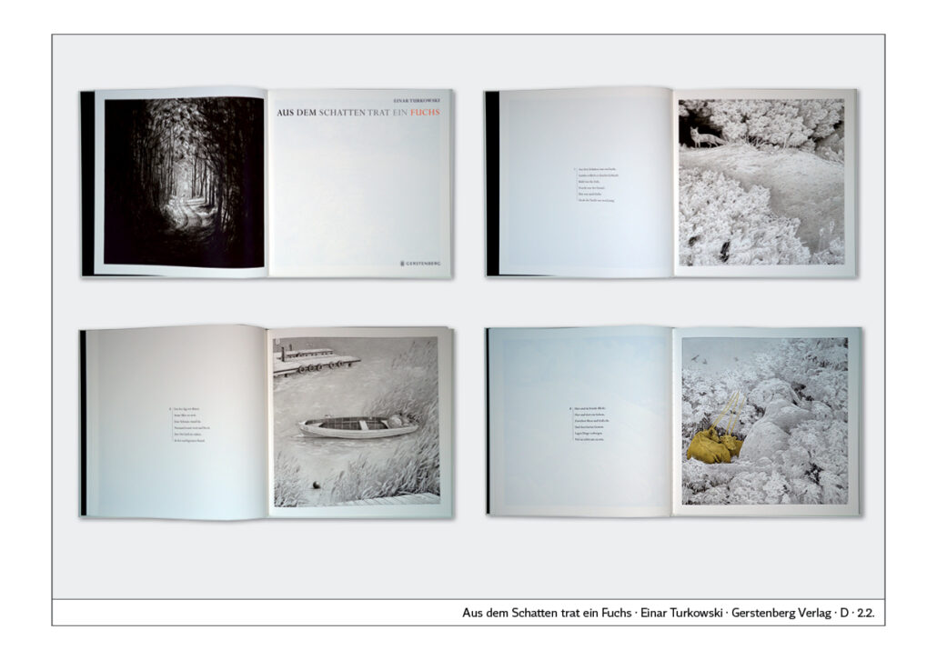
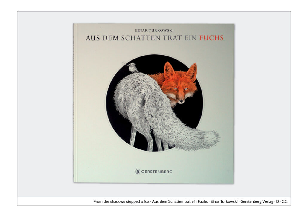
Eye-catcher through circular shape
The square format of the book “Out of the Shadow stepped a Fox” radiates calm. The white surface underlines the calm, aesthetic impression. The circular shape of the illustration is a good eye-catcher.
What is striking about the illustration is that it is predominantly black and white and only partially coloured. This style is continued in the interior.

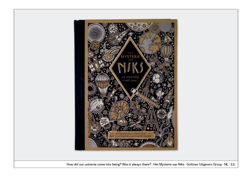
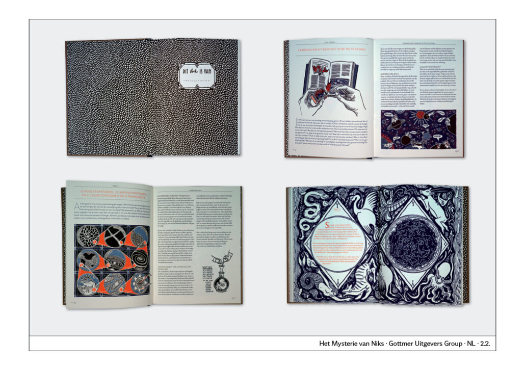
Mysterious cover
At the first glance, the cover seems completely overloaded. Only in the middle is a Rhombus kept free for the name: “Het Mysterie van Niks” – “The Mystery of Nothing”. The cover illustration shows planets, telescopes, rockets, mysterious instruments and creatures.
Young readers will want to explore the mysteries of the universe and then inside they will find the same illustration style with more text added. A highlight is the endpaper: you can write your name in the imprinted label.
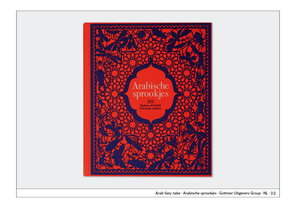
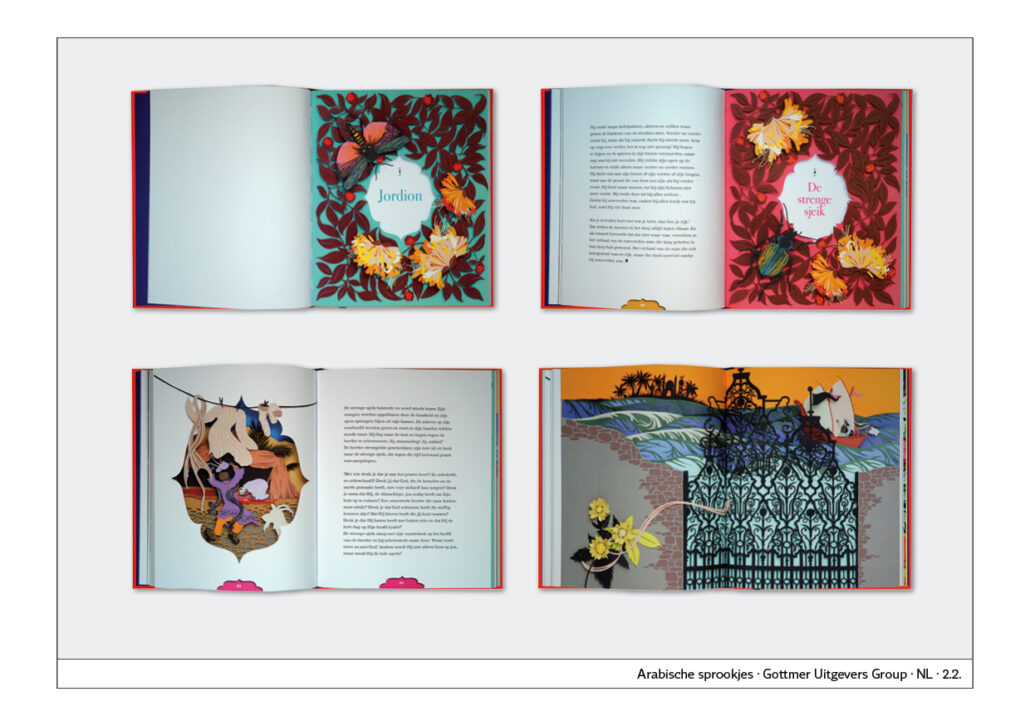
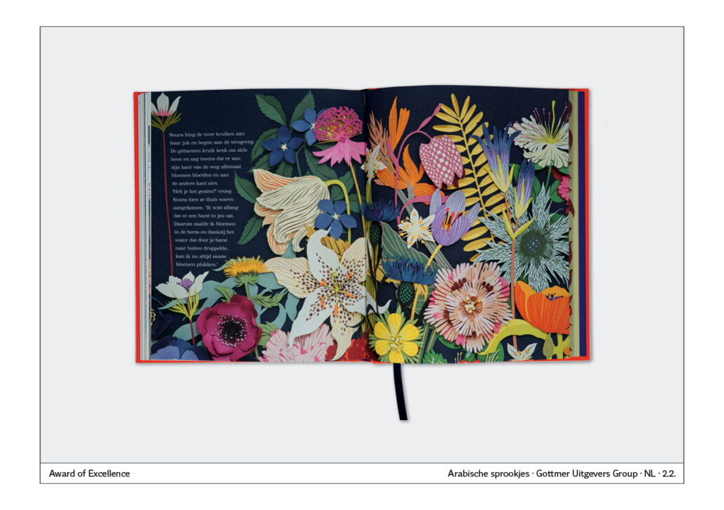
Visualising Arabia
The book is about “Arabian sprookjes” – “Arabian fairy tales”. The visualisation is very well done, as Arabic ornaments are depicted. Inside, the technique of cut-out pictures is further deepened, because the illustrations are coloured.
Logical cover illustration
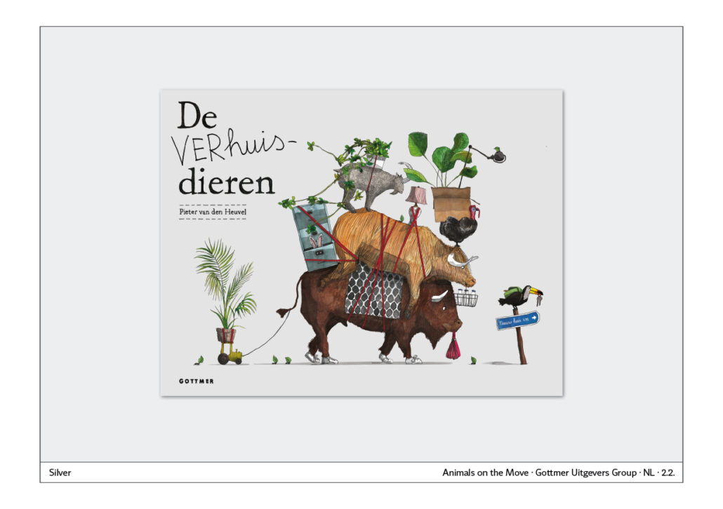
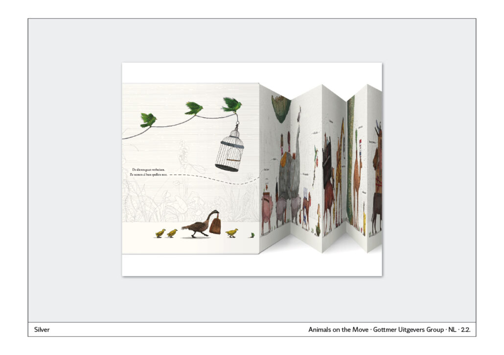
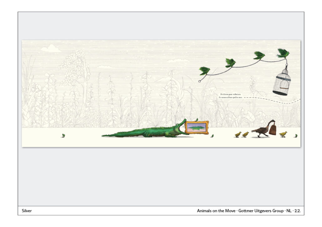
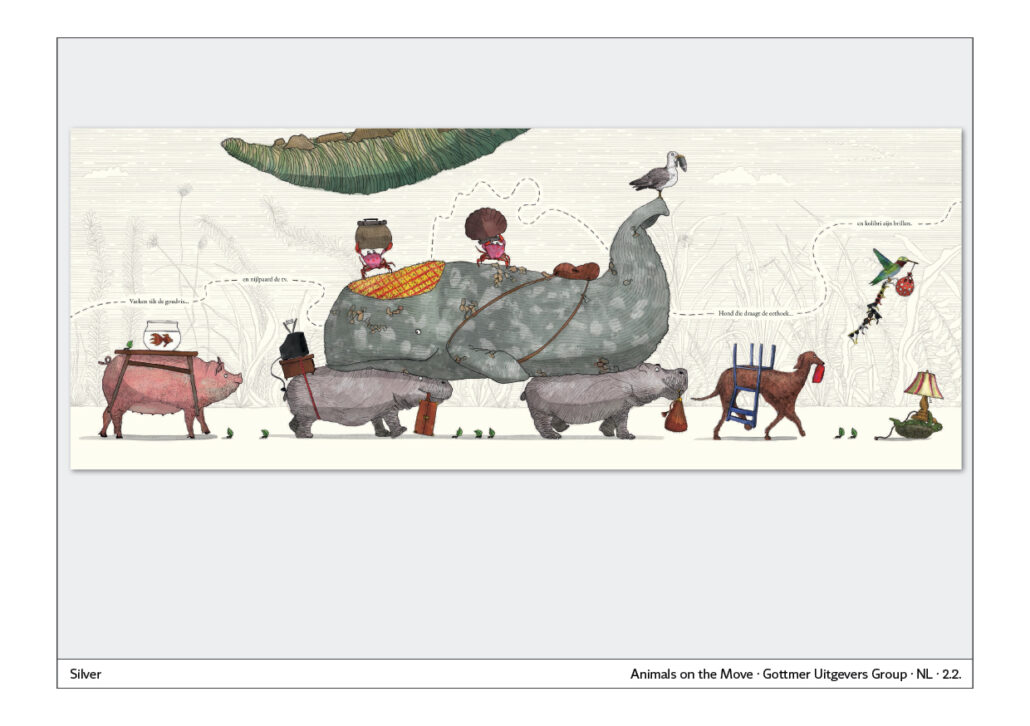
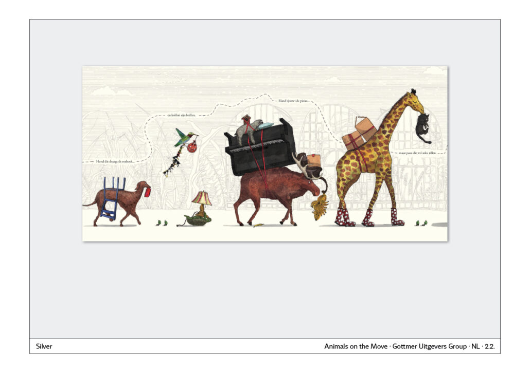
The cover of the book “De VERHuis-dieren” – “The Moving Animals” – shows the beginning of a move of animals. When you open it up, it is a four-metre long fold-out. Countless animals pass by with all their favourite things. From a TV-addicted whale and a learning camel to a piano-playing moose and a very lazy cat.
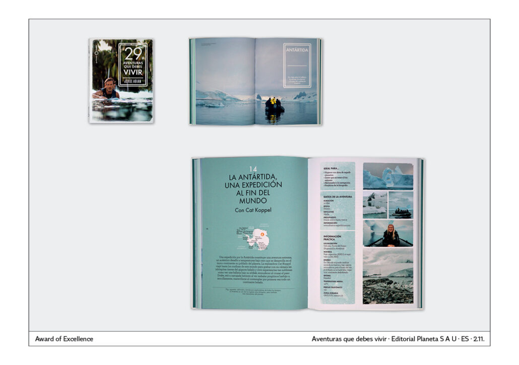
The cover and the interior complement each other logically, as the illustration of the cover and the interior merge perfectly.
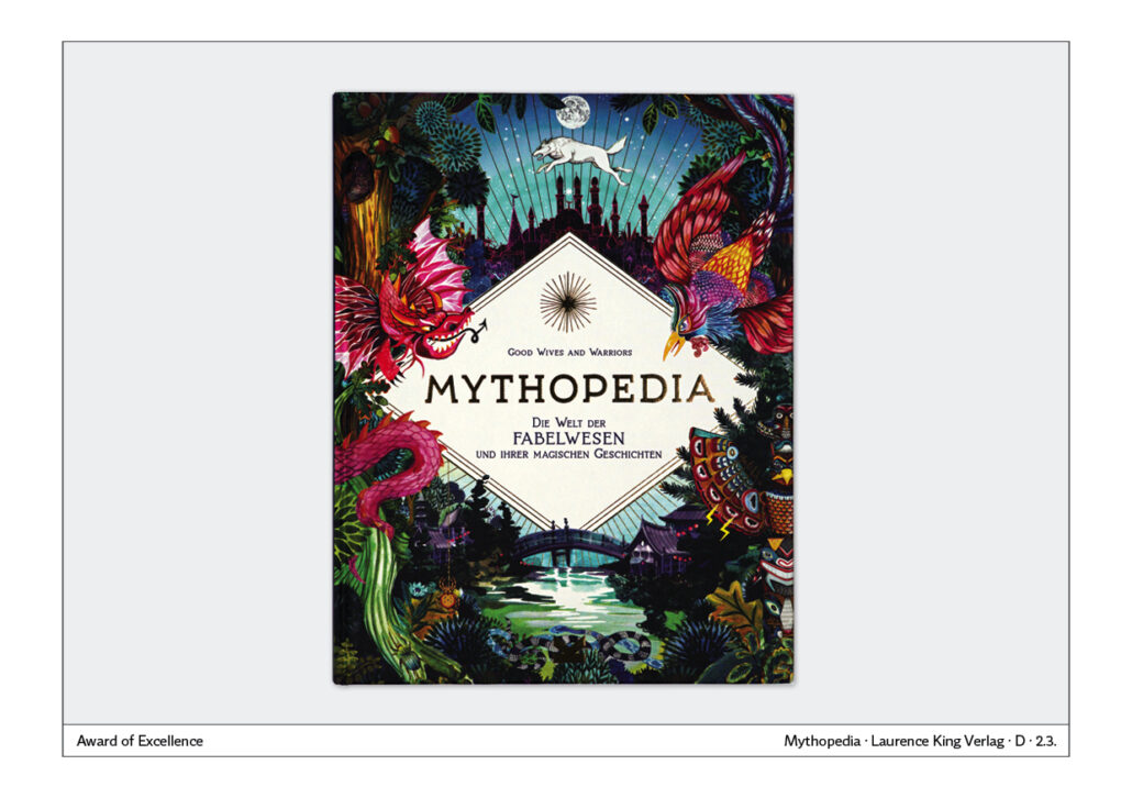
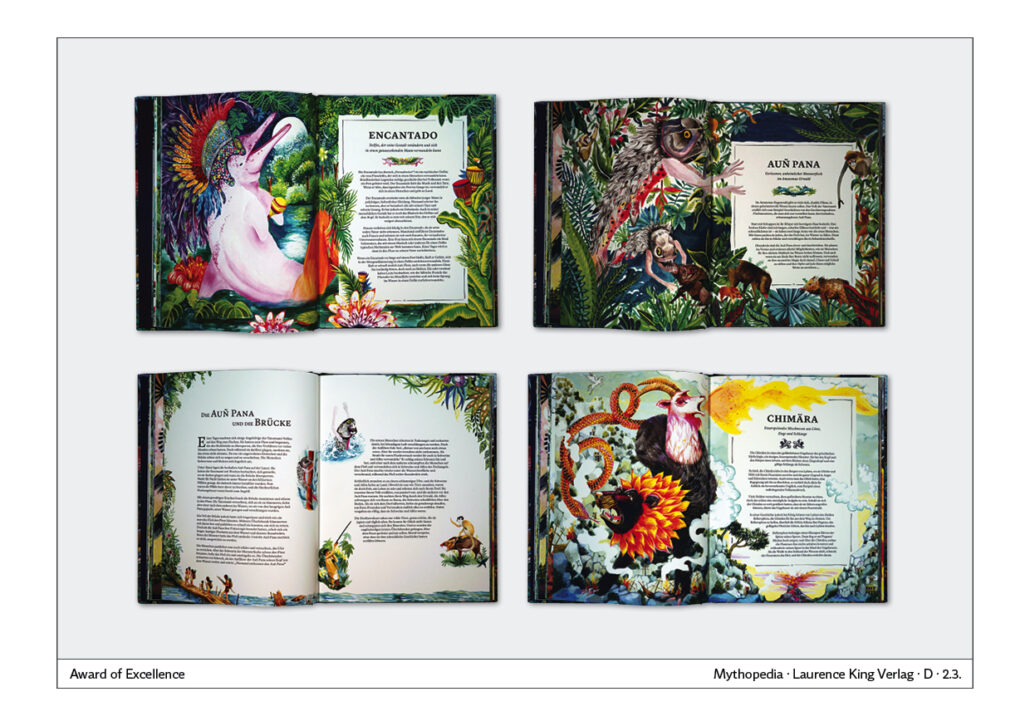
Mythical book
With the title “Mythopedia – the world of mythical creatures”, the publisher focuses strongly on the mysterious. The cover seems overflowing with mysterious plants and creatures. This style is continued very well inside. Illustrations can take up a large part of a double page, but they can also be displaced by longer texts. Good combination of texts and pictures. They do not interfere with each other but find their place.
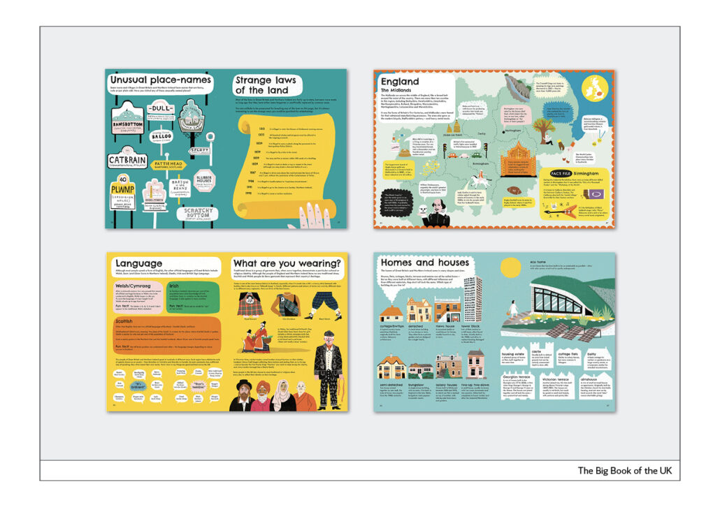
Collected facts
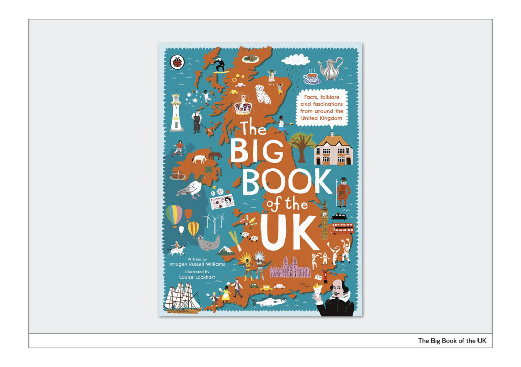
“The Big Book of the UK” shows what it is about on the cover. Namely, Great Britain is shown as a map. The map is enriched with small illustrations in which the style of the inner part is taken up.
The inside pages do not contain long texts, but alternative story forms that make heavy use of lists or small blocks of text. Facts about Great Britain are conveyed in a playful and clear way.
Book cover checklist
Book cover checklist
his is what you should consider when designing a cover:
Generally
A book will not be successful solely because of its cover. It is always the combination of the content, cover and the overall design of the book – paper, cover, typography, photography or illustration.
The cover as a poster
The cover gives the reader the first impression of the book. It must therefore function like a poster. The information in the illustration and text must complement each other and perfectly reflect the content. Reduction to the essential is therefore an important point.
The cover as eye-catcher
The cover is the first impression. Therefore, it must function as an eye-catcher. Eyecatchers are faces, action, colour, perspective, image editing.
The cover must work in all media
The cover must also work on the web: for online orders, in social media and on smartphones. The cover must therefore not only be easily recognisable in the shop window or in the bookshop, it must be suitable for all conceivable media.
Functionality
When judging book covers, I am concerned with functionality and readability. If the cover is functional, it will make a big contribution to success. Part of the functionality of a cover is good readability:
- Good readability is black text on a white background. Therefore, avoid white text on a dark background.
- The font and the illustration should contrast with the background. This is also called figure-ground differentiation.
- Texts in capital letters are difficult to read because all words look the same and are therefore difficult to distinguish. That is why you should set the headlines of covers in upper and lower case.
- Text stands horizontally and is read from left to right. Therefore, text on covers should not be tilted or even placed vertically.
- Fonts that run normally are easy to read. Therefore, no narrow or wide fonts should be used on the cover or in the inner part. Narrow-running fonts in particular impair legibility.
- Use handwritten fonts only for individual words, because longer texts in these fonts cannot be read well.
Visualising the content
When choosing an illustration for a book, the following questions, among others, arise:
– Does the image on the cover represent the content in a way that makes you want to open the book?
– Do the headline and the image complement each other in such a way that they form a unity?
The following media can be used to visualise a content: Photography, illustration, collage, tyography
Covers for book series, covers with labels
A particularly elegant and easy to realise form is the cover with a uniform, for example floral, background. The name and author of the book are attached to the cover with a label. In the past it was glued on, today it is usually printed on. It is a timeless, elegant form of cover lettering.
Cover typography and zeitgeist
Every design and every book cover is subject to the zeitgeist. What we consider contemporary and modern today will be considered outdated in a short time. Nevertheless, it is sometimes possible to develop covers that have a timeless effect. They are usually very reduced.
The modern cover, as of January 2023
Headline typography, which is particularly trendy right now, consists of a sans-serif typeface set in capital letters. The text is usually placed in one corner of the cover. The examples are from Germany and Slovakia. This trend is therefore international.
About the author
About the author
Norbert Küpper is an editorial designer and reading researcher. He studied visual communication at the Düsseldorf University of Applied Sciences. After graduating, he held a lectureship in typography there. He has redesigned more than 180 newspapers and researched how newspapers are used in print and online in several eye-tracking studies.
He is a member of the Motovun Group of International Publishers since several years. It is a worldwide association of book publishers. Norbert Küpper has given talks on trends in book design at various summer meetings.
He has a blog called “Layouttipp”, which is about newspaper design. The column of the same name was published in Medium magazine from 1989 to 2020. Now it is here: https://editorial-design.com/de/layouttipp/
To report on his work and experiences, he is also invited to give lectures, for example in 2022 as a keynote speaker at the annual meeting of the SGKM – Swiss Society for Communication and Media Studies – with the topic “The visual and audiovisual turn in the age of screen media”.