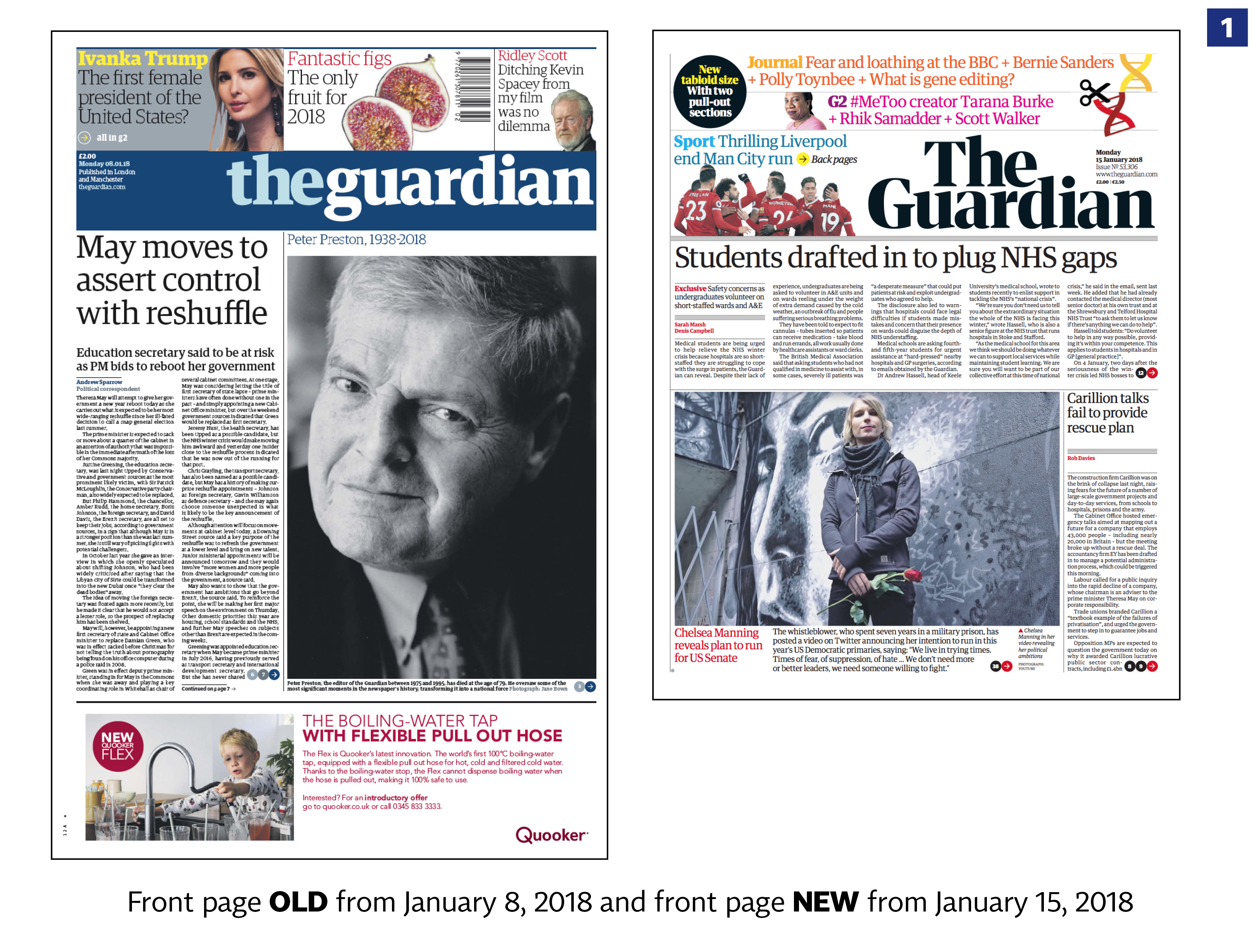
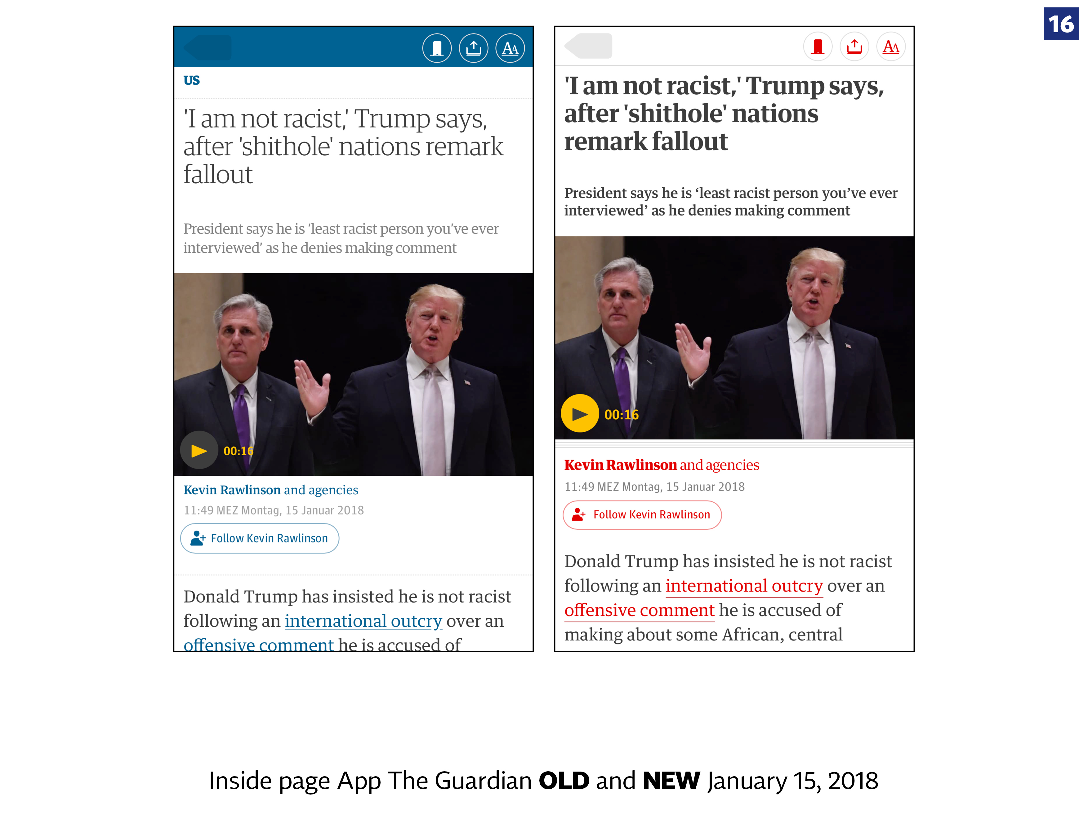
On Monday, January 15,2018, The Guardian changed to a new format and design. I’m newspaper designer, founder and organizer of the European Newspaper Award and I have asked — now eleven — newspaper designers from all over Europe to give their opinion about the changings.
To show the changings, I have compared old and new design. The comparison is Monday January 8 to Monday January 15, 2018, because the last Berlin format version from Saturday has another layout than on other days. We have only pdf files to compare, no printed version. That means we don’t know exactly the different in size of the berlin and tabloid format. I have also an opinion about the new design: I placed it in the captions together with remarks of Jordi Catala, Professor at EINA — Centro Universitario de Diseño y Arte de Barcelona.
This eleven Art-Directors have send in contributions:
– Michael Adams, Editorialdesign, CH
– Marianne Bahl, Art-Director, Børsen, DK
– Jordi Catala, Professor at EINA, ES
– Marco Grieco, Art-Director Expresso, P
– Martin Huisman, Art-Director, Het Nieuwsblad, B
– Dimitris Nikas, Art-Director, H Kathimerini, GR
– Søren Nyeland, Art-Director, Politiken, DK
– Dirk Steininger, Art-Director, Stuttgarter Zeitung, D
– Anna Thurfjell, Designer, SE
– Alie Veenhuizen, Art-Director, Leeuwarder Courant, NL
– Eberhard Wolf, Art-Director, Luxemburger Wort, LUX
If you want to have a look at the new Guardian, please follow this link: http://guardian.newspaperdirect.com/epaper/viewer.aspx It is possible to make a one day free of charge subscription of the epaper.
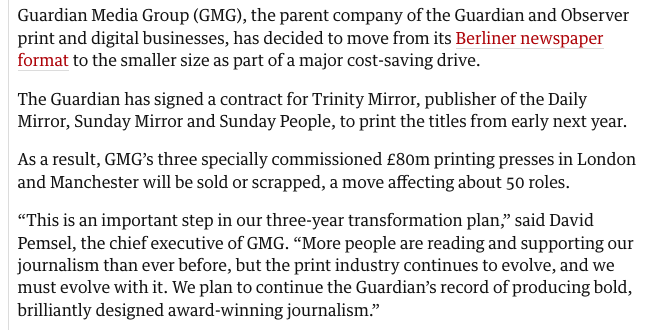
Background: The reason for the format changing was published in 2017: “Guardian Media Group (GMG), the parent company of the Guardian and Observer print and digital businesses, has decided to move from its Berliner Newspaper format to the smaller size as part of a major cost-saving drive.”
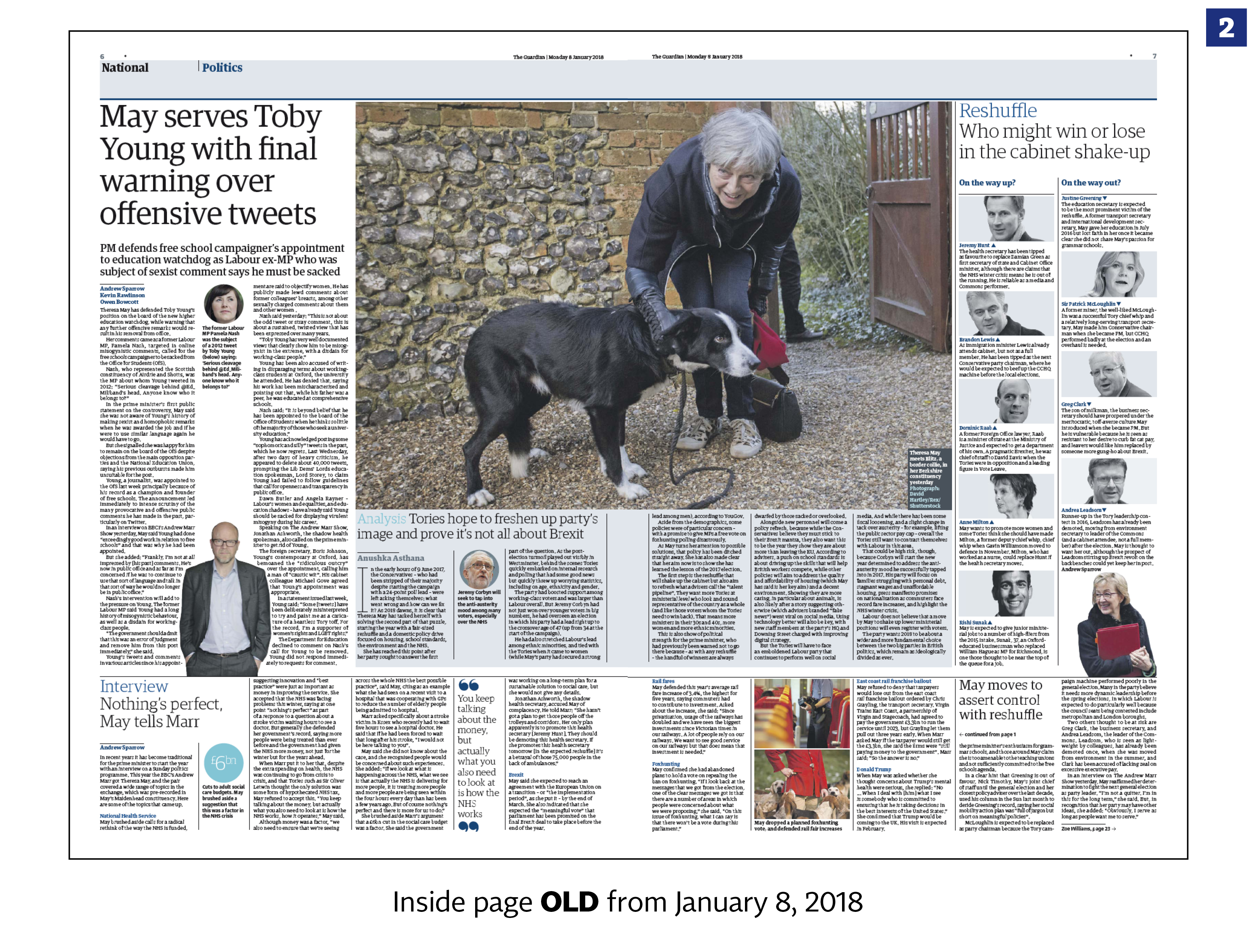
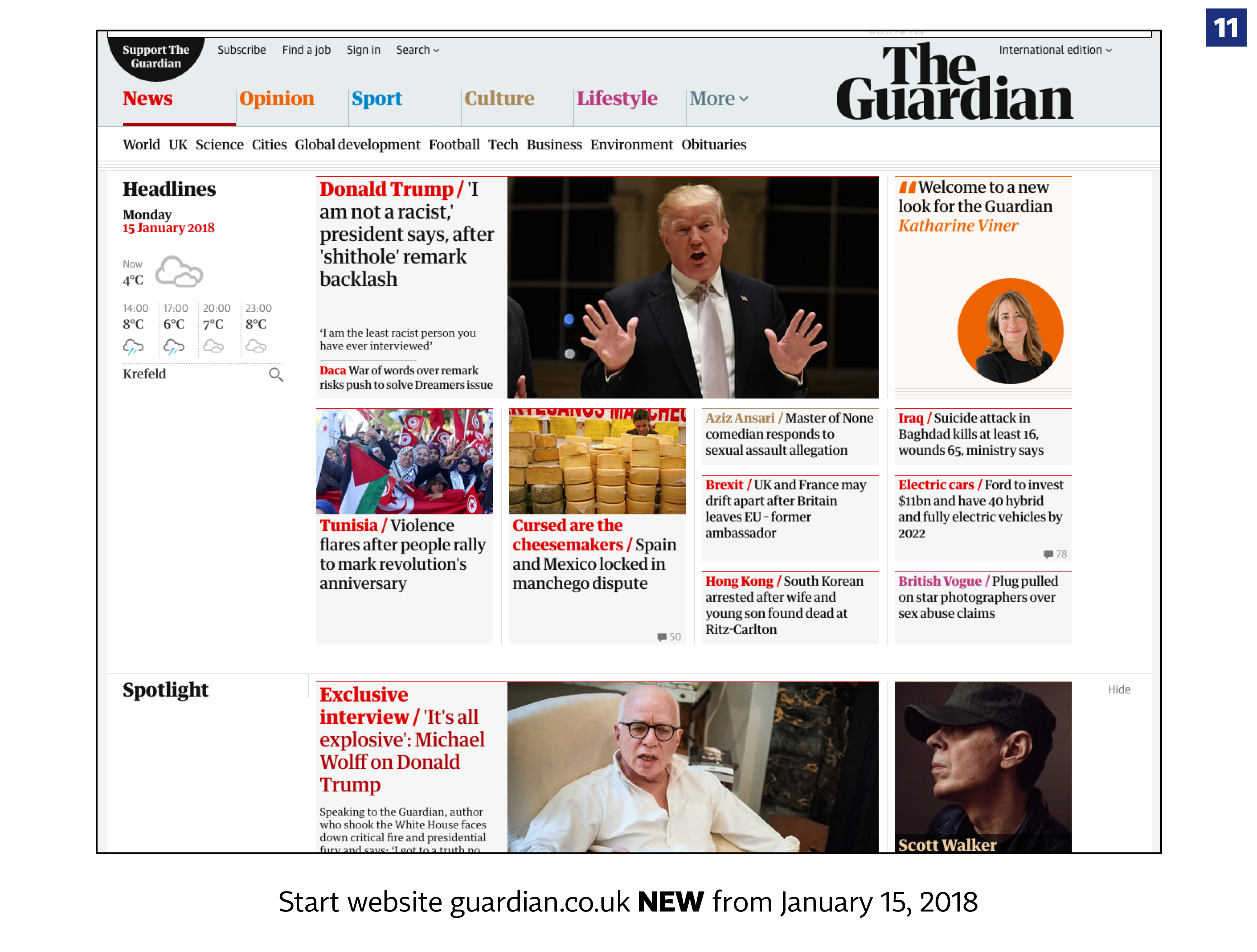
Jordi Catala: More fun at the top and more elegant and visual at the bottom. Can the regular reader miss the blue color? Norbert Küpper: The old masthead is still very good. The new masthead looks more classic, less modern. The promotion headlines on top of the masthead illustrate the rule: If you want to make a headline good legible, do it in black.
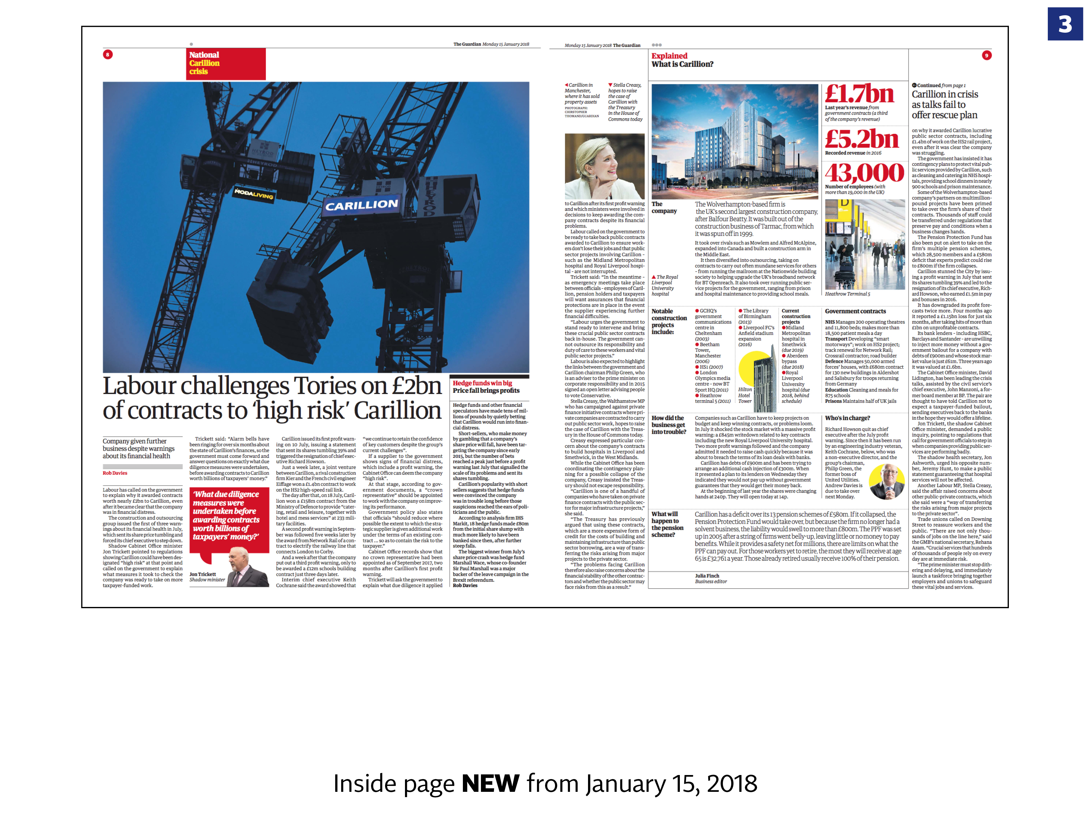
Jordi Catala: Cleanliness and order. It is good that the photographs are large and quality. Breaking the text with data, red dots, special fonts helps to make it less dense. The explanations are very useful. The newspaper is much more didactic, but it is much more difficult to design every day. Norbert Küpper: On the old and the new page you can see: Big pictures give a clear structure to a spread.
Anna Thurfjell, newspaper designer from Sweden. She has won the title “European Newspaper of the Year” in 2010 for Svenska Dagbladed. In between she has also relaunched other newspapers, for example Berlingske in Kopenhagen. http://at-d.net/
It is good that the new redesign and visual identity are launched at the same time in all platforms — important to any modern news brand. The new design is of course of a very high class and executed with great talent. It’s a bold and risky project to swift The Guardians very strong format in print; ‘The Berliner’
for a more common format as the ‘tabloid’. A smaller format somehow diminish The Guardian.
The overall impression I grasp from this very first day is of a more ‘classic newspaper’ look, that somehow looks less modern and contemporary than the previous Guardian did.
Guardian changed to a new title-piece in black and white, a new drawn typeface by The Commercial type called ‘Guardian Headline’. It’s an elegant typeface but the placement of it is not really working, the logo feels somewhat on the way out from the phone, where it sits to the right… In print The title-piece also looks a little misfitted.
A clear mistake in the new design is to loose the lower case character ‘g’ for the capital ‘G’, as the letterform of ‘g’ in lower case, has so much more character than any capitol ’G’.
The most important design dna of Guardian in print and digital is the Egyptienne typeface and it’s a relief, a lot of the Guardian egyptienne are still in play. It’s one of the most efficient newspaper typefaces ant yet it’s beautiful too.
The print frontpage looks incredible common. The Sport ‘front’ on the backside looks more appealing than the newpaper front. Visually it looks like The Guardian really lost it’s focus. It used to really have great edited news photography but the choice of photography today is not creating impact.
Orange is the new ‘black’. This warm red/orange with black, put me somewhat back to the old Guardian 1998 redesign. The range of colours are somehow conflicting and the weaker colours disturbs me. It looks more like a Financial Times, with bright and light colour tints. For example a salmon pink background behind the columnist text bars, is perhaps too sophisticated?
The rulers that is also a very important part of the Guardian design are updated too. It’s was the famous Massimo Vignelli who did it first in the history of graphic design, when he invented the NYC subway system in the 60ties.
It will be interesting to experience how the new Guardian redesign feels on day two. It is always a question about how you use the design and presentation in your journalism.
Dirk Steininger, Art-Director, Stuttgarter Zeitung, Germany:
Neues Format: Während sich der deutsche Tabloid-Hype (Gottseidank!) wieder gelegt hat, kann man den Kollegen vom Guardian nur viel Glück wünschen. Der Brexit vom alten Berliner Format und damit die neue Handlichkeit (gut) hat ihren Preis: die linksliberale Tageszeitung wird einigen Boulevardblättern auf der Insel immer ähnlicher. Hintergrundberichte sind wie beim Handelsblatt oder bei der FR nur noch auf Doppelseiten oder auf noch mehr Seiten möglich. Das neue Konzept bedingt optisch und inhaltlich neue Formate. Basis-Typo: klassisch-feuilletonistisch — passt weiter gut zur intellektuellen Leserschaft.
Titelseite: Oh je, mir etwas wild!! Hier klemmt es an allen Ecken und Enden. Die knallig-farbigen Anreißer bedrängen den Doppeldecker-Zeitungstitel, dazu noch ein Freisteller. Das Bild des Tages “rutscht” deshalb zwangsläufig nach unten (schwierig, völlig im Gegensatz zur Küpper-Lehre!) Die optisch plakativen Seitenhinweise (gut) sind dringend notwendig, sonst würden sie völlig untergehen. Unten beim Foto typografisch zu unentschieden.
Gewöhnungsbedürftig: die 4er-Linien oben (auch bei den Sektions-Titelseiten und über den Autoren), sollen wohl eines der neuen Markenzeichen sein. Viel Glück damit! Und die schockroten Autorenzeilen, fallen als erstes ins Auge! Sind die Schreiber hier wichtiger als der Inhalt? Fand ich die frühere Version in zurückgenommenem Blau angemessener.
Innenseite: Für ein politisches Blatt mit etwas mehr 150.000 Auflage zu wenig Hintergrundberichte über 2 oder noch mehr Seiten. Die Texte sind ob des neuen Formats auf zahlreichen Seiten noch kürzer geworden. Das Zurechtfinden innerhalb der Ressorts ist etwas schwieriger geworden. Halt geben die optisch kräftigen Elemente wie Seitenzahlen in runden Feldern, Zitate, Infoboxen etc. Sektionstitel mit den Anreißern funktionieren gut.
Mit dem Verzicht auf das bisherige Farbschema und die Farbflächen ist dem Guardian die bisher angenehme Harmonie verloren gegangen. Ziel ist offenbar eine grafisch reduzierte Zeitungsoptik mit sehr betontem Typo- und Farbeinsatz.
Verbesserungen:
Pfiffig:
– Die neuen Bildzeilen, jeweils mit einem kleinen roten Pfeil. So funktionieren auch Bildüberschriften, Bildnebenschriften etc. gut.
– Die neuen Zitat-Sprechblasen auf den roten/gelben Feldern, wenn sie richtig angewandt werden.
– Die neuen Infoboxen, die konsequenter als früher angewendet werden. Und die Gliederung der Infoboxen (Zahlen, Fakten mit Farben, Typo farblich hervorgehoben).
– Bei Hintergrundberichten ganze Info-Tableaus.
– Freisteller mit den runden Farbflächen. Bei Porträts gut, bei Sachaufnahmen diskussionswürdig.
– Einsatz von Cyan, Gelb und Rot bei der Typo. Spannend insbesondere die gelben Farbflächen bei den Headlines im Sport (knallig)
– Klare Pullout-Sektionen.
Verschlechterungen:
Nicht so pfiffig:
– Titelseite, mal schauen, wie sich diese in den nächsten Tagen präsentiert.
– Der Fokus zu sehr auf die Autoren mit der Schockfarbe Rot. Wenn die Person auf einem Porträt zu sehen wäre ok., aber so etwas übertrieben.
– Die weitere Begrenzung der Vorspänne. War früher schon wenig, ist nun aber noch enger.
– Noch weniger Infografiken (wo sind die alle hin????, Infoboxen und Datenkästen ok, aber…).
– Noch kürzere Texte auf vielen Seiten = weniger Inhalt?
– Die frühere Farbe Blau findet man nur noch im Sportteil und im G2-Teil (da ist es noch farbiger) — arg konstruierter Gegensatz.
– Online unterscheidet sich wesentlich, hier wäre eine Harmonisierung gut. Spannend das Förderprojekt mit den Lesern, um eine Paywall zu vermeiden!
Jordi Catala: The introduction of yellow (corporate colour) is positive. It is a lighter page than the old page, but it is also more attractive. The use of headlines is improved. The large, well-designed photograph turns the page into an understandable cover page. Norbert Küpper: In comparison, the old page looks old. The blue was to light and the page has too much bodycopy and not enough white space.
Norbert Küpper: Also the old Guardian used big pictures and some yellow elements where part of the layout.
Jordi Catala: The old page and the new page look much alike except for the yellow notes. The new page has more cleanliness and has more small pieces. It is more didactic. Norbert Küpper: The yellow is littlebit “yellow press”, a tabloid element, but it’s not bad.
The team behind the Guardian project are confident, explosive and innovative from day one. The Guardian is still a welldesigned and a role model brand judged from an overall perspective. And for that reason a lot of the design choices should be questioned and critizised.
Guardians famous design for the print edition used to differentiate itself from other quality papers with the Berliner format, the flexible colour system and the even more flexible Guardian typography. So in which way does these qualities still define The Guardian?
The new tabloid edition is a sellout on the format. Period. Money matters!
Editor-in-chief Katharin Viner says that Guardian introduced “a range of energetic colours”. But today it looks like there’s a conflict between the old — but still existing — sophisticated coloursystem and the new raw black-red coloursystem.
So all the news are red and black except for the blue all over the Sport. For the conservative eye the sportspages feels more Guardian than the rest of the paper — but the reader will probably get used to all the dynamic red elements. And the yellow marker technique will probably be even more trendsetting for our industry than it already was — since Guardian is a trendsetter. I really like how Guardian master to turn something flashy into something aesthetic. The layout of page 56 with Roger Federer is a great example of this fine use of yellow marker.
There’s a young happy feel about this first new front page all though it’s too messy in the upper part. It’s like Guardian desperately wants to tell the reader that all the colours of the rainbow are still in play in Guardian. Is the new range of colours endless in reality?
The original Guardian Egyptian family comes is big numbers of cuts and today we meet a new member: called Guardian Headline. It is supposed to be easier to read and that’s a quality! The look of those headlines in Guardian today is crisp and modern. But without the character of the Egyptienne. The big question is how all those great cuts from the design experts ‘Commercial Type’ will combine in the upcoming weekend sections. Look forward to see that.
The old blue masterhead is replaced with a new black masterhead. It gained more classic beauty but lost coolness and suddenly the ridiculous word ‘The’ is way too dominant and heavy. I will also question the use of the new headline font for both the masterhead and the standalone ‘G’ for the app. The look is almost fragile — not my Guardian angel.
My favorite detail are the red quote boxes. What a great tool with subtle reference to the body-language of cartoons!
My hate detail is the overused triple line. Ornament is crime!
Finally my thumb up for the powerful presentation of the new design on all platforms simultaneously.
Martin Huisman, Art-Director of Het Nieuwsblad, Belgium. He has won the title “European Newspaper of the Year” with the newspaper De Morgen in 2004 and 2006:
New size: Inspired by reducing the cost it seems a logical move. I can’t help myself, but I loved the Berliner (size and quality of print). Although the new size is perhaps more practical to handle, it lacks somehow the authority of a full-sized tabloid.
New front page: The masthead looks classy, but less distinctive than the one with the famous blue bar. I like the detail, it still feels like The Guardian. Coulours a bit subtle, orange, red, purple, magenta very close together. Makes it look kind of muddled. I like the typography and the clean architecture of the frontpage. I can’t shake the feeling that for me it’s less authoritative in comparison with the former design. I wonder how it works on actual paper (I only have seen the pdf-version)
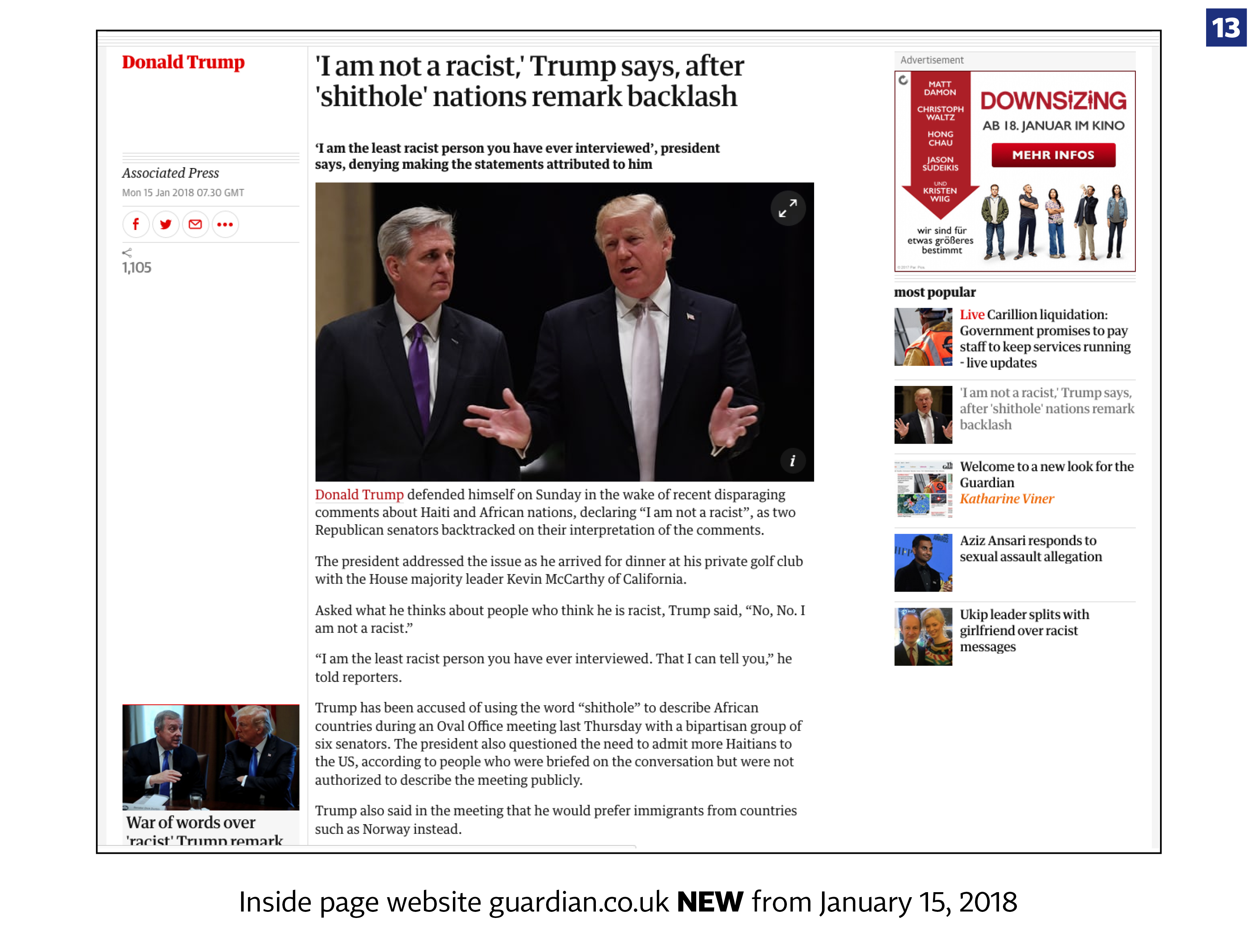
New inside pages: Overall more detail, very properly done. Architecture, use of photo’s, typography. Still very Guardian. In general it eyes more popular than before and more magazinish in my opinion. The yellow bars in the sport-section, the highlighting in yellow. It looks a bit cheaper. I wonder out loud if the perception of authority is diminished because of the detailing and colorization. It’s beautiful, to use the words of Guardian editor-in-chief Katharine Viner. But I don’t agree that it feels bold. I certainly hope size doesn’t matter, like it mattered somehow to The Independent. Apart from that still state of the art.
innovation: In-house designer Mark Porter surprised everybody with the Berliner Guardian back in 2005. By far one of the best innovative designs in the history of newspapers. I still think the design of The Guardian stands the test of time and is being honored in this redesign. The design-team did a very good job in updating the design to the (not so easy) size.
Webdesign: The webpages still seem to have the structure of the former design. It still looks good, but again less distinctive. The use of color in the headlines makes it a bit more messy. Nevertheless in my opinion one of the best newspaper-sites in the world.
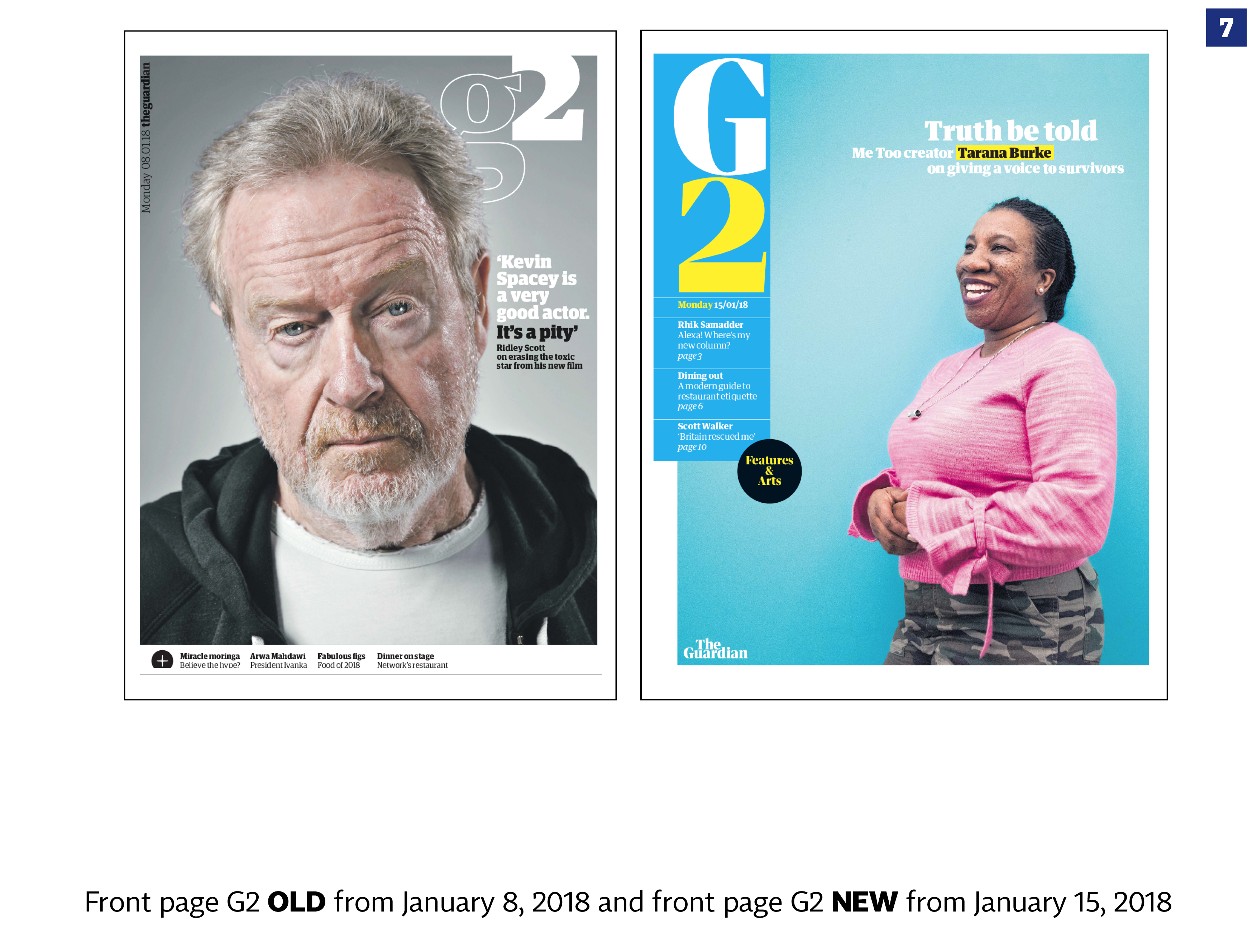
Jordi Caala: A wink to the young reader. More modern and flexible cover but less elegant and less serious than the old cover. Norbert Küpper: The new version has a yellow strip in the headline. Nice idea.
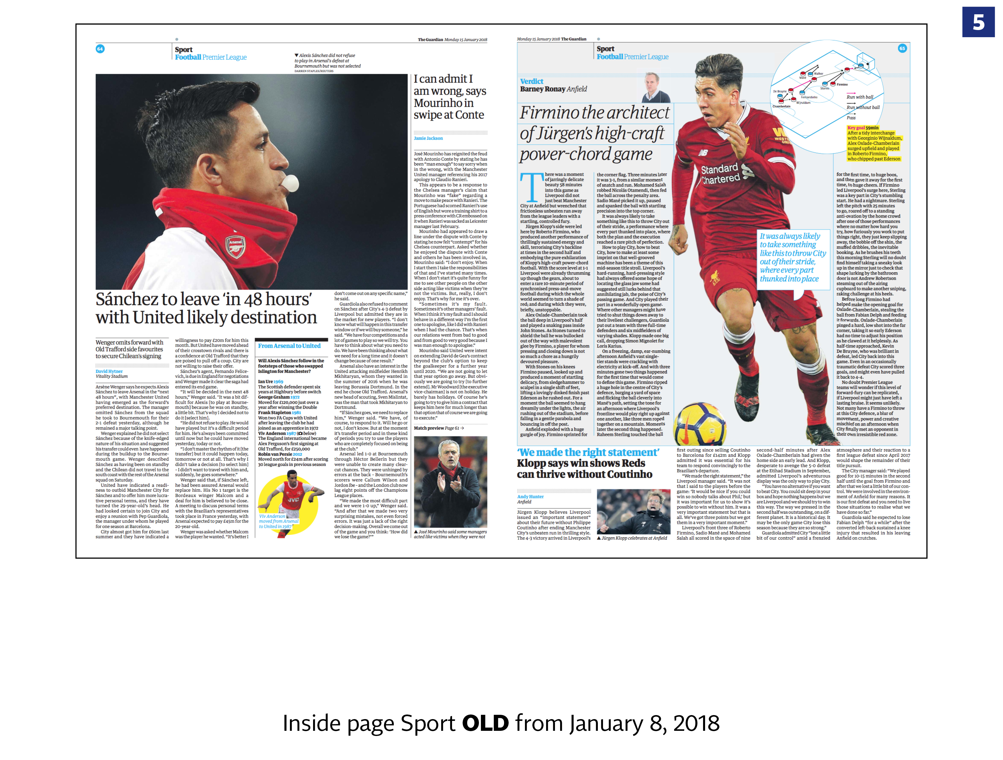
Norbert Küpper: also in the old layout, The Guardian had tabloid supplements with really professional use of pictures.
Jordi Catala: This page is very similar to the old one that already had a great quality. It is important to use the illustration.
Neues Format: Das Format ist (neben der neuen Schrift) die markanteste Veränderung. Eine sympathische Größe; sie erlaubt ein leichteres Handling beim Lesen. Und verstärkt den Magazincharakter der Zeitung.
Neuer Zeitungskopf: Die Wortmarke (Logo) besteht wieder aus Groß- UND Kleinbuchstaben. Der Schriftschnitt ist jetzt weniger rundlich, sondern spitzer, schärfer, bissiger. Genauso wie die journalistische Haltung des Blattes.
Neue Titelseite: Der Seitenkopf ist durch die breite Farbpalette frisch und lebendig; der Textteil darunter zurückhaltend und solide. Als Mischung wirkt die Seite wie ein attraktiver Blumenstrauß in einer stabilen Vase.
Neue Innenseiten: Weiterhin klar gegliedert und funktional. Das neue Format ermöglicht markantere Panorama-Gestaltungen über die Doppelseite. Ein Schwachpunkt ist leider geblieben: der geringe Abstand zwischen Fließtext und Fotos.
Web Design: Reduzierter Einsatz der Hausfarbe blau, dafür mehr Farben. Sie sorgen für Frische, ohne billig zu wirken. Die Glaubwürdigkeit und Wiedererkennbarkeit des Guardian bleibt erhalten.
Jordi Catala: It is an extensive website with a lot of information. This website has good navigation. In essence they are very similar to the old and the new,. Colour change in the headlines (Blue-Red) and the result: smoother tones. Each section has a corporate color. In my opinion, it helps the reader. Norbert Küpper: In comparison, the new masthead looks better than the old one. Also the navigation menu on top of the page is better legible.
1st Page
• The typography is even better than the old (good) one.
• Masthead. I prefer the old one as a logo. It offered a good horizontal grid, organising the upper part of the page. The absence of that horizontal strong title gives a result of a typographic chaos, with 9 lines of titles one after the other.
On the other hand, the new is more ‘fluid’, the colours are brighter and the final result looks… happier!
• I find the text of the first article a bit long. It could be at least 100 words shorter, so as to have an other strong visual element at, for example, the bottom-right of the page.
• The old berliner shape had space for ads. With the tabloid, things are going to be difficult.
Inside pages
• I prefer the new one. It has a more relaxed and pleasant layout, colours are brighter, pages are more organised with good proportions of pictures. The grid looks working good, but needs some time to mature.
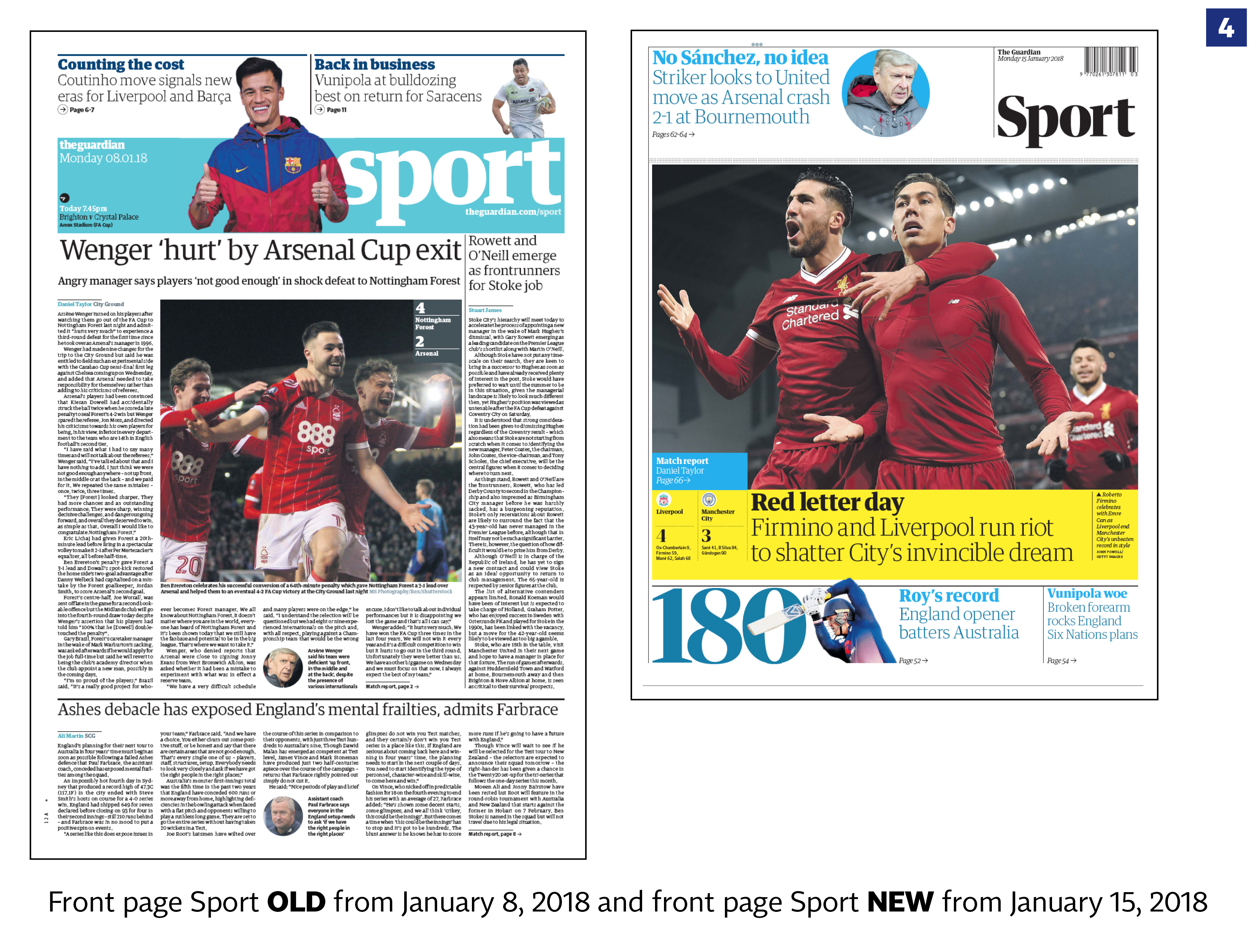
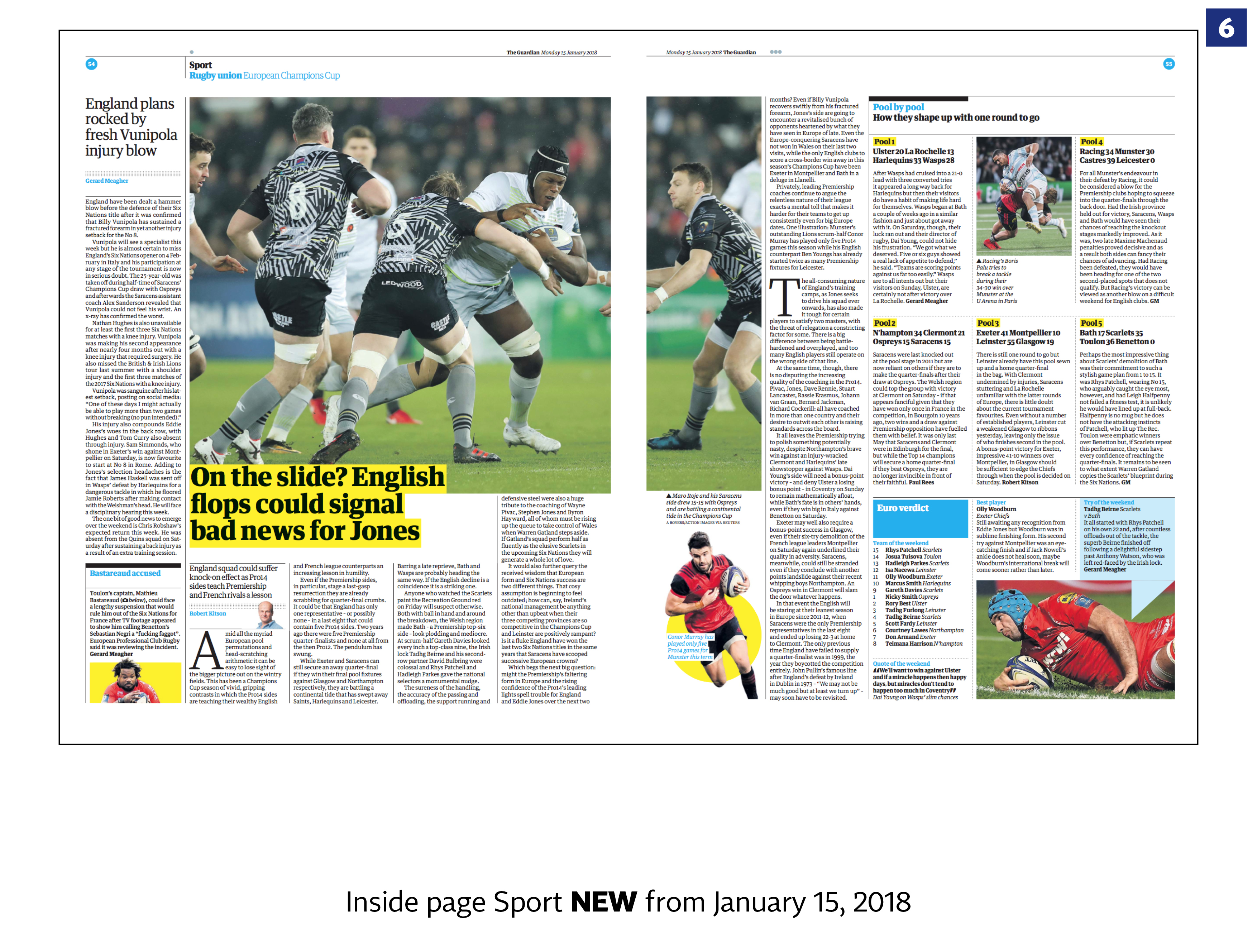
Sports
• The new is very good. Could be even better with a stronger ‘first’ page
G2
• I prefer the new cover page, but I am not happy with the coloured titles in the inside pages.
Marco Grieco, Art-Director Expresso, Portugal. He has won several awards with his team in newspaper competitions around the globe. Expresso was “European Newspaper of the Year” in 2006 and 2015. Here his statement:
It is hard to talk about a newspaper redesign just looking for its first edition with the “new look”.
And it is even harder when we are talking about a newspaper that basically changed the way visual journalism was done some years ago.
And that is the case with The Guardian. Mark Porter’s project was a brief of fresh air to all of us.
And it is sad that we are now reaching the end of this era…
For me, it is specially sad because my newspaper, Expresso, had a lot of similarities with Guardian.
And we believe in a lot of trues that they seemed to believe, too.
It is very sad — in a way — that they are trying to save some money with a new format. But, at the end of the day, we are all passing by hard times…
Due to the design, it is far from new but it is interesting that they are trying to go back to the basics.
Basic grids, basic colors (the old safe port of CMYK but with too much yellow for my taste…), with less white spaces and an enforced connection with the web-design.
They were courageous — again – but far from the revolution that they launched in 2005. Sign of times, maybe…
Looking to their new masthead and front page, I really think that it is a step behind. It sounds a little bit confusing to me.
On the other hand, the Sport section is my favorite one in this new incarnation of the paper. Well balanced and dynamic.
I’ll probably have to wait some more days to understand – and love or hate — this project.
Jordi Catala: The new page looks a lot like the old one. It is an extensive website with a lot of information. This website has good navigation. In essence they are very similar to the old and the new. Colour change in the headlines and the result is smoother tones. norbert Küpper: the basic structure of the website wasn’t souched. The new headline typography is an improvement.
New format: The old format was more distinctive. Everybody got tabloid today so Berliner is more striking. But I understand they choose for tabloid now, it is easier to handle. And you have to choose what you gonne put on the pages, you have to think about the content and the pictures again. That is good, nice and a challenge.
New front page: Maybe risky to create a whole new masthead, but this one feels like it has always been there. Good to say goodbye to the blue-white variant and choose for black. It looks clean, bright and is good to use and still recognizable. Nice font, some more interline creates more readable pages.
They only use the light variant of the font in heads (front and insidepages), that is a daring choice but sometimes I miss the urgency of some articles. With the use of a bold font you also create some importance on a page.
I’m not amused by the colored text above the masthead. I think it is to much. It is a little bit a color circus. I like the red color. Use one spotcolor, it gives more rest on the page.
I’m curious how they handle advertisment on the frontpage. Do they dare to choose for a photo so you get a magazine look-and-feel or they gonne choose a frontpage with multiple elements.
The use of lines is too much. Horizontal and vertical lines, at the byline several lines, sometimes at the head. Too much lines. They use sometimes column lines and in the sportsection dotted lines. It feels like it is not consistent.
And maybe a little bit more white space on the page. At the photo the line is almost bumping at the photo (above) and below the text is very close to the photo.
New inside pages: I like the white space they created above the pages. On some pages they put there a caption, that is not necessary. Better and nicer is to put there one word like news, national or sports and the pages with a subhead also looks nice.
Create some more white space so you also created some rest on the pages. Also some more white space at the photo’s and head or text, you also create some white space to put the caption over there.
At the inside pages are also too much lines.
I really like the quotes in the red box. I think the commas in the old design are more stylish. And I like the photo with the bigger byline and the head in the color red and the small icon of a camera. The eyewitness photo is beautiful!
The balance between photos and text is good, also because they use boxes with quotes and at some pages a smaller column, that breaks the long articles.
At the sportpages is the color yellow very dominant. Choose for one color. Blue or black is ok, and than it is equal at the website. It feels like the sportpages are a totally different newspaper. Cover/frontpage is nice and good that they choose for one photo and some announcements text. Yellow please dont’t. Inside pages feel a little messy. Blue, yellow colors in boxes, different use off lines, color or black and also dotted lines.
The initial is in the new design more elegant than in the old design.
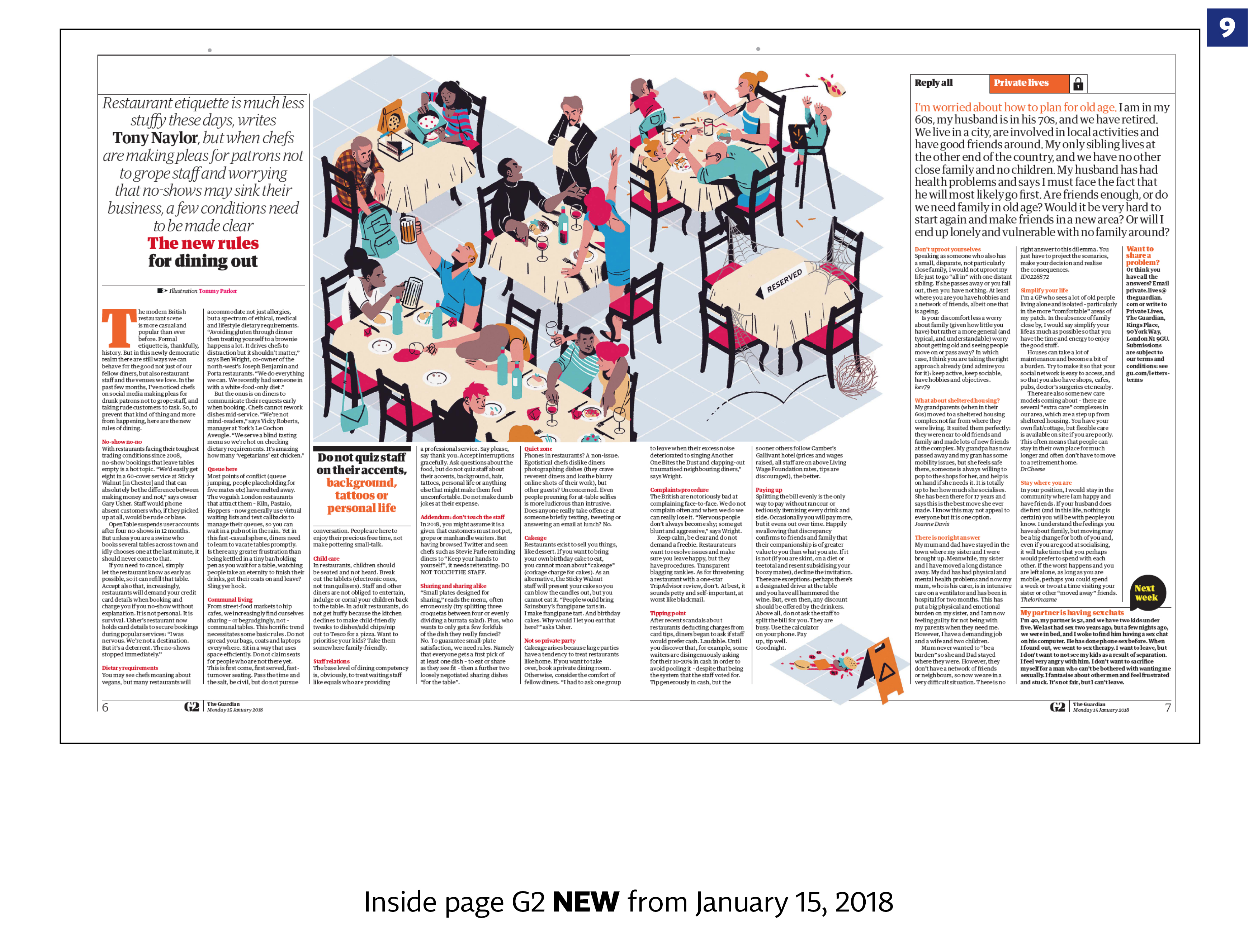
The G2 section is again totally different and it also feels like it is not making part of the newspaper. Create some unity or harmony with the other pages. At this section it feels like everything is pulled out of the closet. All kinds of colors, different boxes, textlines in color (always tricky). I think it is very messy. Bring some more rest and white space and it makes the pages more readable. Dare to choose.
I like the old cover, mainly because the use of color in the new cover, blue and yellow. Is this every day different? The designer choose a color that matches the photo?
innovation: There are some nice things in the new design that makes it readable and more attractive, but it is not a very big innovation.
Webdesign: Nice use of the different sections in color. I want to see that also in the newspaper. News is red, sports is blue, opinion is orange etc. Try to implement that in the paper also. Only use the sectioncolor and no more.
Marianne Bahl, Art-Director of Børsen, Denmark:
My overall experience of the redesign of the Guardian is incredibly positive. As a reader, I immediately feel a new and different pace due to the design, the choice of colors, the grid and the compact layout. It’s a pleasure.
New format: The format is a good choice for the paper. The content has a great life inside that format. The choice of colors is very vivid which adds to the whole expression. I like the yellow which runs through the design. And it’s a compact layout, but still with air to breathe in.
New masthead: I like the new masthead. The masthead itself works really well. I like the typography, with the sharp edges and the black that make the weight. It has gained a weight that expresses both print and digital elegantly.
New front page: the front page has a little bit of a difficult design in the upper part the page, I think. It takes a very good designers eye to make it vivid yet readable. But all together I think the elements work nicely together.
New inside pages: I think the grid works very well, and there is a compact expression which I like. It has a taste of magazine yet still print. And It suits The Guardian well.
Jordi Catala: Better reading of headlines (Typography in Bold). Clean and tidy and agile reading. These are very similar pages.
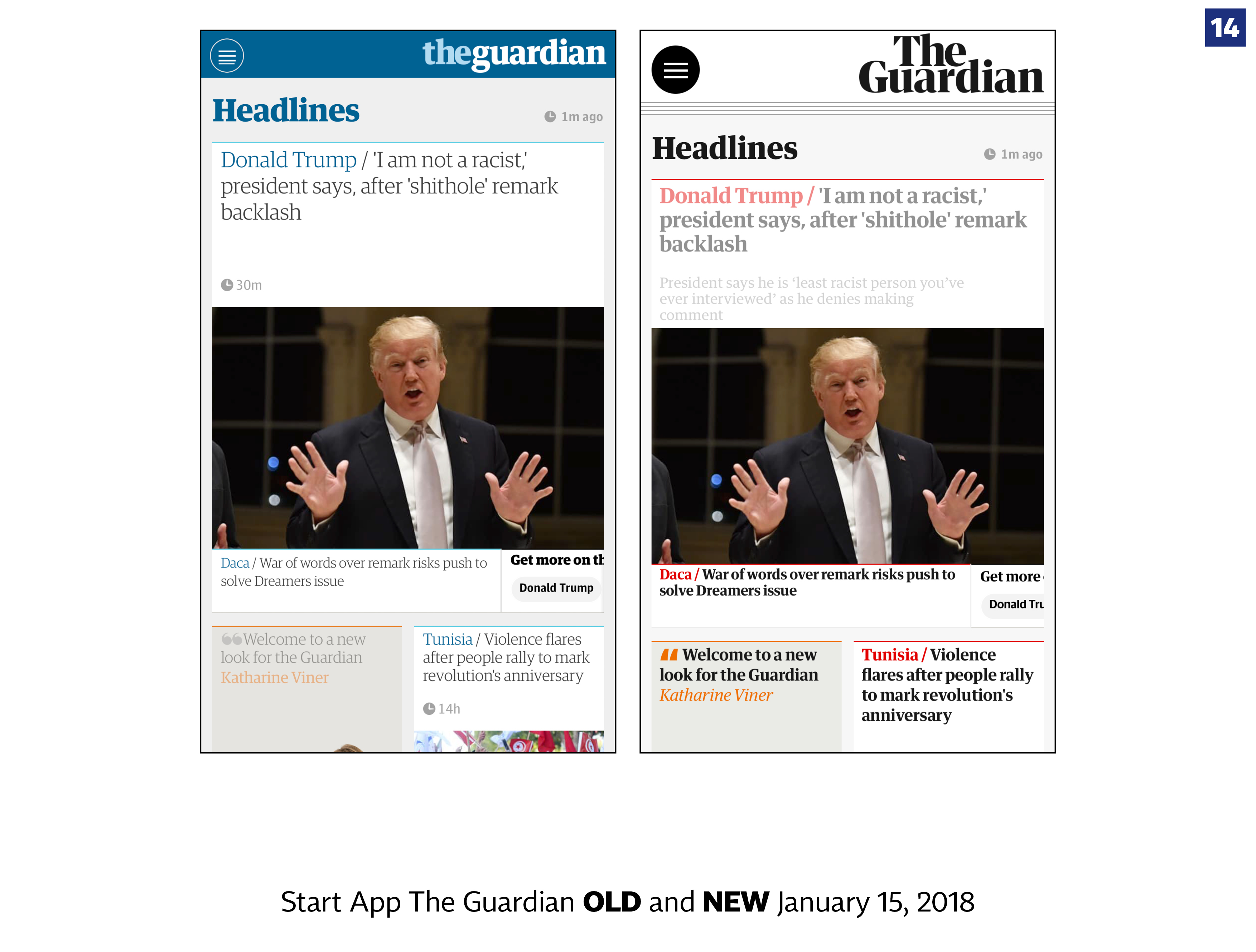
Norbert Küpper: Good that they have changed all media at the same time: Print, Web and App. Now you can see a crossmedia corporate identity. It was created by typography and use of colour.
New format: Very correct. More comfortable to open. Easier to read and carry
New masthead: More modern, more agile to read but perhaps there are too many colors
Innovation:
– It’s positive.
– Modernize and make the diary more enjoyable to read.
– It is an advance in visualization, structuring and outstanding pieces with iconography.
– Color in typography helps to understand.
– Design helps to better understand.
– The newspaper is more didactic.
– The summary on page 2 is an excellent idea that helps to organize the newspaper.
– I am personally concerned about the lack of infographics. There is only the weather map (¿), a sports square and a small location map. Informative graphics are not featured in the new The Guardian.
Eberhard Wolf, Art-Director, Luxemburger Wort, Luxembourg. He was Professor at MAD in Munich and Art-director of Süddeutsche Zeitung, also Munich.
Aus meiner Sicht liegen Freud und Leid bei diesem Relaunch sehr nahe beieinander. Seit Montag erscheint „theguardian“ mit einer veränderten Gestaltung und in einem kleineren Format. Der Reihe nach. Das bisherige Berliner-Format entsprach der Wertigkeit, die man dem Guardian als Leser zollte. Es hatte etwas von Größe und Souveränität. Mit der Verkleinerung auf das Tabloid liegt der Verlag im Trend zu kleineren Zeitungsformaten. Dahinter stecken meistens hohe Einsparungseffekte im Druck. Wahrscheinlich auch hier.
Im Falle des Guardian werden nicht nur die Druckkosten reduziert, sondern auch die Inhalte reduziert. Ob dieses durch höhere Umfänge kompensiert wird, wird sich zeigen. Bei allem Verständnis für die kaufmännischen Aspekte, halte ich die Reduzierung des Formates als Signal nach außen für problematisch. Visuell betrachtet verkleinert sich nicht nur das Format, sondern auch die Bedeutung — was ich nicht hoffe.
Die Titelseite und insbesondere der Zeitungskopf haben verloren. Eindeutig konnte man bisher „theguardian“ lesen. Es war ein feststehender Begriff — sprachlich und typografisch eine Einheit. Heute habe ich im ersten Moment „Tee Guardian“ gelesen. Das neue Logo verschenkt die bisherige Eigenständigkeit und Lesbarkeit. Es ist typografisch zwar alles richtig gemacht, die Buchstaben sind gut ausgeglichen und die Schrift ist markant, nur der alte Schriftzug war klarer und eindeutiger und war auch noch in kleinen Schriftgraden gut lesbar. Das wird der Neue nicht sein.
Die neue Art der Titeltypografie mit den bunten Buchstaben und der verschränkten Anordnung von Bildern erlaubt mit Sicherheit viele Varianten. Plakativer wird das neue Titelbild aber nicht.
Die Innenseiten orientieren sich weitgehend an den bisherigen Gestaltungsmustern. Die Seiten gefallen und wirken im Vergleich zu den alten Seiten leichter und aufgeräumter. Das liegt vielleicht an den neuen Seitenköpfen.
Neben einer Vierfachlinie zur Kennzeichnung von Rubriken und „Zitat-Bubbles“ liegen die wirklichen Revolutionen in der Einführung der Farbe Rot als Leadcolor und Gelb als Akzentfarbe. Ingesamt wirken die Innenseiten nicht neu, obwohl sie es sind. Sie sind einfach gelungen. Angenehm empfinde ich den zurückhaltenden und trotzdem prägnanten Umgang mit Zahlen. Es ist bestimmt kein Fehler, wenn bei der vorliegenden Ausgabe auf übertriebene Infografiken verzichtet worden ist. Auch der Umgang mit Fotos ist gewohnt professionell.
Contact:
Norbert Küpper
Office for Newspaper Design
Gutenbergstr. 4,
40670 Meerbusch, Germany
Email: nkuepper@editorial-design.com
Phone: +49 2159 911615
If you have read the story up to this point, you are probably interested in a facebook group about editorial design. Newspaper and magazine design and also Logos and stationery design are the themes.
https://www.facebook.com/groups/333596403813055/