A New Nation Brand for Australia
Update: In July 2020, we discussed the new Nation Brand for Australia here. Today, in April 2022, the final version has been published. It is a return to the kangaroo. More details are at the bottom.
Australia has established a “Nation Brand Advisory Council” in summer 2018 to develop a new nation brand. The new trademark was presented in December 2019 and has not yet been officially introduced. Andrew Forrest, Chair of Australia’s Nation Brand Advisory Council writes in the preface to the pdf presentation: “Our approach has been to develop a brand platform that allows Australia to show up overseas in a more unified manner and celebrate its unique people, places and products.”
Like so many new trademarks, whether for a company, city or nation, the new trademark is controversial. These opinions can be found on the web: it looks like a circular saw. It looks like a virus. We want the kangaroo back, because it is a unique symbol for Australia.
That is why WOLDA – Worldwide Logo Design Award – invited experienced brand designers from all over the world to express their opinion on the planned new trademark of Australia. They come from Japan, USA, Brazil, Luxembourg, Denmark, Germany and Australia.
– Gary Schmidt, Loa Branding, Brisbane
http://weareloa.com/
– Chikako Oguma, Art Director, Tokyo
http://www.chikako-oguma.com/
– Kat McCord, thackway mccord, New York
https://www.thackwaymccord.com/
– Rodrigo Faustino, Commgroupbranding, Saõ Paulo
http://www.commgroup.com.br/
– Claudia Eustergerling, Claudia Eustergerling Design, Luxembourg
https://www.eustergerling.lu
– Christian Baun, logodesign, Copenhagen
https://www.logodesign.dk
– Norbert Küpper, Editorial Designer, Meerbusch, Germany
https://editorial-design.com
Links with background information
The 23-page Pdf of the Nation Brand Advisory Council is available for download here: Download Pdf
Criticism of the new logo because of the costs and because one misses the previous kangaroo: spectator.com.au
On the website www.dailytelegraph.com.au is says: “Marketing experts have largely given the thumbs down to the newly-approved logo for Australia’s international trade logo, with one saying she wouldn’t have picked it in a week of guesses.”
On the website www.bandt.com.au it is stated: “I can’t believe they have changed the Australian made logo to look like this, it looks like a virus …”
Example Global Mark
![]()
All images are taken from the presentation of the Nation Brand Advisory Council.
Typography
![]()
Wattle Glow
![]()
In the presentation it says: “The wattle glow is a visual device built from the mark. Using the same Indigenous painted dot technique the glow can be used to add our sense of irrepressible optimism into communications.”
The following questions:
In your opinion, what are the arguments for and against the new trademark for Australia?
What is your opinion about the new nation brand?
The anserws
Gary Schmidt, Loa Branding, Brisbane
http://weareloa.com/
Australia is changing and maturing significantly as a culture and nation, so it seems an appropriate time to ask if how we present ourselves in international markets still makes sense.
It’s no coincidence that the term “cultural cringe” was coined in Australia – we’re still reckoning with our past so we can get on with our future. Part of this reckoning should include questioning whether the incumbent symbols of our nation still hold relevancy for who we are, and who we are becoming. What do we need to keep, what do we need to create?
As an Australian branding consultant, I find this latest development extraordinarily frustrating and disappointing.
I struggle to find cultural relevancy and longevity in this mark. It feels forced in its references (a kangaroo tail? co-opted and Indigenous art? typography as broad as our country?) and clumsy to execute, reading more as a campaign than a brand (which is no surprise given the execution comes via an advertising agency).
I find there is nothing particularly or distinctively Australian to it, especially for a foreign audience who would be largely unaware that the wattle is our national floral symbol. I also believe that the rendering of the wattle is far too figurative for it to ever be read as a symbol, which is the primary role of a trade mark. Mechanically it will be difficult to execute, especially at smaller sizes which it will be in most instances. All this leads to the question: what is the intent of this mark?
It’s somewhat baffling that a brand intending to “shift perceptions of our nation (in a way a kangaroo could not)” would simply move focus from the nation’s fauna to flora, and still reference said kangaroo. More layered, richer story telling and recognition could be achieved through an abstract mark.
Overall though, my biggest frustration with this piece is that it serves to fuel the ongoing media narrative that branding is an expensive, wasteful process.
Chikako Oguma, Art Director, Tokyo
http://www.chikako-oguma.com/
The Australian Nation brand mark is a kangaroo that has been popular for over 30 years. This mark is instantly recognisable to everyone as Australia. This very recognisable and well-loved mark is a national asset.
I want to start by saying that I don’t think the new trademark is a bad design. But I think it’s important to know where this mark will be used for first and for what purpose.
I read the concept of the Nation Brand, published in December 2019, and I thought it was wonderful. It’s the wattle flower motif, which is also used in the national emblem, and in the context of history, the new mark also respects Aboriginal culture.
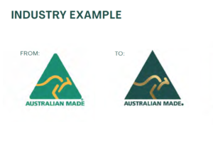
On the left is the old kangaroo logo, on the right the new one. The logo is enriched with gold and a dark green. It is to be used as before for the “Australian Made” segment. Source: Nation Brand Advisory Council Recommendation
However, I don’t think we should discard the highly recognized kangaroo mark for a single point of use – “Australian made” – to announce the country of origin. I like the colors of the renewed kangaroo symbol and the sharper triangle on the outside outline, but I think the shape of the kangaroo path is more beautiful than the previous one. This brand has been revamped for a cooler image. I think this redesign is good. (I find the old kangaroo pass shape to be more sophisticated than the new one.)
Summary: Two completely different brands were presented, the kangaroo and the wattle flower. I suggest the kangaroo for the general nation brand and the wattle flower as brand for tourism and culture.
Kat McCord, thackway mccord, New York
https://www.thackwaymccord.com/
The brand idea for Australia’s new nation brand is a home run: “Only in Australia”. And the words used to describe its values and personality – optimistic, unique, irrepressible, friendly and dynamic – were sure to inspire great work. So what happened?
An advertising agency did an ad campaign. And a lifeless one at that. Australian branding and design studios are some of the best in the world, why not commission one of them?
I actually quite like the golden wattle symbol, it does have some of that promised optimism and dynamism. But paired with a fusty and conservative dark green? And while the gold is rich, and surprise! Au is gold in the periodic table (how clever is that agency folks!) gold is impractical and often disappointing to implement on a brand so wide ranging. The type is fine. It is acceptable. But isn’t it a bit heavy and solid for a country as effervescent as Australia?

On the goldenwattleflag website it is stated: “The Golden Wattle flag finds inspiration in these symbols, drawing them in conceptually and concretely, to build on the story of who we are as a nation and a people.” Source: http://www.goldenwattleflag.com
I actually think Australia could have saved itself money and trouble. The golden wattle symbol created in 2016 by Jeremy Matthews of https://www.miaandjem.com/ for the proposed Australian Golden Wattle flag http://www.goldenwattleflag.com/ would make an enduring iconic nation brand. I am sure he would be happy to set some type to it.
And then there is the Made in Australia kangaroo mark. It lives to see another day. And from an international point of view that is a good thing as it is an obviously recognizable symbol. But now the kangaroo gets to be shiny gold.
Rodrigo Faustino, Commgroup Branding, Saõ Paulo
http://www.commgroup.com.br/
Rodrigo Faustino: Entrepreneur, Founder of Commgroup, Design editor and curator from São Paulo – Brasil
Australia – as a brand – is certainly more than a kangaroo.
Now, what about wattle?
Australia has a new nation brand.
For decades, Australia has given the world the image of the kangaroo character as a synthesis. Now it is changing to another local nature symbol, the wattle. If you don’t know what wattle is, and why it represents Australia, don’t worry, neither do I until writing this article.
To be honest, the strategy of reinventing Australia’s nation brand splits into two main points, and I am stuck positioned between the two.
First – we have to empathize with “what” they are envisioning.
Second – what is the “world” feedback on the meaning of a nation like Australia? Does the new Australia’s nation brand remain understandable?
Sometimes, as designers, we have to take a path against the flow, despite the majority’s opinion, to design a remarkable brand. Yes, I suppose we agree that we are not talking about the logo itself. The reflection here in this article is about the reputation that the image of a nation involves, built by its very existence. A nation brand must seek to inspire the real purpose of a country, and that means finding a balance between politics, people, local nature, and the statutes of a nation, all aligned to achieve the main concept. In this scenario, the wattle symbol in the new Australia’s nation brand resembles the old-fashioned kangaroo character, in which it repeats the same simplistic idea of a nation based on a nature aspect instead of bringing a new and broader concept to Australia.
In times of crisis like that caused by the current COVID-19 pandemic, we have realized how fragile the boundaries of the concept of a nation can be in terms of meaning. The political and market positioning of a nation sometimes fails to take into account the importance that its people have on the planet. They forgot that it’s about people and not about things. So, when the world has stopped for six months watching how quickly a virus spreads across the planet and feeling the breeze of a global economic breakdown, we notice a world less organized as a group of countries and more organized as a group of human beings as a unified civilization.
In addition to the idea of having a wattle symbol in the new Australia’s nation brand, it is becoming more evident that the world has lost the true identity of humanity, and that is quite simple to understand given the fact that we are still looking for what we “have” instead of what we “are” as a society.
In terms of strategy, perhaps this is the most appropriate time to launch a new nation brand for Australia, not using symbols that would represent it, such as the koala, the boomerang, the kangaroo, and now the wattle, but something that would represent the Australian people, who they really are, their feelings, thoughts, values, and beliefs. Isn’t that the real meaning of a nation, the people who live there? Symbols, therefore, are only one side of a nation in this case, not the center of communication.
Design is more than creating a novel brand aesthetically, it’s the ability to reveal the concept that is inside of it. That includes “fixing” the cultural misunderstanding of what a brand represents by creating conceptually notable brands.
Thus, if you think the discussion about the new Australia’s nation brand is just about designing a brandmark, maybe they have the right arguments to get the project to meet its goal. But if you think that a nation brand is a foundation on which the values of a new era of brands are established, maybe they are giving to Australia a pointless brand concept for decades to come.
Claudia Eustergerling, Claudia Eustergerling Design, Luxembourg
https://www.eustergerling.lu
In your opinion, what are the arguments for and against the new trademark for Australia?
A new trademark for Australia? Do I have arguments for or against? Stocked in my day-to-day stuff, it took me a while to focus on the subject and form my opinion to answer your questions and comment. Honestly, it must have been either the volume of the 23 pages PDF or the first impression which held me back and blocked my mind. Taking part in a discussion without having worked the document through makes me feel uncomfortable in a way, but anyway, I guess I can identify a good result.
Talking about a new trademark demands knowledge about the old one, doesn’t it? At least it raises questions. Which image of Australia do I have? What does Australia stand for? Is there a need to correct a perception? Or is it to take the opportunity and work out a strong brand with all advantages and economic value it in general offers? Questions that are important to come up with on a regular evaluation schedule and answer based on analysis and reflection about its identity. As I visited Australia but do not remember any Australian trademark or visual identity, I welcome the intention.
Here in Luxembourg, we recently started the national branding process, and the government came up with today’s logo claim ‘Luxembourg – Let’s make it happen.’ Even if the country is not comparable to Australia in geographical size, the scale of the challenge is the same. Be sure, we had many discussions, for and against, but the more the trademark is in use, displayed in public space and exported, the more Luxemburgish people, born residents and new, identify with and become a proud community. An effect that delivers plenty of arguments for a trademark, regarding from a cultural, social, or economic perspective.
Talking again about Australia, its history of immigration, and today’s world with not only the international competition but simple requirements, it makes sense to question the image and develop a strong brand. Branding is a process. If there is no brand identity designed by time and nature, it needs to identify the character and values. It is working on mindsets and perceptions. A strong brand grows over time. So, no need to judge ultimately at this point. But let’s see what’s in here to work with.
What is your opinion about the new nation brand?
Let’s make my second answer short. I like to mention four points that summarize my opinion about the new nation brand, most of them are negative:
– My first impression was: It looks old.
– My second: It does not work very well. There are too many elements and styles.
– Third thought: No go, it seems like a virus! A fact nobody could foresee last year.
– Still, my fourth reaction was a smile and, in its way, positive: There is this cute little detail, the tail of a kangaroo which fits perfectly to Australia. But somehow, they did not manage to make use of it in a way that it makes sense at this point.
Those of you who are interested in knowing more are kindly invited to continue reading, but that’s it all in all.
Australia comes up with a new visual identity that has nothing to do with the Australian National Flag. It is based on the color-combination Gold and Green. We already know the combination of Yellow and Green from Australian national sports teams’ dresses, just to mention any example seen in the international context. This continuity is a statement, and I like the fact that it is. But unfortunately, they have chosen a very classic green shade, which is more familiar with the British. It makes me think of the brand After Eight, which my grandparents liked. In combination with gold, it appears even more classic, and I miss the contemporary in here. Let’s hope future image language will cover this.
The Typeface is robust, transparent, and individual in line with the narrative approach. What I miss is a stylistic link to the ‘wattle’ symbol with its ‘AU.’ To me, the brand appears like two marks, and I miss a decision for one of them. At least at this point in the branding process on which I commented before I miss it. Due to COVID-19, the ‘wattle’ might be interpreted as a virus. Point to discuss before continuing the journey of the branding process. Right now, I wouldn’t spend a cent on a wattle-virus-pin unless it symbolizes a solidarity campaign.
Finally, let me add a comment on the lovely little detail of the ‘R.’ It’s a pity it is not part of the letter ‘A.’ Otherwise, it would make a perfect symbol. Here it is one element of many others. Almost in the center of the word, close to the middle of the logo, but – just almost, right now.
Christian Baun, logodesign, Copenhagen
https://www.logodesign.dk
The new brand platform try to create international awareness around Australia, with the aim of attracting foreign investment. The idea is to develop a holistic brand platform that will unite and celebrate its unique people, places and products. Of course, this is not done by simply changing the logo. You do that with a large-scale branding campaign!
What are the arguments for and against the new trademark for Australia?
– I like the new trademark. I think it will help Australia achieve its goals. It shows that Australia is much much more than just kangaroos. The many dots show that the country is versatile, but still a unit. Composed of cities and country, various human races and many possibilities. The country is large – but it still gathers in the middle (where all the lines meet).
The new mark is beautiful. It is organic – which is a nice greeting to the magnificent and well known nature. Some details may disappear in small size – the trademark will just transform a bit, but it will just make it more vibrant.
It is difficult to compare the old and the new logo. The old logo is more of a recognition symbol – and the new logo is more of a branding element.
It will take many years before the new mark gets the same level of awareness as the kangaroo brand. But so it is with all branding – you sometimes have to change course. The new logo can be used as a flexible design element (also in wattle glow version) and that’s more the way to do it today
What is your opinion about the new nation brand?
– my answer is the same: I like it. It opens our eyes to new opportunities in Australia, and solves us for the stereotypical kangaroo image.
In the new brand, some strong elements have been developed: Strategy (who we are and how we act) + Narrative (what we say) + Creative (how we look). I have some comments about “Creative”:
The color palette: I like it. You stick to green – fine. It is conservative, but seen in context it works fine.
Brand mark: More modern, more relevant, flexible design element.
Typography: It expresses something big. Just like the country is big!
Wattle glow: A visual device built from the mark. Usable and flexible in many contexts. Does not matter if you recognize the flower.
Summary:
It’s time for the world to open its eyes to the fact that Australia is much much more than just kangaroos. That’s why I say thumbs up to the new.
Norbert Küpper, editorial designer, Meerbusch, Germany
http://www.editorial-design.com/
A Nation Brand for Australia
If you think of Australia in Europe, you see Australia “down under” on the world map, Sydney Opera House, the desert landscape and of course the kangaroo. Also the tourism logo of Australia is a coloured kangaroo. But with the nation brand for Australia, the clients are interested in more than just a tourist logo. In the brochure “Australia’s Nation Brand”, it says: “The Nation Brand needs to live and breathe in our behaviour, narrative and visual design. It must be suitable for adoption by industry and government, it must enhance our competitiveness by uniting our product and service offerings in international markets, it must endure the test of time and create moments of national pride”. In total, more than 16,000 people from international markets and also from Australia were interviewed on the topic of Nation Brand for Australia.
I have never noticed a nation brand like the one for Australia before in any other country.
USA: The distinctive flag stands for the USA. In its complexity with stars and stripes, it is an unmistakable symbol that stands for freedom and individuality.
Canada: The maple leaf in the Canadian flag is associated with nature and the vastness of the country.
Australia: The kangaroo for Australia is more associated with holidays, nature and travel. The new nation brand for Australia, on the other hand, is to be used not only for tourism but also for industry, government and service offers of Australian companies worldwide.
From kangaroo to wattle
I find it difficult to associate the kangaroo with industrial products or services outside of tourism. I therefore think it is right to move away from this icon. In the brochure on the new nation brand it says: “The Council’s preference for the Nation Brand mark was the wattle – it’s our national flower and while not immediately recognisable internationally, it will become so over time.” Very few people will recognize a plant in the new logo. But that doesn’t matter. The round and very irregular shape sets it apart from many other logos.
The colours gold and green
The gold tone with a light-dark gradient distinguishes the new logo from the often very colourful tourist logos. The gold tone stands for something valuable, precious. The dark green stands in great contrast to it. You can also create a mood board for Australia. Beside many colours of the desert and the strong red-brown of Uluru, the blue of the sky and the green of the forests would appear. Therefore, the green is one possibility among many. Green is a reserved colour that is rather in the background. Ideal if you want to use photos and other graphic elements. Gold is always in the foreground and it stands for self-confidence and quality.
Typography
The heavy and thus two-dimensional typography seen in the word AUSTRALIA associates the huge area of this continent. The kangaroo’s tail on the letter R is a small friendly gesture that the kangaroo recalls.
The variable application of the logo
I find the application of the logo on a photo very convincing. The logo and the gold tone combine with the photo and form a new unity, in which the logo and the message of the photo increase each other. The “Wattle Glow” is also an interesting visual element, which prevents the permanent repetition of the actual logo. All in all, a varied, flexible and contemporary logo is offered here.
The implementation
If I enter “New logo controversial” at Google, I get 2.410.000 results in German language. In English language there are even 219.000.000. This means that every citizen has an opinion about innovations and expresses this opinion. One can learn from this that a new logo is always controversial. One should therefore take a lot of time to show as many applications of the new logo as possible and present them openly. It is important to involve the users in innovations. Therefore, the brochure for the new nation brand of Australia could have been provided with even more effort and even more examples. A youtube video showing the new logo in its applications would also be helpful.
Summary
One can criticize the Nation Brand for Australia that it causes reproduction problems due to its fragmentation. But the advantages dominate by far: it is unmistakable, it has its roots in Australia, it can be combined very well with photos, it is very variable. Therefore: Let’s do it!
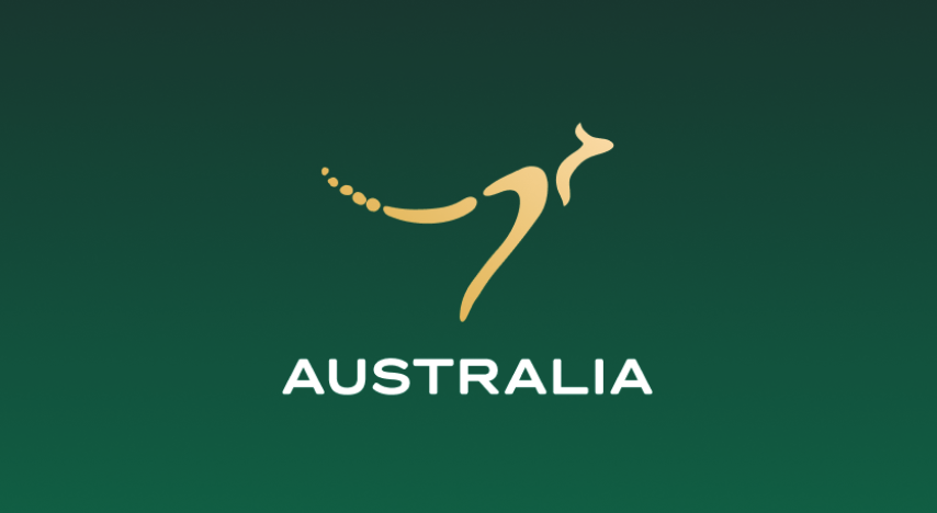
Update: The return of the kangaroo
The new logo, for which the organisation “Australia’s Nation Brand Advisory Council” was specially created, was so controversial that they worked on another solution for another two years. The website says: “Co-created with Indigenous designers, the Brand elements are inspired by ancient stories from the Dreaming and embedded with a cultural richness that speaks distinctively of Australia.” The new logo consists of a kangaroo, three boumerangs and landscape. Full details of this final version can be found here: https://www.brandaustralia.com