
19. ENA: Jury-Mitglieder zeigen beispielhafte Online-Projekte
Dieser Artikel stammt vom April 2018. Er wurde im Hinblick auf den 20. Europen Newspaper Award aktualisiert. Der 20. European Newspaper Award hat 18 Kategorien. Darunter sind auch einige Online-Kategorien, die in diesem Artikel beispielhaft vorgestellt werden. Es sind auch jeweils Links zu den Projekten angegeben. Den Call for Entries für den 20. Wettbewerb finden Sie hier: www.newspaperaward.org

Die 18 Kategorien des European Newspaper Award. Rot markiert sind die Online-Kategorien.
Jury-Mitglieder zeigen hier beispielhafte Online-Projekte aus dem 19. Wettbewerb, die ihnen besonders positiv aufgefallen sind. Manche Texte sind in englischer Sprache, manche in deutsch. Alle Preisträger des 19. European Newspaper Award finden Sie im Jahrbuch, das gerade auf DVD erschienen ist. Man kann es hier bestellen: https://editorial-design.com/de/buchbestellung/
Die Jury des 19. European Newspaper Award hatte 16 Mitglieder aus neun Ländern. Fünf haben die Online-Kategorien bewertet (von links): Björn Heselius, Principal Designer, Nitor, FIN; Professor Joachim Blum, Media Consultant, D; Andreas Kemper, Mitglied der Chefredaktion, Main-Post, D; Marco Grieco, Art-Director, Expresso, P; Søren Nyeland, Art-Director, Politiken, DK. Jury-Mitglieder sind von der Bewertung der eigenen Arbeiten ausgeschlossen. Die Online-Jury bekommt die Einreichungen vorab zugeschickt. Beim Jury-Treffen wird dann nur kurz über die Award-Vergabe diskutiert.
Marco Grieco is Art-Director of Expresso, Portugal. Marco has won the main award “European Newspaper of the Year” two times, 2006 and 2015. He has chosen these projects:
Kategorie 15.0. “Snow-Fall” Projekt, Multimedia Storytelling: “Who Owns Nevsky Prospekt”
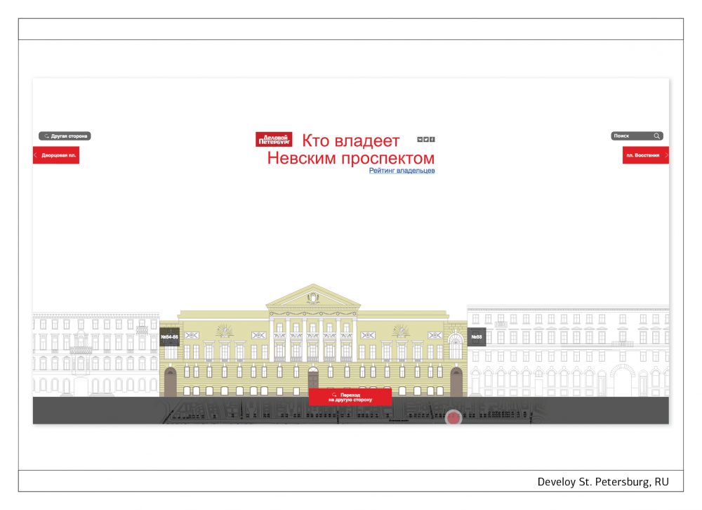
Delovoy St. Petersburg
Is it data journalism? Is it an infographic? Is it an architecture or history class? Well, this wonderful piece from the Delovoy Peterburg is all of these and even more. It is an elegant object of refined design that presents all the buildings of the main avenue of St. Petersburg city, with their most relevant information. The user can navigate it for hours and always discover some hidden treasures and curiosities. A work that meets the objective and encourage the viewer to visit that Russian wonderful city.
Kategorie 15.1. Filme, Trickfilme: “How the electoral system works in the USA?”
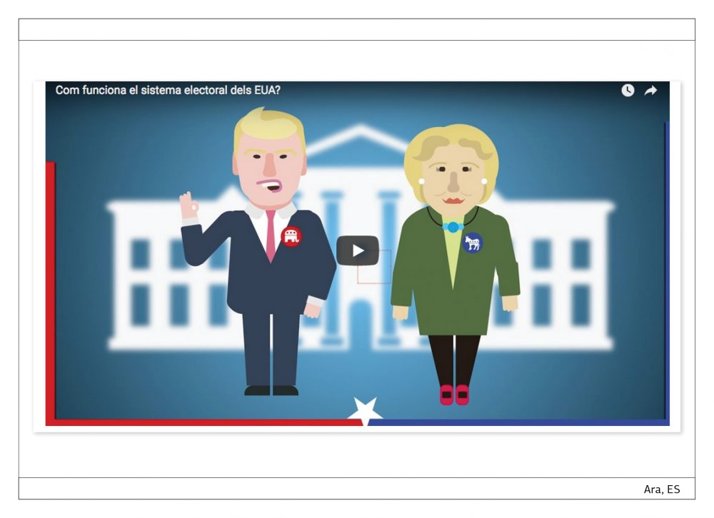
Ara.com
The United States electoral system is a little bit awkward for the regular European citizen. It is one of the biggest democracies in the world but actually with a kind of indirect voting process… So, the Catalan “Ara” tried to explain it through an animated cartoon. And succeeded, I have to say! Well designed and with a simple and funny – but not exaggerated – language that hooks the viewer, it is a good example of unpretentious multimedia format.
Kategorie 15.0. “Snow-Fall” Projekt, Multimedia Storytelling: “Ein Sommer in der Arktis”
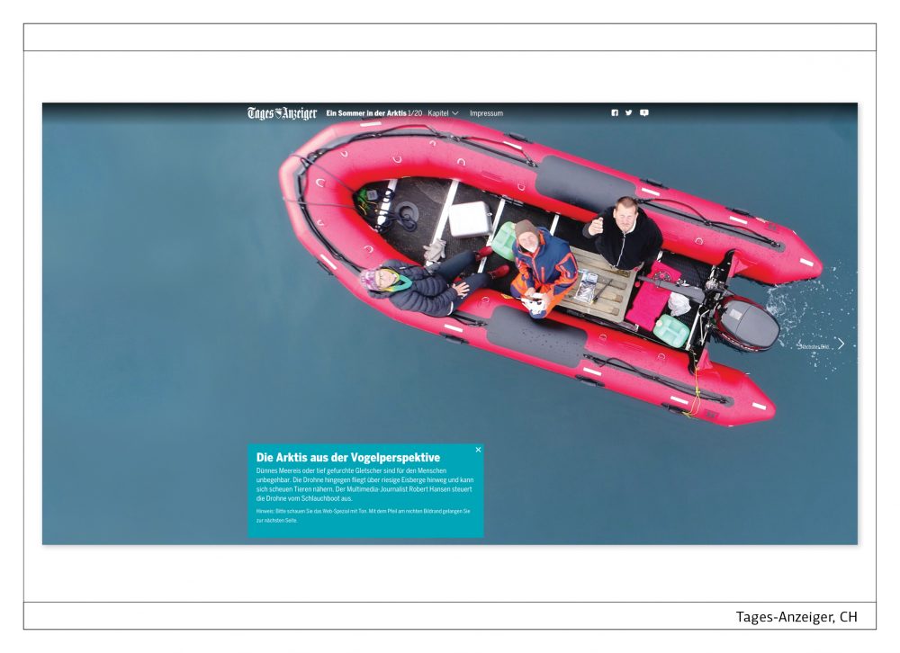
Tages-Anzeiger
Some may say that it is just a summary of drone’s videos. Maybe. And maybe it is even more overwhelming when you are showing a place that is not accessible for the most part of the common mortals. But I should say that it is not fair. It is an overwhelming example of how you/we can use the new tools to tell a rather old story. And the suspicious face of the sea lion in the chapter 5/20 is priceless… (After the start you have to click the arrow in the middle of the right side.)
Andreas Kemper ist Mitglied der Chefredaktion der Main-Post, Würzburg. Die Zeitung hat in den letzten zehn Jahren regelmäßig Awards of Excellence in Print- und Online-Kategorien des European Newspaper Award gewonnen. Er hat die folgenden drei Projekte ausgewählt:
Kategorie 15.1. Filme, Trickfilme: “A evolucao da folia”
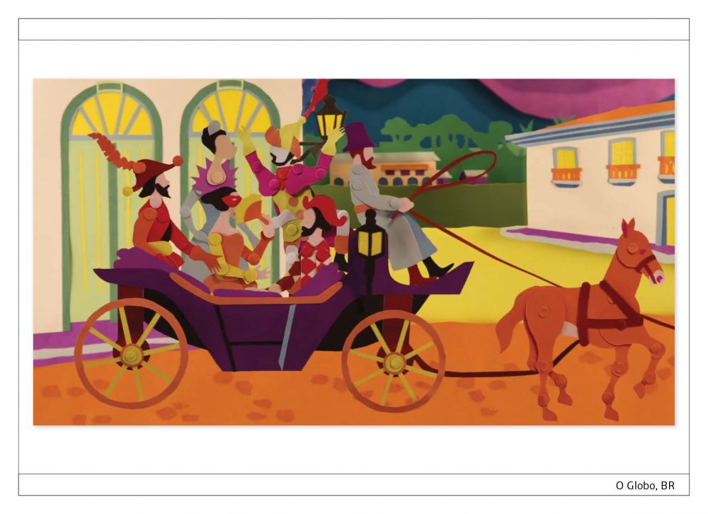
O Globo, BR
In 16 animierten Bildern zeichnet O Globo die Geschichte des Karnevals in Rio de Janeiro nach – vom Beginn des 19. Jahrhunderts bis ins Sambadrom der Neuzeit. In fünf Wochen Produktionszeit mit aufwändiger Stop-Motion-Technik ist ein wundervoll farbenprächtiges und witzig detailreiches Projekt realisiert worden, das den Betrachter in Staunen versetzt. Der eigene Stil der Figuren und Hintergründe, die Musik und die Animation loten die Grenze aus zwischen Zeichentrickfilm, Erklärvideo und Digital Storytelling. Kein Schnellschuss, sondern ein Evergreen-Content, den man sich immer wieder anschauen möchte.
Kategorie 16.1. Daten-Journalismus: “Wie beliebt ist Ihr Geburtstag?”
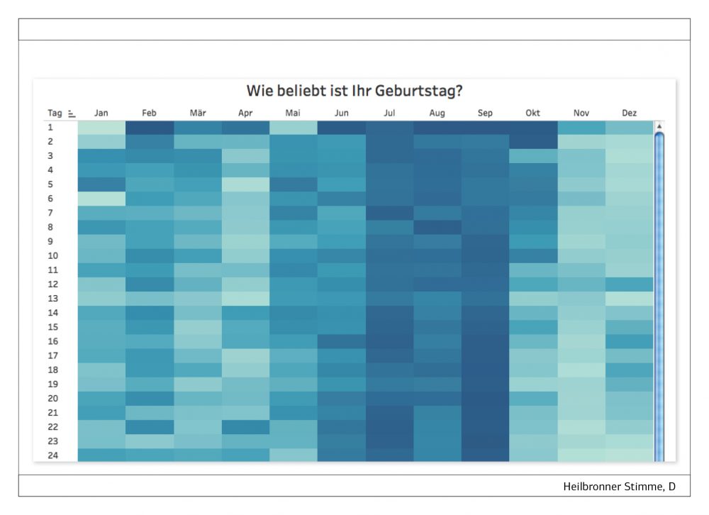
Heilbronner Stimme, D
Daten-Journalismus gilt im Allgemeinen als sehr aufwändig und als was für Spezialisten. Ist er ja normalerweise auch. Die Heilbronner Stimme zeigt, wie eine ziemlich einfache Idee kombiniert mit Big Data eine ebenso einfache aber umso überraschendere Nutzererfahrung möglich macht. Eine Heatmap zeigt die Gesamtzahl der Geburten pro Tag in Baden-Württemberg, zusammengefasst aus 35 Jahren. Faszinierend, wie in den Tagen vor Weihnachten kaum jemand auf die Welt kommen möchte, aber nach dem Fest um so mehr. Und plötzlich steht der Nutzer fast allein da, sieht er doch, dass es nicht viele sind, die mit ihm gemeinsam Geburtstag feiern. Es ergeben sich Fragen über Fragen, die natürlich nicht alle beantwortet werden – aber den Lesern der Heilbronner Stimme eine spannende interaktive Nutzererfahrung ermöglichen.
Kategorie 16.1. Daten-Journalismus: “2:59 para explicar o mundo”
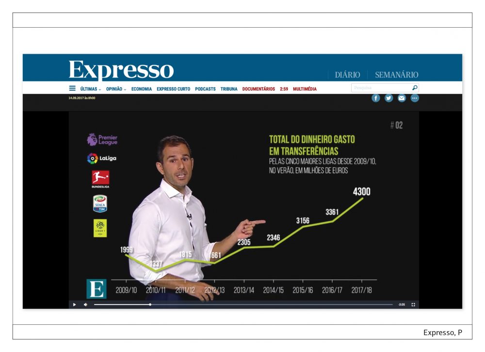
Expresso, P
http://expresso.sapo.pt/multimedia/259#gs.40bpgzI
Die Videos von Expresso überraschen mit einer innovativen Verbindung von Erklärstück und animierter Infografik. Streng in der Form und elegant in der Optik widmen sich die nicht länger als drei Minuten langen Beiträge jeweils einem einzigen Thema. Fotos, Videos, Zahlen, Karten, Balkengrafiken und viele andere Elemente wechseln in schneller Folge. Alles wird zusammengehalten vom schwarzen Hintergrund – und vom Anchor Woman oder dem Anchor Man, der nach weniger Sekunden ins Bild tritt und es auch nicht mehr verlässt, bis die Geschichte zu Ende erklärt ist. Das Format hat hohen Wiedererkennungswert und lässt keine Langeweile aufkommen. Aufklärung, die im besten Sinne unterhaltsam ist.
Björn Heselius used to be Art Diretor of Hufvudstadsbladet, Finland. This newspaper has twice been awarded the title „European Newspaper of the Year“, in 2006 and 2016. Since 2017 he is Principal Designer at Nitor, a company offering digital development, design, insight and lean-agile transformation. He has chosen these three projects:
Kategorie 15.0. “Snow-Fall” Projekt, Multimedia Storytelling: “So pünktlich ist Ihre VBZ-Linie”
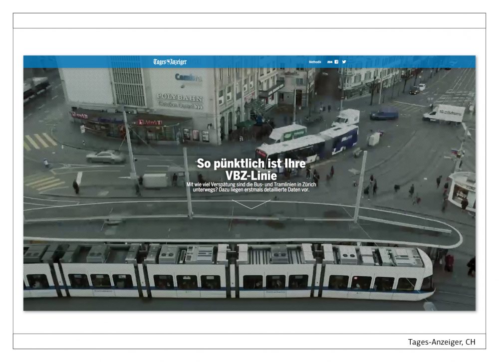
Tages-Anzeiger, CH
https://interaktiv.tagesanzeiger.ch/2016/so-puenktlich-ist-ihre-vbz-linie
The commuter traffic in Zürich has published data on the punctuality of bus and tram routes in the city. The visualizations show the three most rush prone stations during rush hour – lead by the Central, where around 46 000 people enter or exit a commuter vehicle in a typical Monday.
By analyzing the data for each bus or tram line, the fleet, each stop and station as well as the infrastructure at each stop, Tages Anzeiger has made a very useful data presentation that lets us as users know what lines probably will be delayed due to construction work or busy traffic. In other words, by opening up the data the commuter traffic company let citizens make decisions on how to avoid getting stuck in traffic and as a result they might even ease the pressure on some of the most heavily used routes.
Kategorie 15.0. “Snow-Fall” Projekt, Multimedia Storytelling: “Clinton versus Trump”
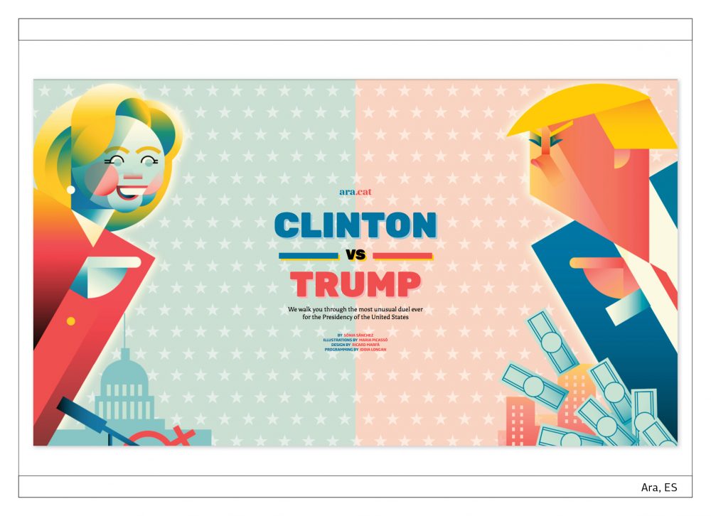
Ara.com
http://interactius.ara.cat/clinton-trump/en
With the delicate but still intense visual touch that we have come to expect from Catalonian Ara, they present a beautifully designed and developed comparison of the two candidates for the office of President of the USA – Hillary Clinton and Donald Trump.
As you scroll down the classical side-by-side comparison, it will focus on one story field at a time, helping you read and understand the story before you. Also, the most important points of comparison are highlighted, making it easy to both fast forward through the story, only comparing the most remarkable highlights for each candidate.
Needless to say, the story works just as smoothly on mobile as it does on desktop.
Kategorie 15.0. “Snow-Fall” Projekt, Multimedia Storytelling: “Von Rottweil hoch hinaus”
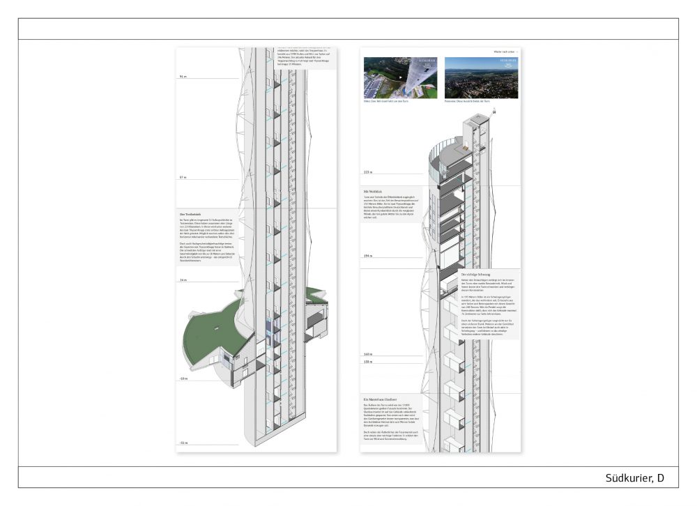
Südkurier
The tallest building in Baden-Württemberg is the test tower outside Rottweil, used by Thyssen Krupp elevators to test and develop new technologies. Beginning at 32 meters below ground, the scrollytelling story by Südkurier takes us on a tour of the landmark, floor by floor until we have scrolled ourselves up to 246 meters above ground. By the time you reach the top of the tower, and have been served selected pieces of information, you can also check out the 360 degree video from the construction of the tower, but be adviced – it is not suitable for anyone with even the mildest fright of heights.
Das Jahrbuch mit allen Gewinnern in Print und Online gibt es hier:
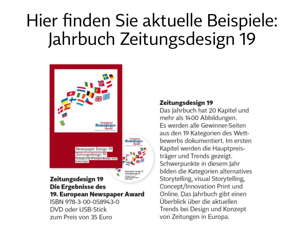
Das Buch gibt es ausschließlich auf DVD oder USB-Stick. Bestellung am besten über den Bookstore auf https://editorial-design.com/de/buchbestellung/ in jeder Buchhandlung und bei Amazon.